Lesson 6 .
Learning Objectives
- Introduce several beta diversity metrics
- Discover different ordination methods
- Learn about statistical methods that are applicable
Beta diversity
Beta diversity is between sample diversity. This is useful for answering the question, how different are these microbial communities?
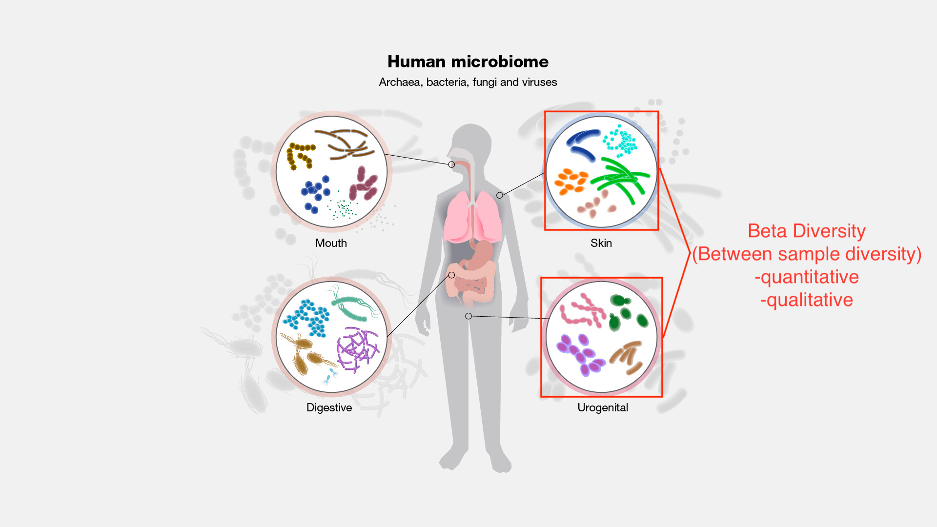
Image modified from https://www.genome.gov/genetics-glossary/Microbiome
Beta diversity is measured using distance and dissimilarity metrics. The core-metrics-phylogenetic pipeline automatically produces Bray-Curtis, Jaccard, weighted UniFrac, and unweighted UniFrac. More on these below.
Distance and dissimilarity metrics
Bray-Curtis dissimilarity
- quantitative
- Takes into consideration abundance and presence absence
Jaccard
- qualitative
- presence / absence
- percentage of taxa not found in both samples
Weighted UniFrac
- quantitative
- similar to Bray-Curtis but takes into consideration phylogenetic relationships
Unweighted UniFrac
- qualitative
- like Jaccard focuses on presence / absence of taxa but also includes phylogenetic relationships
- percentage of phylogenetic branch length not found in both samples
Aitchison
- an answer to the compositional nature of the data
- "euclidean distances between clr-transformed compositions" (Quinn et al. 2018).
- a clr transformation sets the features in a data set relative to the geometric mean of the composition
What is compositional data?
Compositional data have two unique properties. First, the total sum of all component values (i.e. the library size) is an artifact of the sampling procedure (van den Boogaart and Tolosana-Delgado, 2008). Second, the difference between component values is only meaningful proportionally [e.g. the difference between 100 and 200 counts carries the same information as the difference between 1000 and 2000 counts (van den Boogaart and Tolosana-Delgado, 2008)].--- Quinn et al. 2018
See this paper for more information on compositional data.
Some other notable metrics are described here.
These methods result in large distance / dissimilarity matrices. In all methods, a value closer to zero indicates similarity between microbial communities, while a value closer to one indicates dissimilarity.
Beta rarefaction
Again, rarefaction is used to eliminate issues due to differences in library size prior to beta diversity. This method is built-in to QIIME 2 core metrics pipelines. We can examine the stability of a beta diversity metric using qiime diversity beta-rarefaction.
qiime diversity beta-rarefaction \
  --i-table filtered-table-3.qza \
  --p-metric braycurtis \
  --p-clustering-method nj \
  --p-sampling-depth 10000 \
  --m-metadata-file /data/sample-metadata.tsv \
  --o-visualization braycurtis-rarefaction-plot.qzv
This will rarefy your feature table multiple times at a given depth. The output provides a jacknifed emperor plot, with variability around a community represented by the ellipsoids around a point. A correlation heatmap and a UPGMA/NJ sample-clustering tree is also output.
Ordination methods
Methods to reduce dimensionality in the data and visualize trends in the data. The following list includes commonly used methods and is not exhaustive.
PCoA
- most common
- similar to PCA but works on distance metrics beyond euclidean
- maximizes linear correlation
- prone to the horseshoe effect (also observed in PCA)
UMAP (Uniform Manifold Approximation and Projection)
- non-linear
- can be used on multiple distance / dissimilarity metrics
- improved resolution in clusters
- More information here.
NMDS (Not available in QIIME 2)
- better for rank ordered data (e.g., Bray-Curtis)
- dimensions are specified
- stress indicates how well the ordination represents the data (stress < 0.1 ~ good)
- no single solution
See this resource for more information on ordination metrics.
Generating a PCoA and UMAP in QIIME2
PCoA
PCoA was included by default in our core-metrics-phylogenetic pipeline. Because these are longitudinal data, we will customize the axis to include the varaible, week-relative-to-hct.
qiime emperor plot \
  --i-pcoa diversity-core-metrics-phylogenetic/unweighted_unifrac_pcoa_results.qza \
  --m-metadata-file /data/sample-metadata.tsv diversity-core-metrics-phylogenetic/faith_pd_vector.qza diversity-core-metrics-phylogenetic/evenness_vector.qza diversity-core-metrics-phylogenetic/shannon_vector.qza \
  --p-custom-axes week-relative-to-hct \
  --o-visualization uu-pcoa-emperor-w-time.qzv
qiime emperor plot \
  --i-pcoa diversity-core-metrics-phylogenetic/weighted_unifrac_pcoa_results.qza \
  --m-metadata-file /data/sample-metadata.tsv diversity-core-metrics-phylogenetic/faith_pd_vector.qza diversity-core-metrics-phylogenetic/evenness_vector.qza diversity-core-metrics-phylogenetic/shannon_vector.qza \
  --p-custom-axes week-relative-to-hct \
  --o-visualization wu-pcoa-emperor-w-time.qzv
UMAP
First, we perform the ordination.
qiime diversity umap \
  --i-distance-matrix diversity-core-metrics-phylogenetic/unweighted_unifrac_distance_matrix.qza \
  --o-umap uu-umap.qza
qiime diversity umap \
  --i-distance-matrix diversity-core-metrics-phylogenetic/weighted_unifrac_distance_matrix.qza \
  --o-umap wu-umap.qza
Then we use emperor to plot. Though the input parameter is --i-pcoa, we can also input umap results.
qiime emperor plot \
  --i-pcoa uu-umap.qza \
  --m-metadata-file /data/sample-metadata.tsv diversity-core-metrics-phylogenetic/faith_pd_vector.qza diversity-core-metrics-phylogenetic/evenness_vector.qza diversity-core-metrics-phylogenetic/shannon_vector.qza \
  --p-custom-axes week-relative-to-hct \
  --o-visualization uu-umap-emperor-w-time.qzv
qiime emperor plot \
  --i-pcoa wu-umap.qza \
  --m-metadata-file /data/sample-metadata.tsv diversity-core-metrics-phylogenetic/faith_pd_vector.qza diversity-core-metrics-phylogenetic/evenness_vector.qza diversity-core-metrics-phylogenetic/shannon_vector.qza \
  --p-custom-axes week-relative-to-hct \
  --o-visualization wu-umap-emperor-w-time.qzv
When we view these files, there are many options for customizing our plot and toggling our view. Let's look at these in more detail.
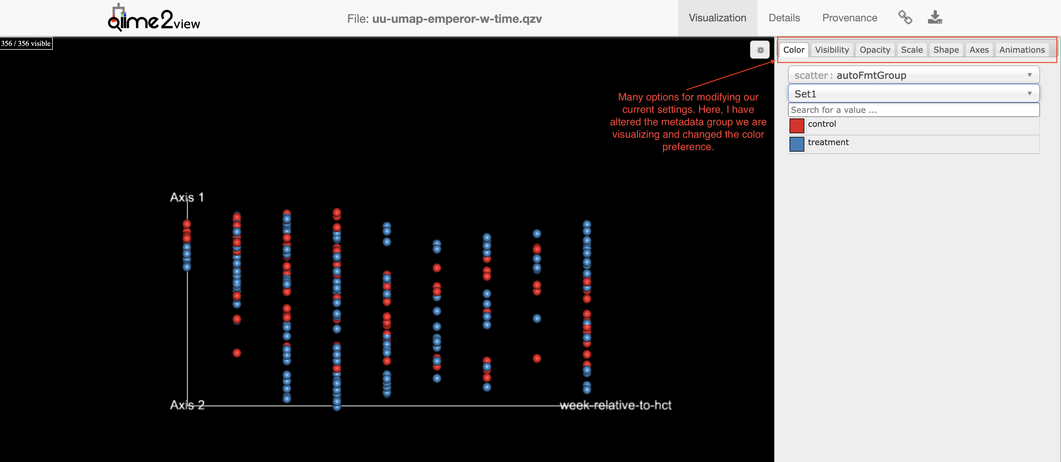
UMAP (unweighted UniFrac): A 2-D representation of axis-1 vs week-relative-to-hct. We can toggle our view to see this in 3D.
Longitudinal trends are difficult to view here because the data are dependent, but these can be teased apart in greater detail using the q2-longitudinal plugin.
Let's take a look at the moving pictures data set for a clearer example.
Statistics
Some typical statitstical tests applied to beta diversity metrics include the following:
Adonis (PERMANOVA)
- Similar to a MANOVA, but is permutational and non-parametric.
- Sensitive to group dispersion, so it is worth running alongside a beta-dispersion method.
- generates a pseudo-F ratio; larger pseudo-F suggests larger group separation.
- requires data independence
ANOSIM (Analysis of Similarity)
- uses a ranked approach (complementary to NMDS)
-
The ANOSIM statistic compares the mean of ranked dissimilarities between groups to the mean of ranked dissimilarities within groups. An R value close to "1.0" suggests dissimilarity between groups while an R value close to "0" suggests an even distribution of high and low ranks within and between groups. R values below "0" suggest that dissimilarities are greater within groups than between groups. --- gustame documentation
- Also sensitive to differences in group dispersion.
These methods, including a permutational dispersion test, can be run using qiime diversity beta-group-significance. The PERMANOVA implementation here is one-way. To include more than one variable with potential interactions, use qiime diversity adonis.
Again, because we are looking at longitudinal data, these are not as relevant in this specific case.