Data visualization with ggplot2
Objectives
To learn how to create publishable figures using the ggplot2 package in R.
By the end of this lesson, learners should be able to create simple, pretty, and effective figures.
Why use R for Data Visualization?
Learning R and associated plotting packages is a great way to generate publishable figures in a reproducible fashion.
With R you can:
1. Create simple or complex figures.
2. Create high resolution figures.
3. Generate scripts that can be reused to create the same or similar plot.
Introducing ggplot2
ggplot2 is an R graphics package from the tidyverse collection. It allows the user to create informative plots quickly by using a 'grammar of graphics' implementation, which is described as "a coherent system for describing and building graphs" (R4DS). The power of this package is that plots are built in layers and few changes to the code result in very different outcomes. This makes it easy to reuse parts of the code for very different figures.
Being a part of the tidyverse collection, ggplot2 works best with data frames (tidy data), which you should already be accustomed to.
To begin plotting, let's load our tidyverse library.
#load libraries
library(tidyverse) # Tidyverse automatically loads ggplot2
## ── Attaching core tidyverse packages ──────────────────────── tidyverse 2.0.0 ──
## ✔ dplyr     1.1.3     ✔ readr     2.1.4
## ✔ forcats   1.0.0     ✔ stringr   1.5.0
## ✔ ggplot2   3.4.4     ✔ tibble    3.2.1
## ✔ lubridate 1.9.3     ✔ tidyr     1.3.0
## ✔ purrr     1.0.2
## ── Conflicts ────────────────────────────────────────── tidyverse_conflicts() ──
## ✖ dplyr::filter() masks stats::filter()
## ✖ dplyr::lag()    masks stats::lag()
## ℹ Use the conflicted package (<http://conflicted.r-lib.org/>) to force all conflicts to become errors
We also need some data to plot, so if you haven't already, let's load the data we will need for this lesson.
#scaled_counts
#We used this in lesson 2 so you may not need to reload
scaled_counts<-
  read_delim("./data/filtlowabund_scaledcounts_airways.txt")
## Rows: 127408 Columns: 18
## ── Column specification ────────────────────────────────────────────────────────
## Delimiter: "\t"
## chr (11): feature, SampleName, cell, dex, albut, Run, Experiment, Sample, Bi...
## dbl  (6): sample, counts, avgLength, TMM, multiplier, counts_scaled
## lgl  (1): .abundant
##
## ℹ Use `spec()` to retrieve the full column specification for this data.
## ℹ Specify the column types or set `show_col_types = FALSE` to quiet this message.
dexp<-read_delim("./data/diffexp_results_edger_airways.txt")
## Rows: 15926 Columns: 10
## ── Column specification ────────────────────────────────────────────────────────
## Delimiter: "\t"
## chr (4): feature, albut, transcript, ref_genome
## dbl (5): logFC, logCPM, F, PValue, FDR
## lgl (1): .abundant
##
## ℹ Use `spec()` to retrieve the full column specification for this data.
## ℹ Specify the column types or set `show_col_types = FALSE` to quiet this message.
The ggplot2 template
The following represents the basic ggplot2 template:
ggplot(data = <DATA>) +
  <GEOM_FUNCTION>(mapping = aes(<MAPPINGS>))
We need three basic components to create a plot: the data we want to plot, geom function(s), and mapping aesthetics. Notice the + symbol following the ggplot() function. This symbol will precede each additional layer of code for the plot, and it is important that it is placed at the end of the line. More on geom functions and mapping aesthetics to come.
Let's see this template in practice.
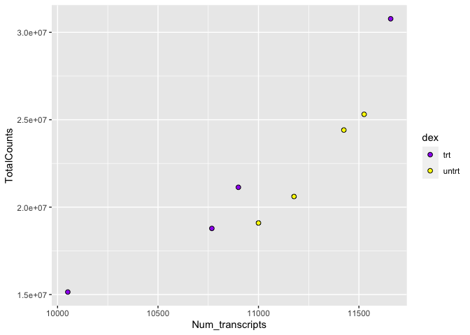
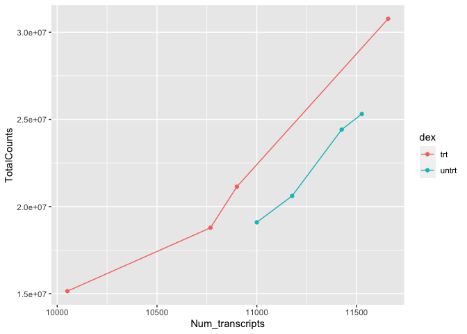
What is the relationship between total transcript sums per sample and the number of recovered transcripts per sample?
#let's get some data
#we are only interested in transcript counts greater than 100
#read in the data
sc<-read_csv("./data/sc.csv")
## Rows: 8 Columns: 4
## ── Column specification ────────────────────────────────────────────────────────
## Delimiter: ","
## chr (2): dex, SampleName
## dbl (2): Num_transcripts, TotalCounts
##
## ℹ Use `spec()` to retrieve the full column specification for this data.
## ℹ Specify the column types or set `show_col_types = FALSE` to quiet this message.
#let's view the data
sc
## # A tibble: 8 × 4
##   dex   SampleName Num_transcripts TotalCounts
##   <chr> <chr>                <dbl>       <dbl>
## 1 trt   GSM1275863           10768    18783120
## 2 trt   GSM1275867           10051    15144524
## 3 trt   GSM1275871           11658    30776089
## 4 trt   GSM1275875           10900    21135511
## 5 untrt GSM1275862           11177    20608402
## 6 untrt GSM1275866           11526    25311320
## 7 untrt GSM1275870           11425    24411867
## 8 untrt GSM1275874           11000    19094104
These data include total transcript read counts summed by sample and the total number of transcripts recovered by sample that had at least 100 reads.
Note
These data can be generated using
scaled_counts |> group_by(dex, SampleName) |>
  summarize(Num_transcripts=sum(counts>100),TotalCounts=sum(counts))
Let's plot
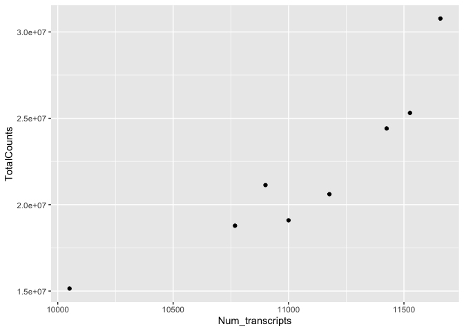
ggplot(data=sc) +
  geom_point(aes(x=Num_transcripts, y = TotalCounts))

We can easily see that there is a relationship between the number of transcripts per sample and the total transcripts recovered per sample. ggplot2 default parameters are great for exploratory data analysis. But, with only a few tweaks, we can make some beautiful, publishable figures.
What did we do in the above code?
The first step to creating this plot was initializing the ggplot object using the function ggplot(). Remember, we can look further for help using ?ggplot(). The function ggplot() takes data, mapping, and further arguments. However, none of this needs to actually be provided at the initialization phase, which creates the coordinate system from which we build our plot. But, typically, you should at least call the data at this point.
The data we called was from the data frame sc, which we created above. Next, we provided a geom function (geom_point()), which created a scatter plot. This scatter plot required mapping information, which we provided for the x and y axes. More on this in a moment.
Let's break down the individual components of the code.
#What does running ggplot() do?
ggplot(data=sc)

#What about just running a geom function?
geom_point(data=sc,aes(x=Num_transcripts, y = TotalCounts))
## mapping: x = ~Num_transcripts, y = ~TotalCounts
## geom_point: na.rm = FALSE
## stat_identity: na.rm = FALSE
## position_identity
#what about this
ggplot() +
geom_point(data=sc,aes(x=Num_transcripts, y = TotalCounts))
Geom functions
A geom is the geometrical object that a plot uses to represent data. People often describe plots by the type of geom that the plot uses. --- R4DS
There are multiple geom functions that change the basic plot type or the plot representation. We can create scatter plots (geom_point()), line plots (geom_line(),geom_path()), bar plots (geom_bar(), geom_col()), line modeled to fitted data (geom_smooth()), heat maps (geom_tile()), geographic maps (geom_polygon()), etc.
ggplot2 provides over 40 geoms, and extension packages provide even more (see https://exts.ggplot2.tidyverse.org/gallery/ for a sampling). The best way to get a comprehensive overview is the ggplot2 cheatsheet, which you can find at https://posit.co/resources/cheatsheets/. --- R4DS
You can also see a number of options pop up when you type geom into the console, or you can look up the ggplot2 documentation in the help tab.
We can see how easy it is to change the way the data is plotted. Let's plot the same data using geom_line().
ggplot(data=sc) +
  geom_line(aes(x=Num_transcripts, y = TotalCounts))

Mapping and aesthetics (aes())
The geom functions require a mapping argument. The mapping argument includes the aes() function, which "describes how variables in the data are mapped to visual properties (aesthetics) of geoms" (ggplot2 R Documentation). If not included it will be inherited from the ggplot() function.
An aesthetic is a visual property of the objects in your plot.---R4DS
Mapping aesthetics include some of the following:
1. the x and y data arguments
2. shapes
3. color
4. fill
5. size
6. linetype
7. alpha
This is not an all encompassing list.
Let's return to our plot above. Is there a relationship between treatment ("dex") and the number of transcripts or total counts?
#adding the color argument to our mapping aesthetic
ggplot(data=sc) +
  geom_point(aes(x=Num_transcripts, y = TotalCounts,color=dex))
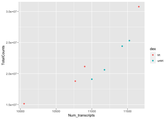
There is potentially a relationship. ASM cells treated with dexamethasone in general have lower total numbers of transcripts and lower total counts.
Notice how we changed the color of our points to represent a variable, in this case. To do this, we set color equal to 'dex' within the aes() function. This mapped our aesthetic, color, to a variable we were interested in exploring. Aesthetics that are not mapped to our variables are placed outside of the aes() function. These aesthetics are manually assigned and do not undergo the same scaling process as those within aes().
For example
#map the shape aesthetic to the variable "dex"
#use the color purple across all points (NOT mapped to a variable)
ggplot(data=sc) +
  geom_point(aes(x=Num_transcripts, y = TotalCounts,shape=dex),
             color="purple")
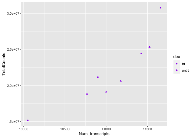
We can also see from this that 'dex' could be mapped to other aesthetics. In the above example, we see it mapped to shape rather than color. By default, ggplot2 will only map six shapes at a time, and if your number of categories goes beyond 6, the remaining groups will go unmapped. This is by design because it is hard to discriminate between more than six shapes at any given moment. This is a clue from ggplot2 that you should choose a different aesthetic to map to your variable. However, if you choose to ignore this functionality, you can manually assign more than six shapes.
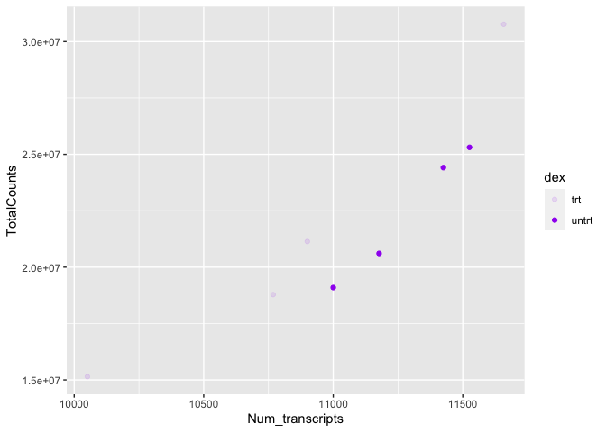
We could have just as easily mapped it to alpha, which adds a gradient to the point visibility by category.
#map the alpha aesthetic to the variable "dex"
#use the color purple across all points (NOT mapped to a variable)
ggplot(data=sc) +
  geom_point(aes(x=Num_transcripts, y = TotalCounts,alpha=dex),
             color="purple") #note the warning.
## Warning: Using alpha for a discrete variable is not advised.
Or we could map it to size. There are multiple options, so explore a little with your plots.
Other things to note:
The assignment of color, shape, or alpha to our variable was automatic, with a unique aesthetic level representing each category (i.e., 'trt', 'untrt') within our variable. You will also notice that ggplot2 automatically created a legend to explain the levels of the aesthetic mapped. We can change aesthetic parameters - what colors are used, for example - by adding additional layers to the plot. We will be adding layers throughout the tutorial.
R objects can also store figures
As we have discussed, R objects are used to store things created in R to memory. This includes plots created with ggplot2.
dot_plot<-ggplot(data=sc) +
  geom_point(aes(x=Num_transcripts, y = TotalCounts,color=dex))

dot_plot

We can add additional layers directly to our object. We will see how this works by defining some colors for our 'dex' variable.
Colors
ggplot2 will automatically assign colors to the categories in our data. Colors are assigned to the fill and color aesthetics in aes(). We can change the default colors by providing an additional layer to our figure. To change the color, we use the scale_color functions: scale_color_manual(), scale_color_brewer(), scale_color_grey(), etc. We can also change the name of the color labels in the legend using the labels argument of these functions
dot_plot +
  scale_color_manual(values=c("red","black"),
                     labels=c('treated','untreated'))

dot_plot +
  scale_color_grey()

dot_plot +
  scale_color_brewer(palette = "Paired")

Similarly,if we want to change the fill, we would use the scale_fill options. To apply scale_fill to shape, we will have to alter the shapes, as only some shapes take a fill argument.
ggplot(data=sc) +
  geom_point(aes(x=Num_transcripts, y = TotalCounts,fill=dex),
             shape=21,size=2) + #increase size and change points
  scale_fill_manual(values=c("purple", "yellow"))
There are a number of ways to specify the color argument including by name, number, and hex code.Here is a great resource from the R Graph Gallery for assigning colors in R.
There are also a number of complementary packages in R that expand our color options. One of my favorites is viridis, which provides colorblind friendly palettes. randomcoloR is a great package if you need a large number of unique colors.
library(viridis) #Remember to load installed packages before use
## Loading required package: viridisLite
dot_plot + scale_color_viridis(discrete=TRUE, option="viridis")

Paletteer contains a comprehensive set of color palettes, if you want to load the palettes from multiple packages all at once. See the Github page for details.
Facets
A way to add variables to a plot beyond mapping them to an aesthetic is to use facets or subplots. There are two primary functions to add facets, facet_wrap() and facet_grid(). If faceting by a single variable, use facet_wrap(). If multiple variables, use facet_grid(). The first argument of either function is a formula, with variables separated by a ~ (See below). Variables must be discrete (not continuous).
Using ~ in ggplot2
The ~ is used in R formulas to split the dependent or response variable from the independent variable(s). For more information, see this explanation here.
In facet_wrap() / facet_grid() the ~ is used to generate a formula specifying rows by columns.
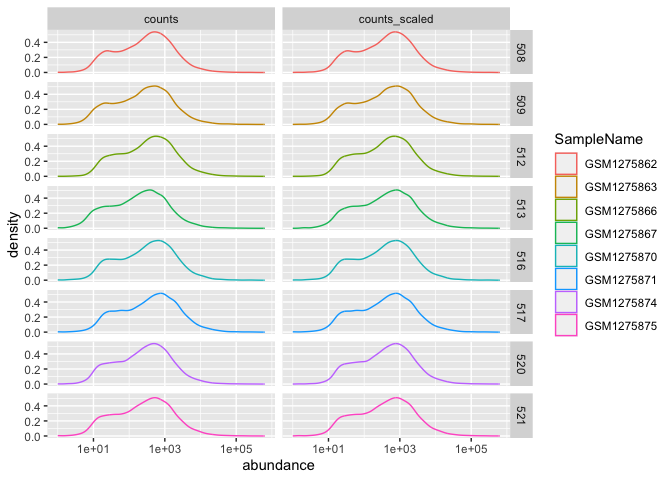
Let's return to the airway count data to see how facets are useful. Here, we are going to compare scaled and unscaled count data using a density plot.
A density plot shows the distribution of a numeric variable. --- R Graph Gallery
In our example data, density_data, the gene counts were scaled to account for technical and composition differences using the trimmed mean of M values (TMM) from EdgeR (Robinson and Oshlack 2010), but non-normalized values remained for comparison. Thus, we can compare scaled vs unscaled counts by sample using faceting.
#density plot
#let's grab the data and take a look
density_data<-read.csv("./data/density_data.csv",
                       stringsAsFactors=TRUE)

head(density_data)
##           feature sample SampleName   cell   dex albut        Run avgLength
## 1 ENSG00000000003    508 GSM1275862 N61311 untrt untrt SRR1039508       126
## 2 ENSG00000000003    508 GSM1275862 N61311 untrt untrt SRR1039508       126
## 3 ENSG00000000419    508 GSM1275862 N61311 untrt untrt SRR1039508       126
## 4 ENSG00000000419    508 GSM1275862 N61311 untrt untrt SRR1039508       126
## 5 ENSG00000000457    508 GSM1275862 N61311 untrt untrt SRR1039508       126
## 6 ENSG00000000457    508 GSM1275862 N61311 untrt untrt SRR1039508       126
##   Experiment    Sample    BioSample transcript ref_genome .abundant      TMM
## 1  SRX384345 SRS508568 SAMN02422669     TSPAN6       hg38      TRUE 1.055278
## 2  SRX384345 SRS508568 SAMN02422669     TSPAN6       hg38      TRUE 1.055278
## 3  SRX384345 SRS508568 SAMN02422669       DPM1       hg38      TRUE 1.055278
## 4  SRX384345 SRS508568 SAMN02422669       DPM1       hg38      TRUE 1.055278
## 5  SRX384345 SRS508568 SAMN02422669      SCYL3       hg38      TRUE 1.055278
## 6  SRX384345 SRS508568 SAMN02422669      SCYL3       hg38      TRUE 1.055278
##   multiplier        source abundance
## 1   1.415149        counts  679.0000
## 2   1.415149 counts_scaled  960.8864
## 3   1.415149        counts  467.0000
## 4   1.415149 counts_scaled  660.8748
## 5   1.415149        counts  260.0000
## 6   1.415149 counts_scaled  367.9388
#plot
ggplot(data= density_data)+
  aes(x=abundance,
             color=SampleName)+ #initialize ggplot
  geom_density() + #call density plot geom
  facet_wrap(~source) + #use facet_wrap; see ~source
  scale_x_log10()#scales the x axis using a base-10 log transformation
## Warning: Transformation introduced infinite values in continuous x-axis
## Warning: Removed 140 rows containing non-finite values (`stat_density()`).
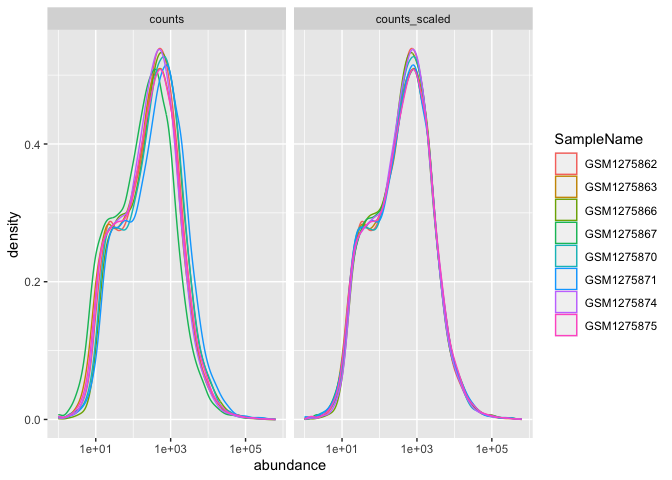
The distributions of sample counts did not differ greatly between samples before scaling, but regardless, we can see that the distributions are more similar after scaling.
Here, faceting allowed us to visualize multiple features of our data. We were able to see count distributions by sample as well as normalized vs non-normalized counts.
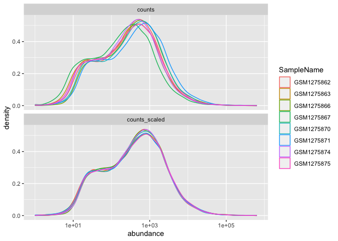
Note the help options with ?facet_wrap(). How would we make our plot facets vertical rather than horizontal?
ggplot(data= density_data)+ #initialize ggplot
  geom_density(aes(x=abundance,
             color=SampleName)) + #call density plot geom
  facet_wrap(~source, ncol=1) + #use the ncol argument
  scale_x_log10()
## Warning: Transformation introduced infinite values in continuous x-axis
## Warning: Removed 140 rows containing non-finite values (`stat_density()`).
We could plot each sample individually using facet_grid()
ggplot(data= density_data)+ #initialize ggplot
  geom_density(aes(x=abundance,
             color=SampleName)) + #call density plot geom
  facet_grid(as.factor(sample)~source) + # formula is sample ~ source
  scale_x_log10()
## Warning: Transformation introduced infinite values in continuous x-axis
## Warning: Removed 140 rows containing non-finite values (`stat_density()`).
Using multiple geoms per plot
Because we build plots using layers in ggplot2. We can add multiple geoms to a plot to represent the data in unique ways.
#We can combine geoms; here we combine a scatter plot with a
#add a line to our plot
ggplot(data=sc) +
  geom_point(aes(x=Num_transcripts, y = TotalCounts,color=dex)) +
  geom_line(aes(x=Num_transcripts, y = TotalCounts,color=dex))

#to make our code more effective, we can put shared aesthetics in the
#ggplot function
ggplot(data=sc, aes(x=Num_transcripts, y = TotalCounts,color=dex)) +
  geom_point() +
  geom_line()
#or plot different aesthetics per layer
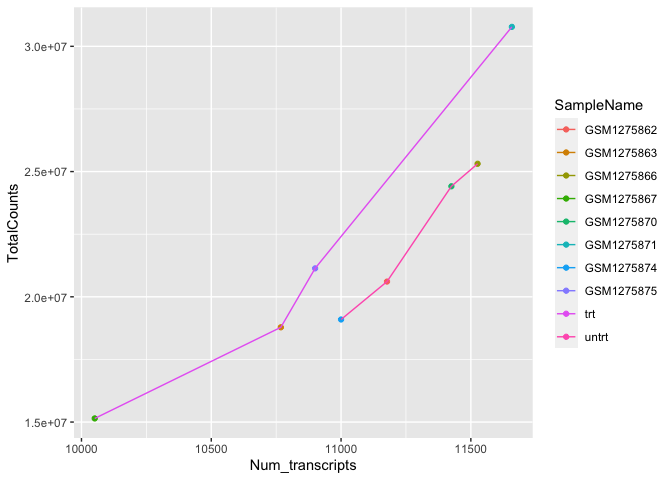
ggplot(data=sc) +
geom_point(aes(x=Num_transcripts, y = TotalCounts,
color=SampleName)) +
geom_line(aes(x=Num_transcripts, y = TotalCounts,color=dex))
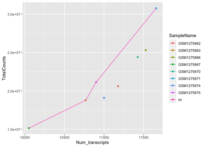
#you can also add subsets of data in a new layer without overriding
#preceding layers
#let's only provide a line for the treated samples
 ggplot(data=sc) +
  geom_point(aes(x=Num_transcripts, y = TotalCounts,
                 color=SampleName)) +
  geom_line(data=filter(sc,dex=="trt"),
            aes(x=Num_transcripts, y = TotalCounts,color=dex))
To get multiple legends for the same aesthetic, check out the CRAN package ggnewscale.
Other data visualization options in R
We will continue with ggplot2 in the next lesson, but before we get there, let's take a moment to discuss other R visualization options.
R base graphics
You do not need to load a package to visually explore data. Rather, you can use base R graphics for plotting (from the graphics package). This plotting is fairly different from ggplot2, which is based on the grid package. Unlike ggplot2 the data does not need to be organized in a data frame to use base R graphics. The plots are built line-by-line using an "Artist's pallete model", and because of this, it is difficult to preserve plots from base R graphics as objects to be manipulated later, as you can with ggplot2.
You can obtain fairly nice figures using base R graphics; however, it often will take more lines of code.
The most common function from R base graphics is plot(). For a complete list of functions, use library(help = "graphics").
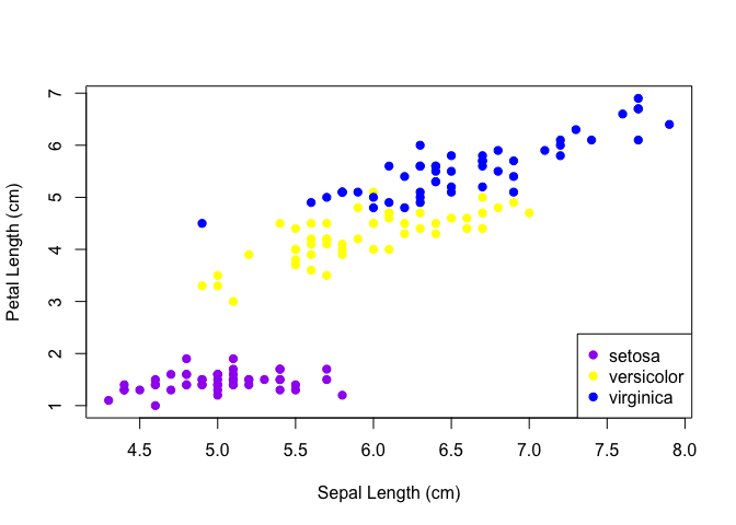
Base R graph
plot(iris$Sepal.Length, iris$Petal.Length, pch=19,
     col=c("purple","yellow","blue")[as.numeric(iris$Species)],
     xlab="Sepal Length (cm)", ylab="Petal Length (cm)")
legend("bottomright",legend=levels(iris$Species),
       col=c("purple","yellow","blue"), pch=19)
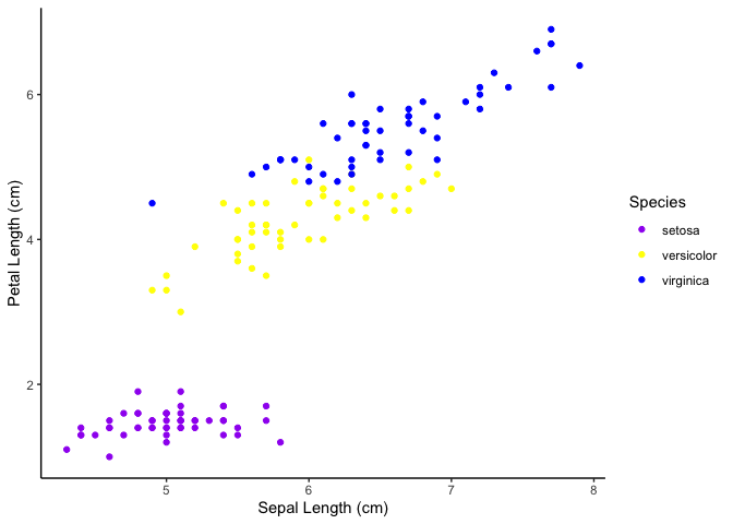
ggplot2 graph
ggplot(data=iris)+
  geom_point(aes(Sepal.Length,Petal.Length,color=Species))+
  scale_color_manual(values=c("purple","yellow","blue"))+
  theme_classic() +
  labs(x="Sepal Length (cm)",y="Petal Length (cm)")
Lattice
The lattice package is another prominent graphic system in R. Like ggplot2 this is also based on the grid package.
For more information comparing the three plotting systems, see this chapter from Exploratory Data Analysis with R.
Resource list
Acknowledgements
Material from this lesson was adapted from Chapter 3 of R for Data Science and from "Data Visualization", Introduction to data analysis with R and Bioconductor, which is part of the Carpentries Incubator.