Lesson 9: Differential Expression Analysis with iDEP
Learning Objectives
By the end of this lesson, learners should be able to:
- upload an RNA-Seq expression matrix and sample design into iDEP;
- run preprocessing, QC, and differential expression analysis in iDEP;
- interpret PCA, heatmap, volcano plot, MA plot, and DEG table outputs;
- explain what the selected contrast means;
- export results and identify settings needed for reproducibility.
Introduction to iDEP
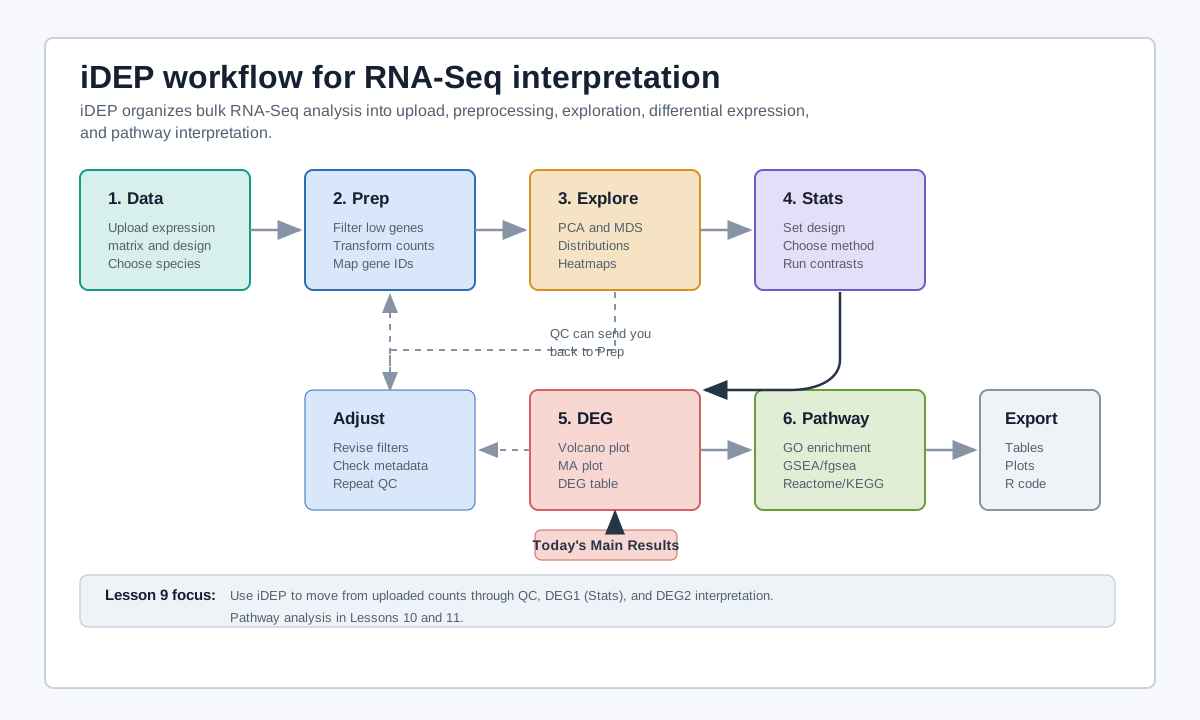
iDEP stands for Integrated Differential Expression and Pathway analysis. It is a web application for interactive RNA-Seq analysis that brings together data upload, preprocessing, visualization, differential expression, gene-set enrichment, pathway analysis, and reproducible output in one interface.
For this module, iDEP is useful because it lets learners see the analysis workflow without writing R code first. The goal is not to hide the statistics, but to make the sequence of decisions visible: upload the matrix, check the data, define the comparison, run a model, inspect the DEG output, and then ask pathway-level questions.
Resources for using iDEP:
- Add the paper reference here https://link.springer.com/article/10.1186/s12859-018-2486-6
- Wordpress docs: https://idepsite.wordpress.com/
- Github page: https://github.com/gexijin/idepGolem
Helpful Things to Know About iDEP:
- if the analysis hangs at any point, try refreshing the page and starting over. You will need to start again from the "Load Data" tab. While annoying, it shouldn't take too long to get back to the same point.
Get Started with HPC OnDemand
If you are following along with this lesson, go ahead and open a browser to the NIH HPC OnDemand portal: https://hpcondemand.nih.gov/ and log in with your NIH credentials. Then open an iDEP session using the instructions outlined in Lesson 8.
NIH HPC OnDemand Student Accounts
If you are using one of the available student accounts, you will need to navigate to https://hpcclass.cit.nih.gov/. There are a limited number of student accounts available, so please be considerate of other students. If you are unable to access the student accounts, you can still follow along with the lesson using a personal Biowulf account of the public iDEP server. New features and updates may be available on the public server that are not yet available on the Biowulf iDEP installation. For a similar experience, you can select v2.01 from the public iDEP server homepage.
Get the Files
In Lesson 1, we downloaded the primary RENEE output file RSEM.genes.expected_count.all_samples.txt. For this iDEP demo, we will use a modified version of that file ready for import rsem_modified.txt.
More about RSEM.genes.expected_count.all_samples.txt
This matrix comes from RSEM's own per-sample rollup (transcript-level counts summed to genes), not from tximport. That's fine for most analyses, but it means the matrix carries no per-sample transcript-length correction. Gene-level counting implicitly assumes each gene's effective transcript length is constant across samples; if isoform usage shifts between conditions, that assumption breaks, since a sample using a longer isoform of a gene will generate more reads at the same expression level. tximport uses transcript-level estimates to compute a per-sample, length-weighted offset that corrects for this (Soneson, Love, and Robinson 2015). If your samples/conditions are unlikely to involve major isoform-usage shifts, RENEE's gene-level matrix is a reasonable, standard input for DESeq2/edgeR/limma-voom as-is.
Reference: Soneson C, Love MI, Robinson MD. Differential analyses for RNA-seq: transcript-level estimates improve gene-level inferences. F1000Research. 2015;4:1521. https://doi.org/10.12688/f1000research.7563.1
Sample Names and Design File
If you look at our modified count matrix, the sample names are: hcc1395_normal_rep1, hcc1395_normal_rep2, hcc1395_normal_rep3, hcc1395_tumor_rep1, hcc1395_tumor_rep2, and hcc1395_tumor_rep3.
iDEP uses the sample names to define the sample groups. The rep number should be placed at the end, with the condition preceding it. With simple experimental designs (e.g., two groups, no batch effects, etc.), an experimental design file is optional. See the iDEP documentation for specifics on the sample IDs and design file format: https://idepsite.wordpress.com/data-format/.
Continuous Variables / Covariates
There are seemingly no options or documented examples in iDEP for non-factorial (continuous) designs. The experimental design interface appears to be built around factor-based columns. However, all three major DE tools discussed in Lesson 8 (DESeq2, edgeR, and limma-voom) can accept numeric covariates directly in their design formulas or model matrices. Trainees wanting more flexible designs will likely need to move to R for that work. See the Bioconductor Support threads below (and others not listed) for more discussion on incorporating continuous covariates in DESeq2 and limma-voom.
Further reading (Bioconductor Support threads):
- DESeq2: Continuous and discrete variables in the design (#126713)
- DESeq2 with continuous variables — predictors and/or outcomes (#97262)
- Limma-voom with both categorical and continuous confounders (#104580)
- Design matrix for continuous independent variable in limma (#76638)
Consider consulting with a statistician when modeling complex experimental designs, especially if you have continuous covariates or multiple confounders. iDEP is a great tool for simple designs, but it does not expose the full flexibility of the underlying DESeq2 or limma-voom workflows.
iDEP Orientation
In version 2.01, iDEP has eleven primary tabs. Latest versions of iDEP have a cleaner UI with fewer tabs, but the underlying workflow is the same. The following table summarizes the purpose of each tab.
| Tab | Teaching purpose |
|---|---|
| Load Data | Upload expression matrix, fold changes, design matrix, or gene choose species, choose data type |
| Pre-process | Filter low-expression genes, transform data, inspect processed matrix, examine useful QC plots |
| Clustering / PCA | Explore sample and gene structure before formal testing |
| DEG | Define design and run differential expression models |
| DEG2 | Inspect genes, heatmaps, volcano plots, MA plots, and DEG enrichment |
| Pathway | Run pathway analysis methods |
There are two additional tabs: Bicluster and Network, which require larger sample sizes and are beyond the scope of this lesson.
iDEP includes many opportunities to download data, plots, and R code for reproducibility..
Upload the Data
Demo script:
- Choose species:
Homo sapiens. - Select Data type - In this case we are using the "Read counts data" as this will provide the most robust differential expression analysis.
- Upload
rsem_modified.txtand define the experimental design. - Consider including an experiemental design file if you have one. For this demo, we are not including a design file. If you do include a design file, the sample names in the design file must match the sample names in the count matrix.
- Modify global settings if needed. This is your chance to include some customizations like plot colors, themes, and ID types.
Gene ID Mapping
iDEP can map gene IDs to a common set of identifiers for each species. This is useful if your input data uses gene symbols, Entrez IDs, or other identifiers. For this demo, we are using Ensembl gene IDs. Note, for version 2.01, if you choose "Do not convert gene IDs", iDEP will not attempt to map gene symbols for downstream plots.
Preprocess the Data
The pre-processing step is important for filtering and transformation prior to QC and exploratory data analysis. iDEP provides a number of options for filtering and transformation. The default settings are usually reasonable, but you can adjust them if needed.
Filtering
Before differential expression analysis, iDEP filters out lowly-expressed genes, which add noise without adding biological signal. iDEP uses CPM-based filtering for count data. CPM is calculated by scaling each gene's raw count by that sample's total library size:
CPM = (raw count / total library size) * 1,000,000
A common rule is to keep genes that pass a minimum CPM threshold (CPM > 0.5) in at least one or more samples.
Why CPM?
A fixed cutoff like "10 reads" treats every sample the same, even if some were sequenced much more deeply than others, making the filter too lenient for shallow samples and too strict for deep ones. CPM adjusts for library size first, so the threshold reflects the same relative expression level regardless of sequencing depth. This makes it a depth-aware filter.
The "n libraries" setting controls how many samples must clear the CPM threshold. A common practice is to set this to match your number of replicates per group, so a gene isn't kept based on one noisy sample alone.
Transformation
Before clustering or PCA, count data needs to be transformed to stabilize variance across the range of expression levels. This is to avoid genes with the highest counts dominating the analysis. iDEP offers three options:
- edgeR-style log2(CPM + c) (default): log2 transformation with a small pseudo-count (c=1–10, default c=4) added to avoid taking log(0). Fast and works well in most cases — a good default for beginners.
- VST (variance stabilizing transform): fast even with many samples; applies a strong, uniform transformation across expression levels. Best when library sizes are fairly similar across samples.
- rlog (regularized log): more robust when library sizes vary a lot between samples, since it shrinks low-count genes more carefully. Slower than VST, so only recommended for fewer than 10 samples.
Rule of thumb: many samples or similar library sizes → VST; fewer samples and/or uneven library sizes → rlog.
A few practical notes:.
- Transformed data is used for exploratory analysis (clustering, PCA) and for limma-trend DEG analysis. DESeq2 and limma-voom instead use the raw counts directly.
- If library sizes vary more than ~3-fold between samples, limma-trend isn't recommended, as this method works best for samples with similar sequencing depths.
- iDEP checks for this automatically, flagging a warning if sequencing depth differs significantly between groups, since this can confound the analysis.
Filtering and Transformation Summary
Following filtering and transformation, we will receive a summary of what was filtered: "1453 genes in 6 samples. 627 genes passed filter, 605 were converted to Ensembl gene IDs in our database. The remaining 22 genes were kept in the data using original IDs."
QC and Exploratory Analysis
After transformation, iDEP provides several diagnostic plots to help you verify the transformation worked well and to explore your dataset. Nicely, we can easily compare transformation methods by switching between them in the UI.
Warning
On heavily sub-setted or very small gene sets (like this chr22 practice dataset), VST's dispersion-trend fitting step can run very slowly or stall, since it's designed to fit trends across genome-wide data. If VST hangs, started log or rlog are reliable alternatives for small datasets like this one.
The following plots are included here:
- Barplot of library sizes
- Boxplot of transformed expression distributions
- Density plot of transformed expression distributions
- Scatterplots of pairwise sample correlations
- Dispersion plot of transformed expression distributions
- QC plot with the number of genes by type
- Gene plot comparing gene expression by condition or sample
Plots 2-5 are about verifying the transformation worked before moving on to downstream clustering and PCA. Plots 6-7 are more about exploring whether the data makes sense biologically.
Barplot of library sizes
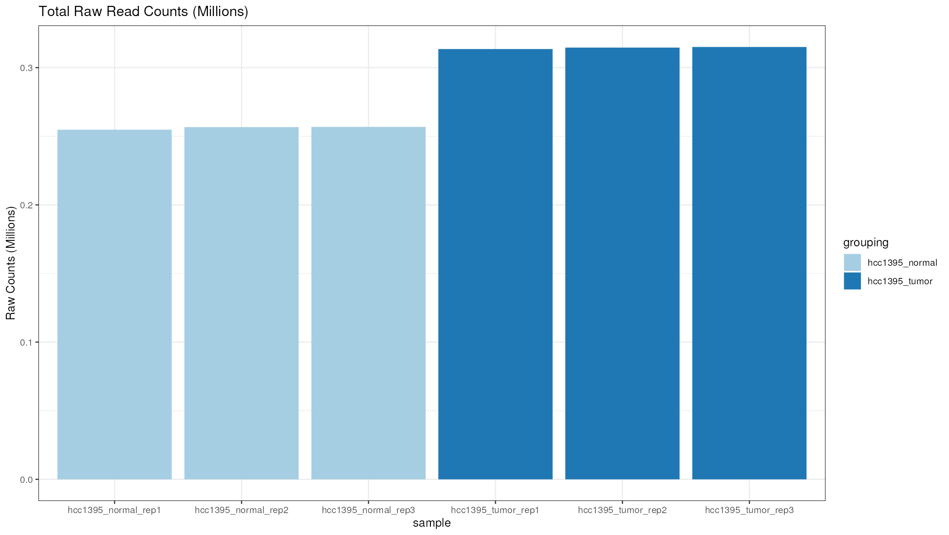
Are samples similarly sequenced? Do any samples have unusually small or large libraries?
iDEP checks whether sequencing depth (library size) differs significantly between your comparison groups, using an ANOVA test (flagged if P < 0.01). It also reports the ratio of max/min total counts across groups, with <1.5 generally considered acceptable.
We received "Warning! Sequencing depth bias detected. Total read counts are significantly different among sample groups (p= 2.10e-07 ) based on ANOVA. Total read counts max/min = 1.23."
This warning is a prompt to check whether depth and biology are entangled, not an automatic sign that something is wrong. Stay under a max/min ratio of 1.5, and use your knowledge of the samples to judge whether it's worth acting on. Not that if depth varies more than ~3-fold across samples, avoid limma-trend and use DESeq2 or limma-voom instead, since they handle depth differences more robustly.
Small dataset for teaching
The HCC1395 dataset is a small, pre-filtered subset of a larger RNA-seq experiment. It is intended for teaching purposes only. The small size allows for fast runtimes in iDEP, but it does not represent the full complexity of a real RNA-seq experiment. In practice, you would typically work with larger datasets with more replicates and more genes.
Boxplot and Density plots of transformed expression distributions
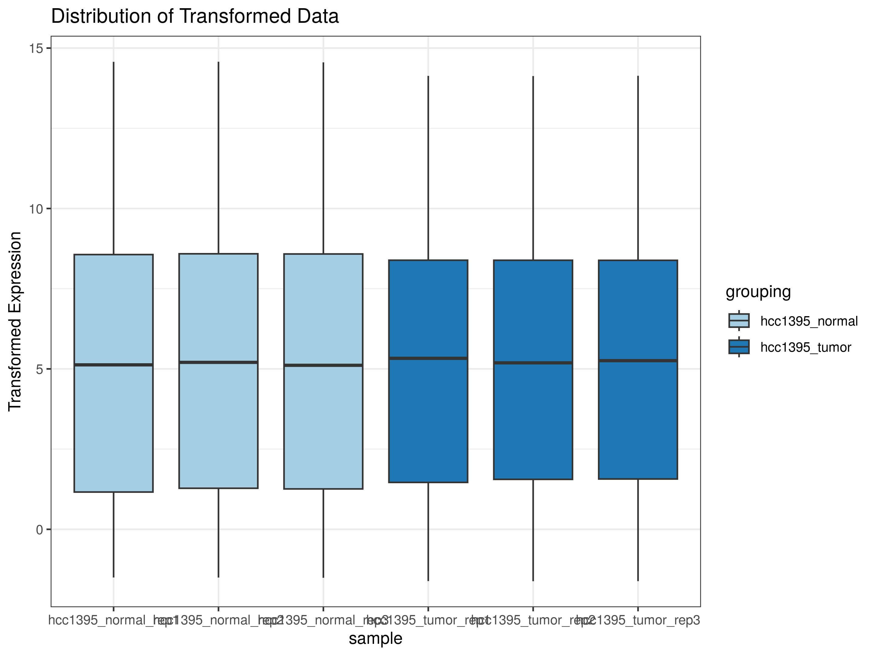
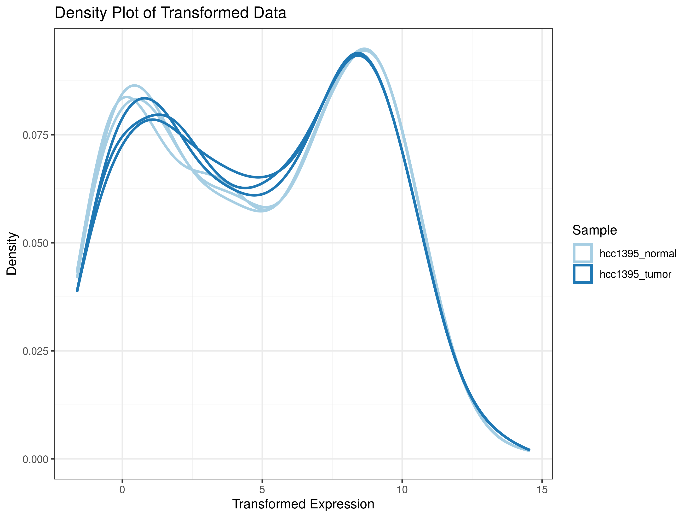
Do transformed expression distributions look comparable?
The boxplot shows the spread (median, IQR, range) of expression per sample, while the desnity plot shows the shape of each sample's distribution. For the boxplot, you should look for boxes and medians aligned across samples, indicating consistent normalization. For the density plot, look for overlapping curves across samples, indicating similar distributions. A bimodal shape (one peak of low/noise genes, one peak of expressed genes) is typical and expected for RNA-seq data.
Scatterplots of pairwise sample correlations
Do technical or biological replicates resemble each other?
These scatter plots compare transformed expression between two samples directly. You can compare replicates within a condition and replicates between conditions. You should see tight clustering along the diagonal and a high correlation (R close to 1) between replicates within a condition, indicating good reproducibility between replicates.
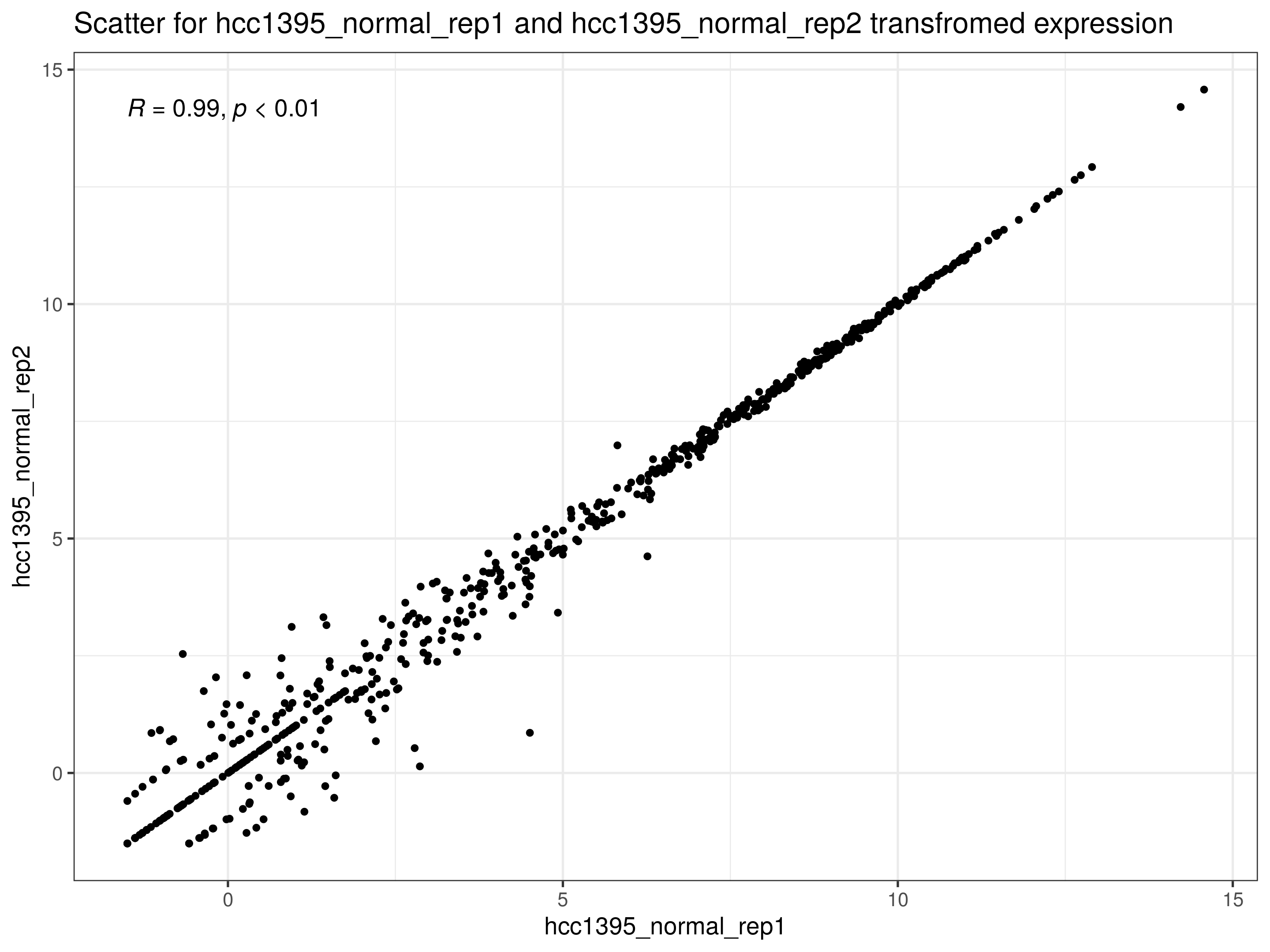
We can also see here how the rlog transformation has stabilized variance across the range of expression levels, as the points are more tightly clustered along the diagonal compared to the log2(CPM + c) transformation. Compare this to the idep documentation for more examples of how the different transformations affect the scatter plots.
Mean vs standard deviation plot of transformed expression distributions
Did the transformation successfully stabilized variance across expression levels?
This dispersion plot can also provide information on how well the transformation stabilized variance across expression levels. Ideally, we would like to see a relatively flat trend since transformation methods like VST and rlog aim to reduce the relationship between mean expression and variance (making the data more homoskedastic, or having consistent variance across the mean, rather than heteroskedastic, where variance changes with expression level). Some residual trend is normal; no transformation removes it completely.
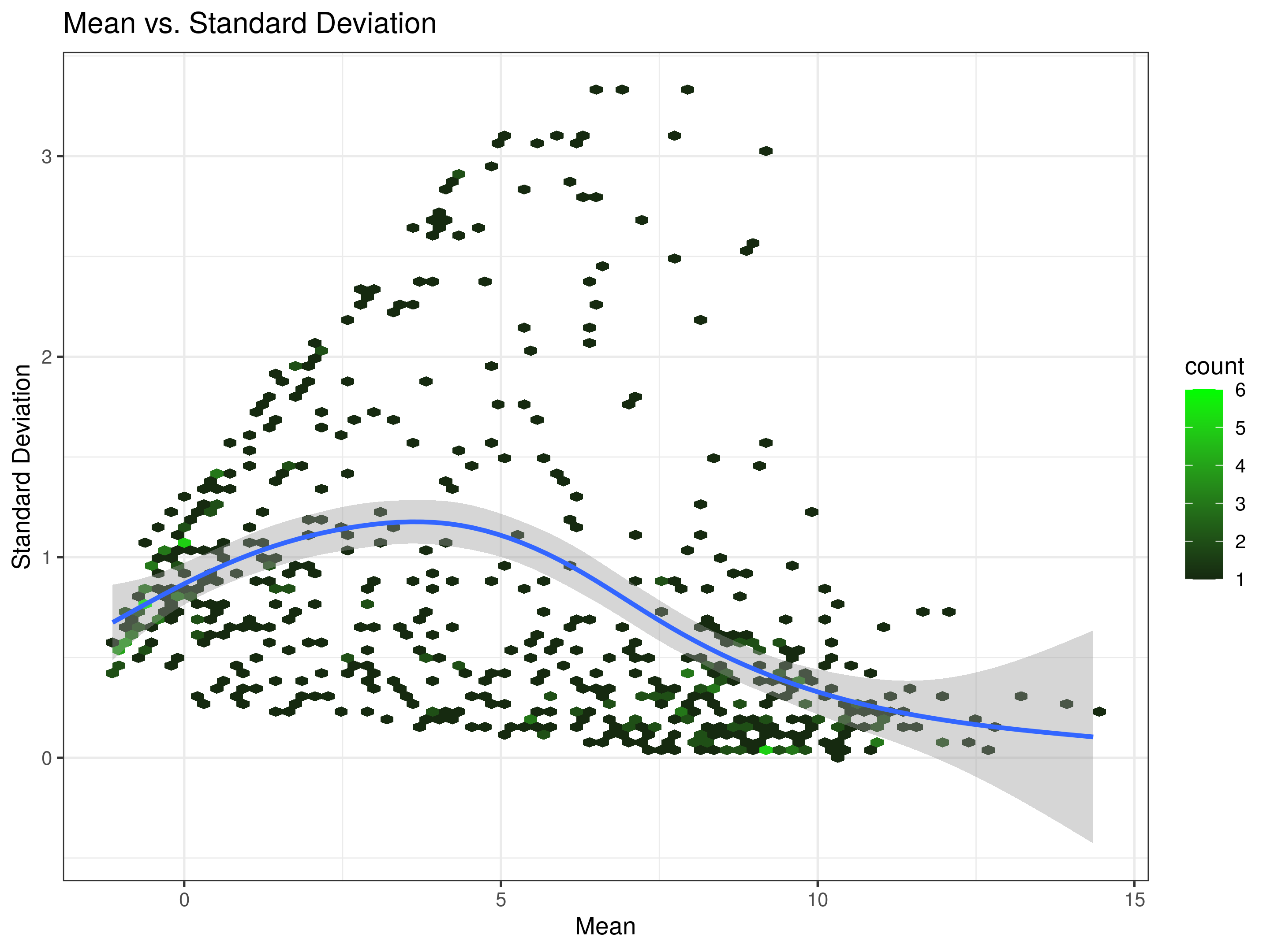
Read more on this here.
QC plot with the number of genes by type
Are the expected gene types present?
This is basically an annotation summary of your filtered gene set by type (protein-coding, lncRNA, pseudogene, etc.), based on iDEP's Ensembl-derived annotation. We want to make sure the composition matches our expectations. We should see more coding genes than non-coding genes, and a reasonable number of lncRNAs and pseudogenes. If the composition is unexpected, it may indicate a problem with the input data or filtering.
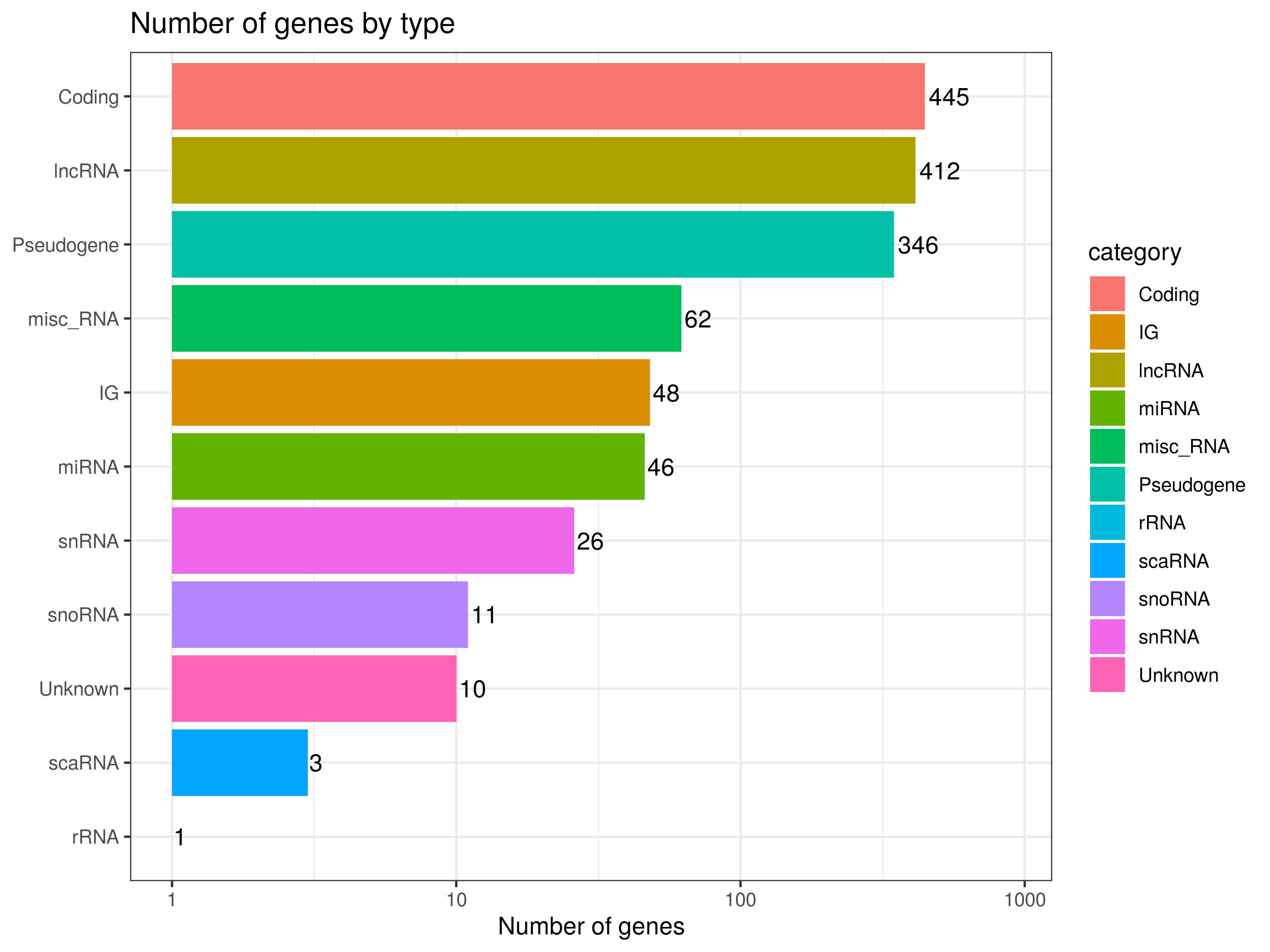
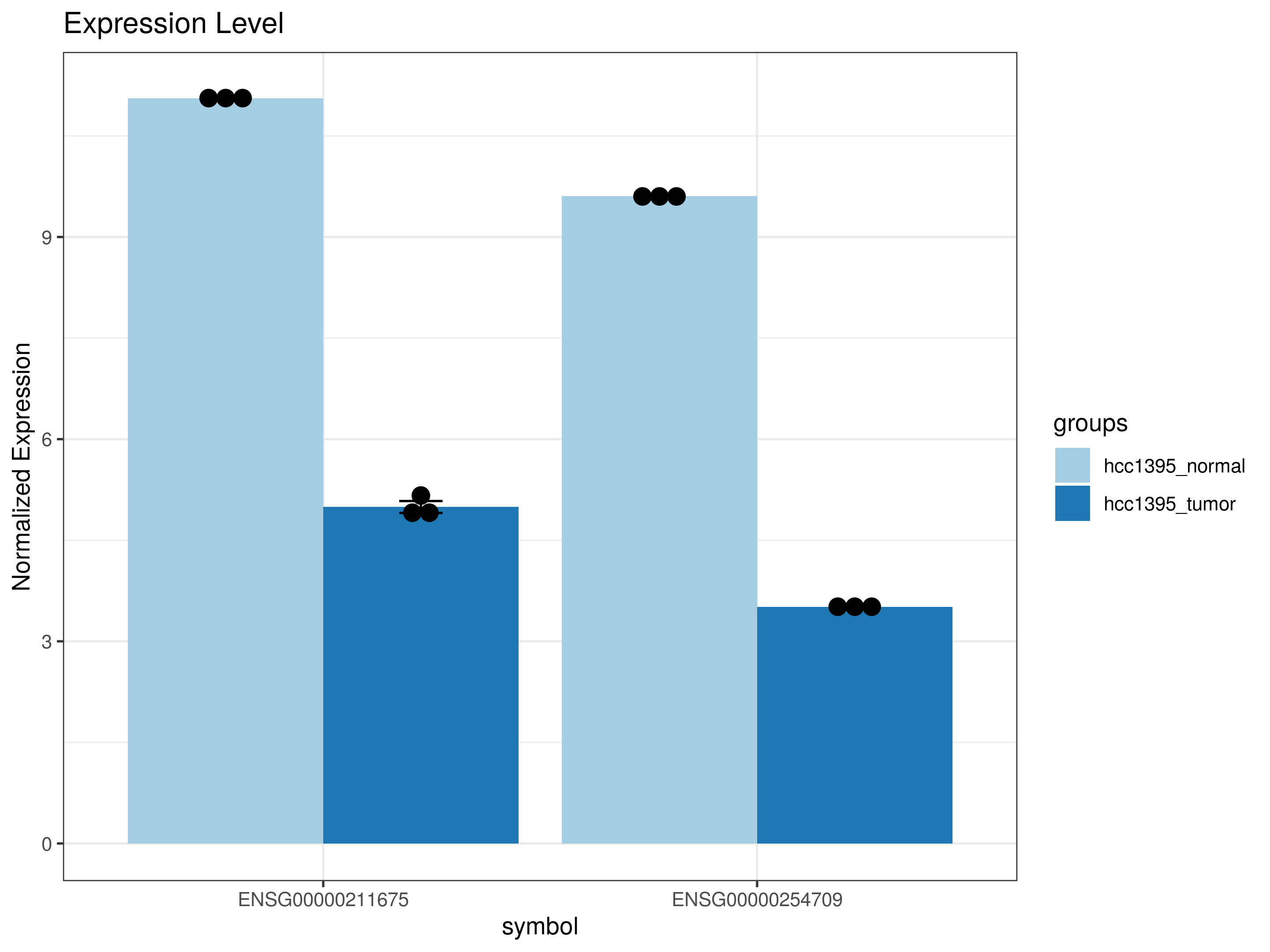
Gene plot comparing gene expression by condition or sample: Are the expected genes expressed?
Shows normalized expression for specific genes you select, split by group or sample with replicate points overlaid. Useful for checking known marker genes against expectations, or for visually confirming genes that came up as significant in your DEG results.
Clustering and Heatmap
Hierarchical clustering of samples and genes.
Do samples cluster as expected? Are genes grouped into coherent patterns?
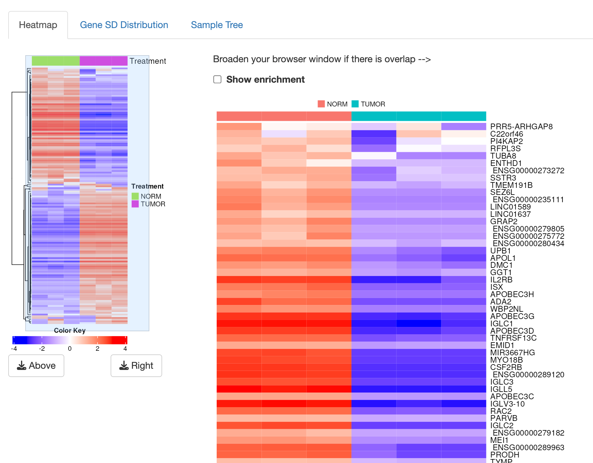
The Clustering tab gives you a visual overview of your dataset through hierarchical clustering of both samples and genes, allowing further exploratory data analysis. Rather than jumping straight into formal statistics, this tab lets you eyeball the overall structure in your data first. While this step will not tell you which genes are significant, it can catch problems that would otherwise go unnoticed for a long time: sample mix ups, labeling errors, or contamination. The heatmap will let you see whether your samples group together as expected, and whether the genes you selected for clustering show coherent patterns.
By default, iDEP identifies the genes with the greatest variability across your samples (typically the top 2,000, ranked by standard deviation on the transformed data) and clusters using those. Genes that barely change across any sample carry little information for distinguishing groups, so they are excluded from this view. Expression values are also centered per gene, meaning the colors you see represent whether a sample is above or below that gene's own average, not its absolute expression level. Clustering itself relies on correlation between samples or genes, so two samples with similar expression patterns end up placed near each other in the dendrogram regardless of overall magnitude. Importantly, your experimental group labels play no role in how the clustering is calculated. They only appear afterward as a color strip for reference. Read more in the docs.
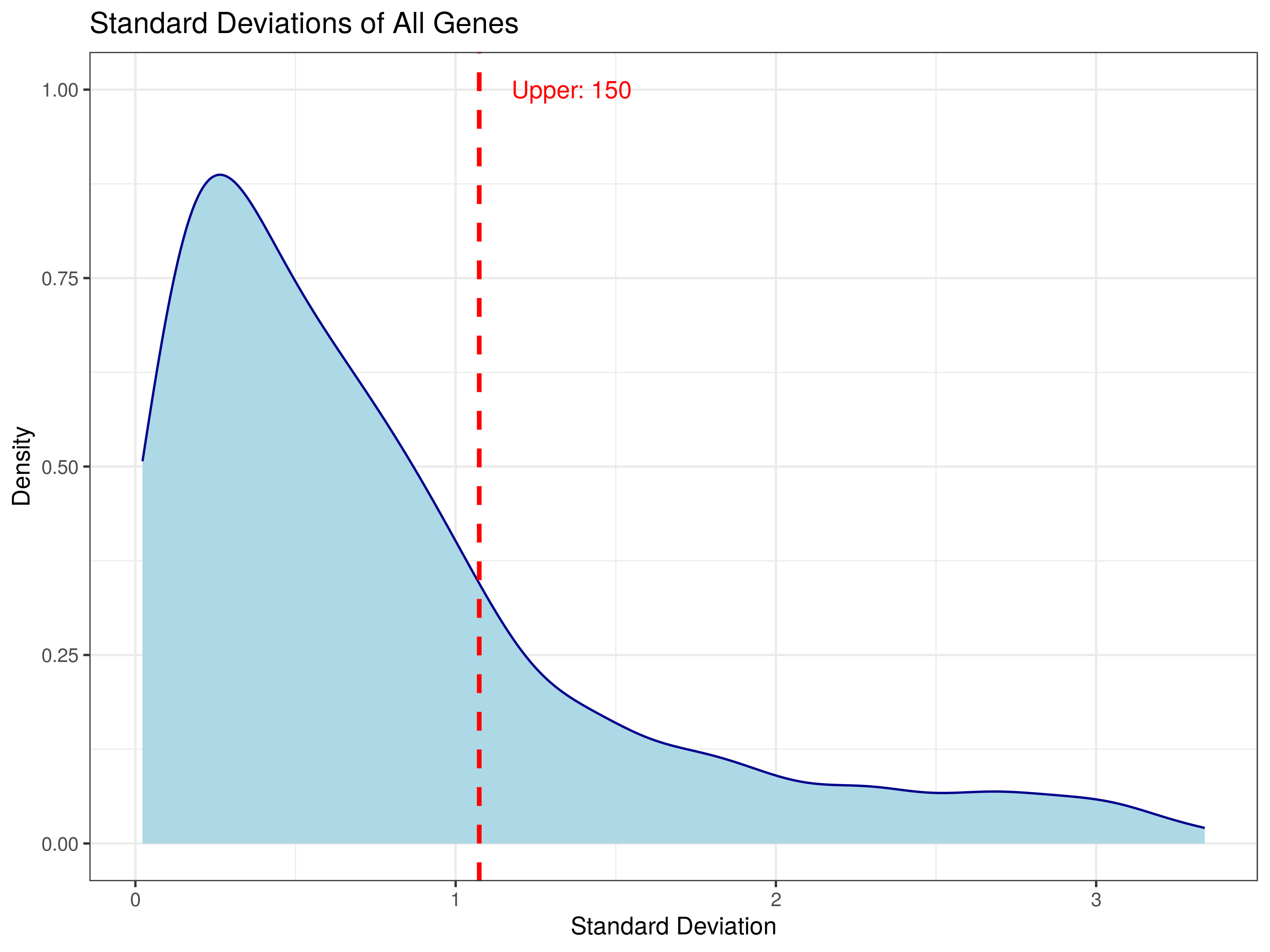
The Gene SD Distribution can be used to select the number of genes to include in the heatmap. The default is 2,000, but you can adjust this number to include more or fewer genes. The heatmap will update automatically when you change this setting. You want to shoot for the right skewed tail, which includes the genes with the most variation across samples.
Otherwise, the heatmap uses sensible defaults including Pearson for the distance metric and complete linkage for the clustering method. You can change these settings if you want to explore different clustering methods, but only if you have an understanding of what those methods do and how they affect the results.
K-means clustering of genes
The K-means clustering method is an alternative to hierarchical clustering. It partitions the genes into a pre-specified number of clusters (k) based on their expression patterns across samples. The user can choose the number of clusters, and iDEP will assign each gene to one of these clusters. This method is useful for identifying groups of genes that share similar expression profiles, which may indicate co-regulation or shared biological functions, and iDEP will perform enrichment analysis on each cluster to identify over-represented pathways or gene sets. Read more in the docs.
This analysis is beyond the scope of this lesson, but you can explore it on your own if you are interested. You can learn more about why this method is useful and how to interpret the results in the iDEP documentation and in this chapter.
Clustering Methods
If you would like a deeper understanding of clustering methods, check out this ABCS Training on clustering: https://bioinfo-abcc.ncifcrf.gov/training/event/introduction-to-clustering-building-549-executive-board-room-nci-frederick-1103251200.
PCA
PCA allows us to explore the overall structure of our dataset and see whether samples cluster as expected. PCA reduces the dimensionality of the data by finding the directions (principal components) that capture the most variance in the dataset. The first principal component (PC1) captures the most variance, followed by PC2, and so on. By plotting the samples in this reduced space, we can visualize how they relate to each other based on their expression profiles.
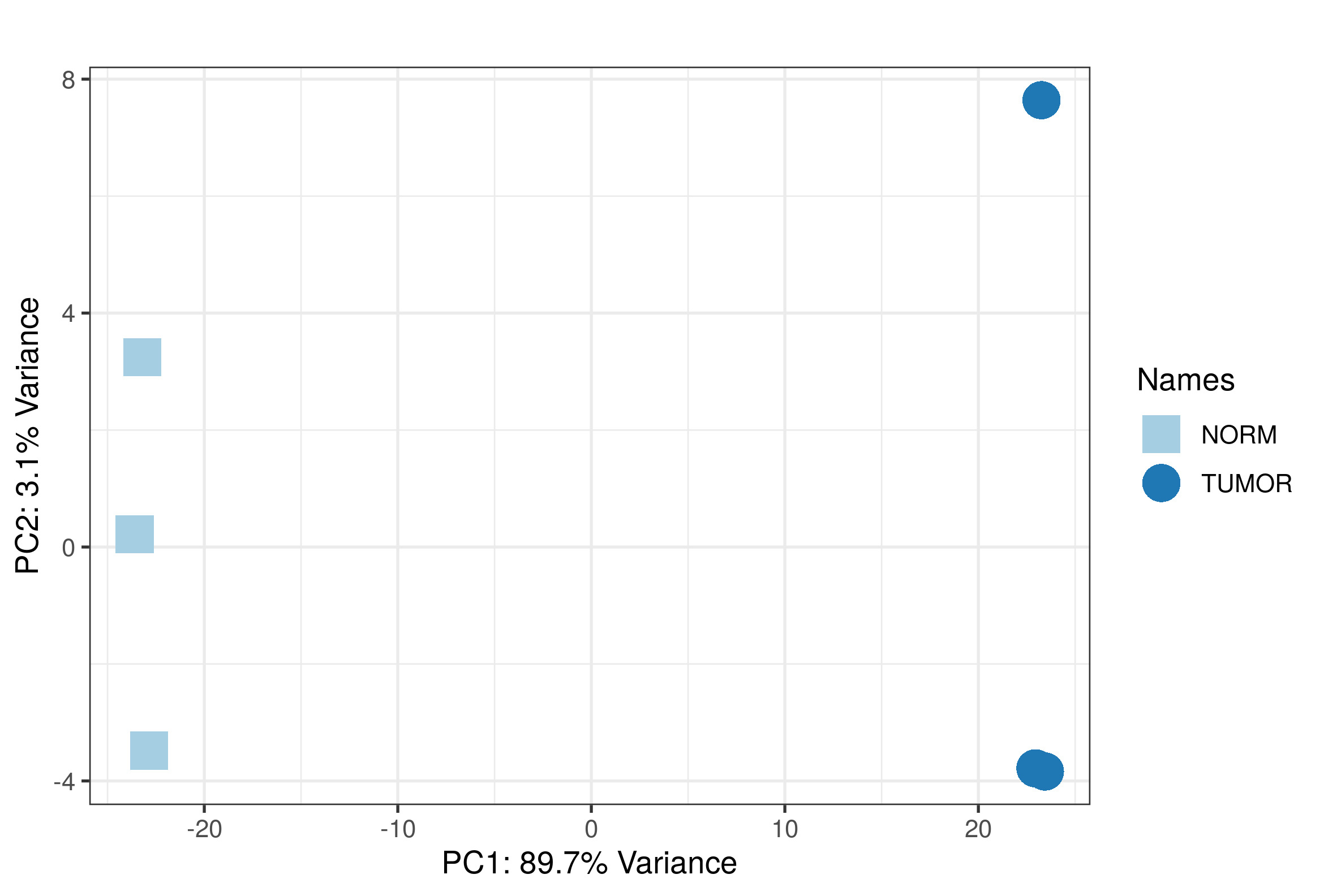
PCAtools provides us with some additional information including the PCA loadings and a scree plot. The PCA loadings tell us which genes contribute the most to each principal component, while the scree plot shows us how much variance is explained by each principal component.
MDS is a non-linear method available alongside PCA. It can serve as a useful cross-check against PCA, since a fairly different mathematical approach that still shows similar sample groupings adds confidence that the pattern is real. iDEP also offers t-SNE as another non-linear projection option, though it is not covered in the PCA documentation section itself. You can learn more about various dimensionality reduction methods in this ABCS training.
What to look for in PCA and clustering?
- If Norm lanes cluster together and Tumor lanes cluster together, the global expression pattern supports the planned comparison.
- If a replicate is far from its group, pause before interpreting DEG results. Discuss sample swap, batch effect, low quality, or biological heterogeneity.
Batch Correction in RNA-Seq
Batch Correction in RNA-Seq
Batch effects are technical differences that can look like biology. Common batch variables include library preparation date, sequencing run, lane, technician, site, extraction batch, or patient/donor pairing.
We can address batch effects in two ways:
- Adjusting the statistical model: include a known batch variable in the DEG model, such as
~ Batch + Treatment. This is generally preferred for differential expression because the raw counts still go into DESeq2, edgeR, or limma-voom, and the model estimates the treatment effect while accounting for batch. - Creating a corrected expression matrix: remove or regress out batch signal from transformed/log expression values for visualization, clustering, PCA, or downstream exploratory work. These corrected matrices should be used cautiously and are usually not the input for count-based DEG testing.
In iDEP: known batch variables can be added to the design file and included as block factors in the Stats tab (e.g., ~ Batch + Treatment). For methods like ComBat, ComBat_seq, removeBatchEffect, or RUVSeq, export the iDEP results/R code and continue in R.
Resources:
- iDEP Stats documentation on block factors and batch variables: https://bioinformatics.sdstate.edu/idep/
- DESeq2 vignette, design formulas and transformations: https://www.bioconductor.org/packages/release/bioc/vignettes/DESeq2/inst/doc/DESeq2.html
- limma
removeBatchEffect()documentation: https://rdrr.io/bioc/limma/man/removeBatchEffect.html - sva Bioconductor package, including surrogate variables and ComBat: https://www.bioconductor.org/packages/release/bioc/html/sva.html
- RUVSeq vignette: https://bioconductor.org/packages/release/bioc/vignettes/RUVSeq/inst/doc/RUVSeq.html
Run Differential Expression in DGE1
The DGE1 tab is where we define the comparison and run the differential expression analysis. iDEP supports three methods: DESeq2, limma-voom, and limma-trend (Read more here).
For this demo, we will use DESeq2, since we are working with a small sample size and a simple two group comparison. It is also the recommended option by the iDEP developers, and includes more options for additional variables within iDEP. While DESeq2 is slower than limma-voom and has been shown to be more conservative in some cases, it is generally considered a robust choice for small-sample RNA-seq experiments.
iDEP recommendations for method selection
- DESeq2 (default): robust for most RNA-seq experiments and recommended whenever you have access to raw counts. Modelling counts directly gives the method full information about sequencing depth and dispersion.
- limma-voom: useful for larger studies or when mean–variance trends need extra modeling.
- limma-trend: recommended for already normalized expression data such as microarrays. Avoid it when library sizes differ by more than ~3×. - iDEP internal docs
Pay close attention to the output script
There may be things that you assume are happening in the background that are not. For example, iDEP's default DESeq2 script does not apply a separate shrinkage step to the fold change estimates themselves (via lfcShrink), so the log2 fold changes reported here are the direct maximum likelihood estimates, not shrunken values. The shrunken values are particularly useful for smaller sample sizes.
Also, as I have already mentioned, iDEP offers less flexibility for all methods than you would have in R. Only two factors are allowed for limma-voom, whereas more complex designs can be handled in R. If you are working with a more complex design, you will need to export the data and run the analysis in R. It is possible that newer versions of iDEP have added more flexibility, so check the documentation for the version you are using.
Experimental Design
Your view in the experimental design section will depend on your design file. Again, for this demo, we are using a simple two-group comparison with no batch effects, so we will only have one factor, Treatment, and one contrast, Tumor vs Norm.
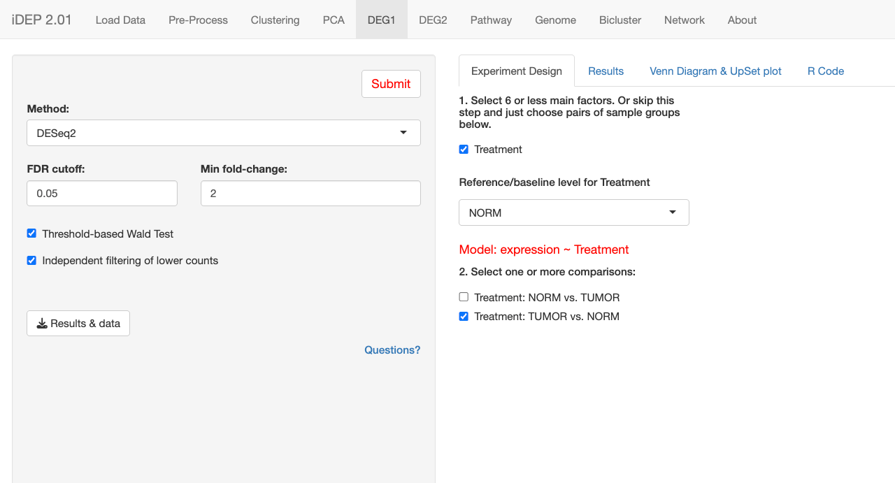
Recommended Settings for a simple two-group comparison in iDEP
| Setting | Suggested value |
|---|---|
| Factor | Treatment |
| Comparison | Tumor-Norm or equivalent B-A contrast |
| Method | DESeq2 |
| FDR cutoff | 0.05 |
| Fold-change cutoff | 2, equivalent to abs(log2FC) >= 1 |
Comparisons
Choosing between norm vs tumor or tumor vs norm comes down to how you want to think and communicate about direction, up in tumor versus up in normal tissue, whichever framing matches the biological question you're asking. If you are looking for genes activated by tumor progression, TUMOR vs. NORM (positive values = upregulated in tumor) is probably the more intuitive framing to present in a paper or figure, even though NORM vs. TUMOR is technically valid and just mirrored.
Other Options
The following options are optional and result in a smaller and more trustworthy set of DEGs:
Threshold-based Wald test changes DESeq2's significance test so it asks whether a gene's fold change exceeds a chosen cutoff, rather than just whether it differs from zero, building your effect size requirement directly into the p-value. Independent filtering of lower counts removes genes with unreliably low expression before multiple testing correction is applied, which avoids wasting statistical power.
You can find more about the differential expression test settings in iDEP here: https://idepsite.wordpress.com/degs/. To better understand the model set up and experimental design, especially for more complex designs, see this helpful doc from iDEP: https://rpubs.com/ge600/deseq2.
DEG Results Walkthrough
The DEG results are provied in the DEG1 tab along with the R Code that was used. You should download all reports at each step in the iDEP workflow to ensure reproducibility. You will also find Venn diagrams and UpSet plots for visualizing the overlap of DEGs across multiple comparisons. This is not as useful for our simple two-group comparison, but it is a nice feature for more complex designs.
The DEG2 tab shows the results for all comparisons across different plots: heatmaps, volcano plots, and scatter plots. It also provides enrichment results, which we will discuss more in Lesson 11. Unfortunately, the DEG2 tab does not provide the R code used to generate the plots, so the plots have to be recreated in R if you want to reproduce / customize them. You can find the R code used to generate these plots on Github: https://github.com/gexijin/idepGolem.
Data Export: DEG Visualizations
iDEP DOES provide the data and R code needed to recreate the DEG visualizations in newer versions of iDEP.
DEG Table
The output DEG table includes the following columns as well as the processed data. Note: the raw counts were used as input for the DESeq2 model, but the processed data includes the rlog transformed values for visualization and clustering.
| Column | Meaning |
|---|---|
| symbol | Feature being tested |
| ensembl_ID | Ensembl gene ID for the feature being tested |
| User_ID | User-provided gene ID |
| log2 fold change for selected contrast | Estimated direction and magnitude |
| adjPval | Multiple-testing adjusted significance |
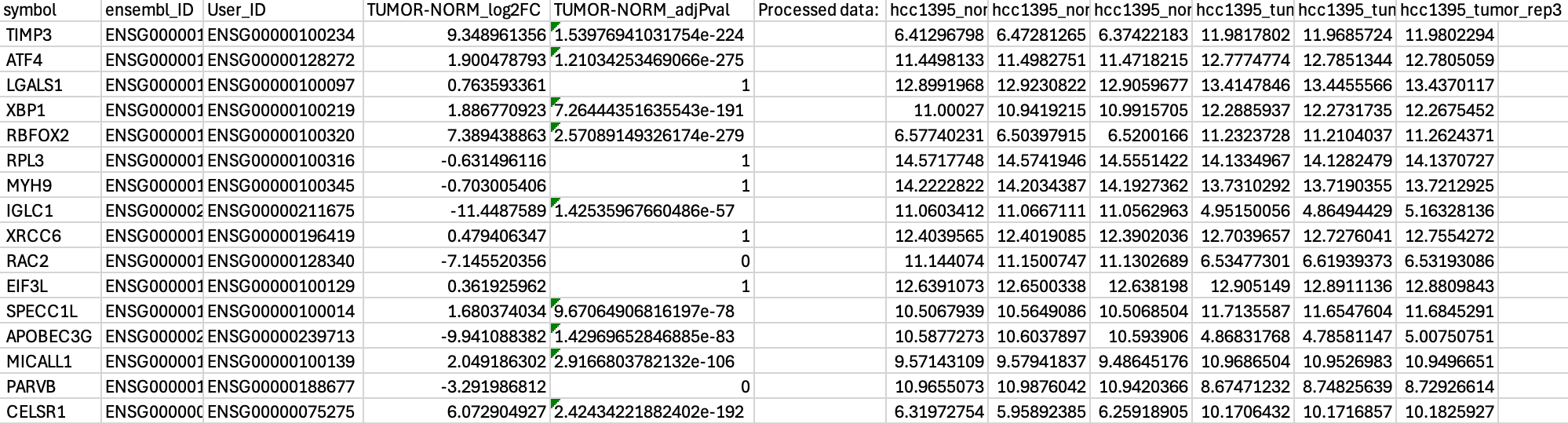
You can also download a list of up and down regulated genes based on your FDR and fold-change cutoffs and your contrasts. This is useful for downstream analysis, such as pathway enrichment or gene set enrichment analysis.
Interpreting the DEG Tab Plots
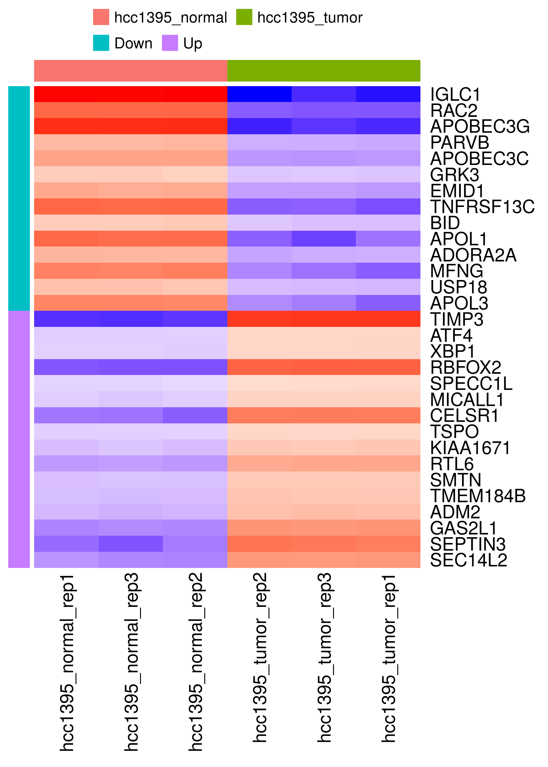
Heatmap
What it's for: Unlike a QC heatmap (which checks overall sample/replicate clustering), this heatmap visualizes your curated list of top DEGs, letting you confirm each hit looks consistent across replicates and spot genes with similar expression patterns. It's a visual companion to your results table, not a data quality check. You choose how many genes to show and whether to sort by fold change or FDR.
What you see here: Normal and tumor samples cluster cleanly into two groups, with genes split into "Down" and "Up" blocks. There is a distinct lack of documentation regarding this plot and how it was constructed. It seems likely that the values are mean-centered, but there is no dendrogram, so the clustering method is unclear.
You can subset the plot and hover over points to see the gene ID, value, and whether it is up or down regulated. You can also download the heatmap as a PDF, PNG, or SVG.
Volcano plot
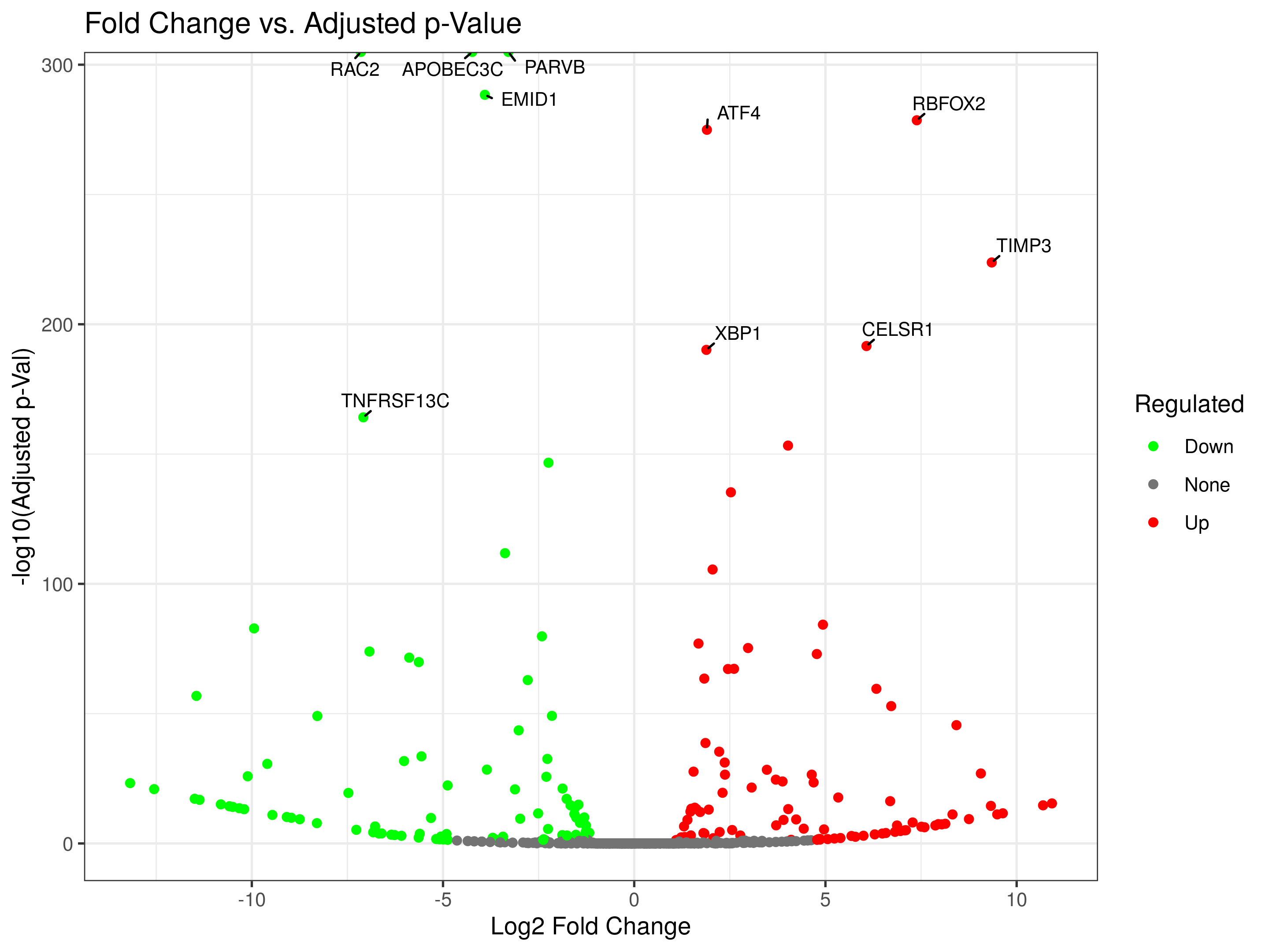
What it's for: Highlights genes with large fold change and strong statistical support (log2FC vs. -log10 adjusted p-value). The y-axis uses -log10(p) so smaller p-values plot higher (more intuitive) and tiny p-values get spread out instead of crushed near zero. Labeling controls let you tag specific genes.
What you see here: Red = Up, green = Down, gray = None, for the current contrast. Direction follows the "B-A" baseline convention, so Tumor-Norm means that the Up-regulated points are associated with Tumor samples. We are looking for genes with large fold change and strong significance (top corners of the plot). You can also download the volcano plot as a PDF, PNG, or SVG.
MA plot
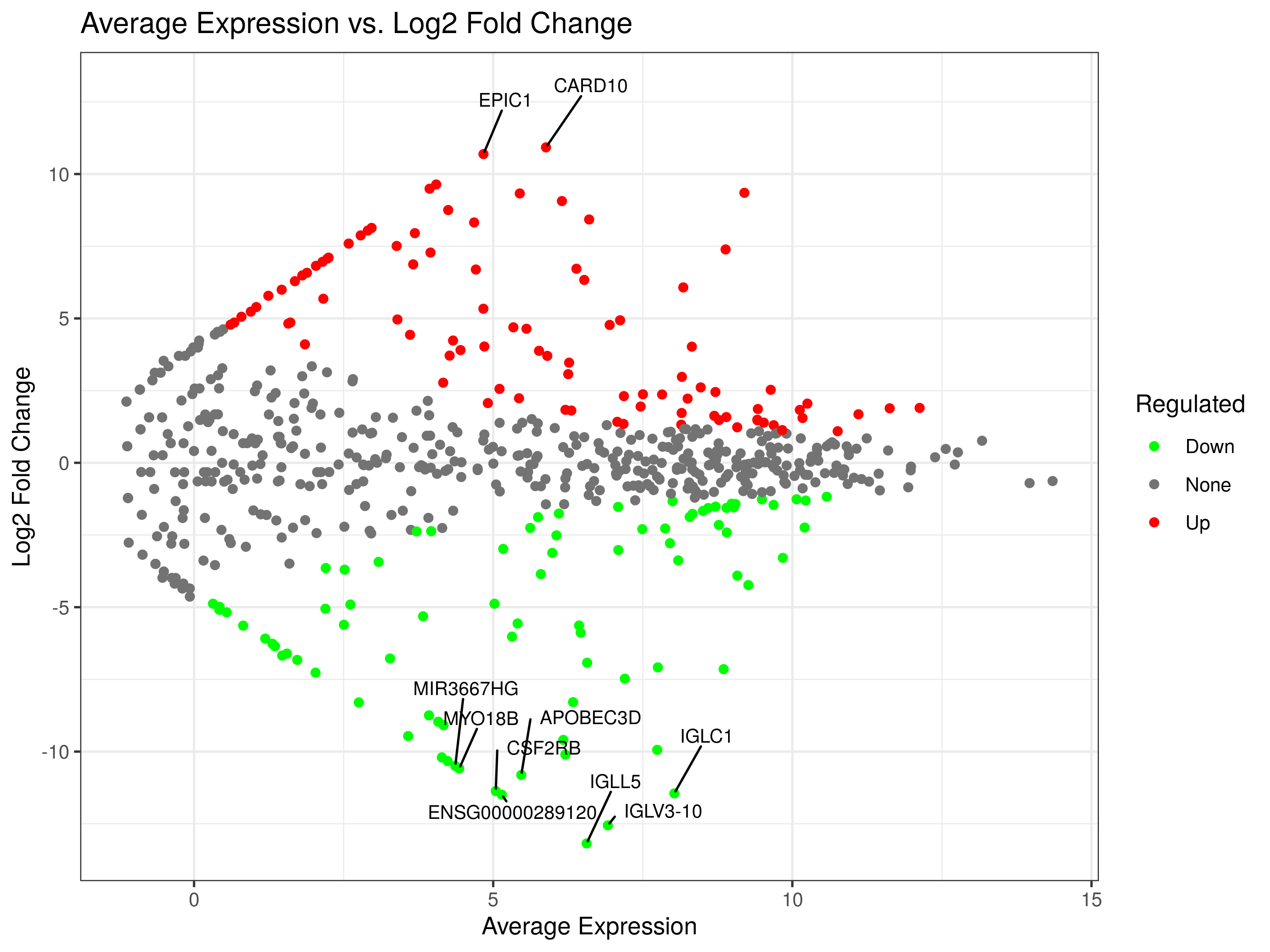
An MA plot shows fold change vs. average expression across conditions, which can be useful for catching intensity dependent artifacts (unreliable fold changes at low expression).
What you see here: Gray points form a funnel, wider at low expression, narrower at high expression, as expected. Significant genes (red/green) mostly sit at low to moderate expression, which is typical and not a red flag on its own.
When to use it: Great for quality control, after normalization, most points should center around M = 0 (the M axis is the y-axis), since most genes aren't differentially expressed. It also reveals systematic bias. If genes seem to be almost entirely upregulated in one condition with no biological reason to expect that, suspect a technical issue rather than biology.
Resources: Check out this detailed explanation from Biostatsquid: https://biostatsquid.com/how-to-interpret-ma-plots/.
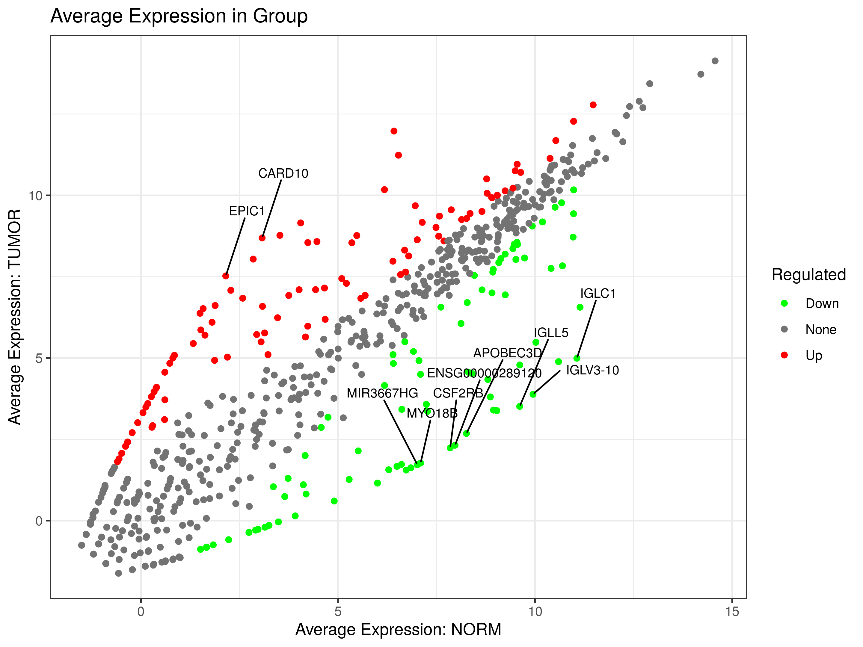
Scatter plot
What it's for: Compares average expression between the two conditions in your contrast (NORM vs. TUMOR), so you can see directly which condition a gene is higher in, something the MA plot can't tell you on its own, since its x-axis combines both conditions.
What you see here: Points above the diagonal are up-regulated in TUMOR, points below are up-regulated in NORM. Genes sitting near one axis (e.g., NORM near 0, TUMOR high) suggest a gene that's essentially off in one condition and on in the other, distinct pattern worth flagging separately from genes that are simply higher in one group. It's also a useful sanity check for your top MA/volcano plot hits, confirming the underlying values make sense rather than being driven by a dropout in one condition.
Note on the docs: newer iDEP documentation describes this scatter plot as comparing fold changes between two contrasts (e.g., Drug-Control vs. Drug2-Control) to reveal shared responses across treatments, useful when you have multiple contrasts and want to see which genes respond similarly (or oppositely) to two different conditions. That view isn't what's shown here since this dataset only has one contrast, but is something to be aware of.
Genome Tab
"The Genome tab shows where your fold-changes of genes along each chromosome. It also scans for genomic regions where many neighboring genes change together, highlighting potential co-regulation or shared copy-number events. The controls on the left let you choose the comparison, gene filters, and window settings used in these plots." - iDEP documentation: https://bioinformatics.sdstate.edu/idep/
Reproducibility Checklist
Lastly, before ending any analysis session, make sure to download all the relevant files and reports for reproducibility or keep a record of any important parameters or details not provided. This includes:
- uploaded input file names;
- species and ID type;
- filtering settings;
- transformation settings;
- design factor and contrast;
- DEG method;
- FDR and fold-change thresholds;
- DEG table;
- key plots;
- iDEP report and R code from the Stats tab when available.
Resources Used
- iDEP main documentation site: https://idepsite.wordpress.com/
- iDEP current web application and embedded documentation, verified June 8, 2026: https://bioinformatics.sdstate.edu/idep/
- Ge SX, Son EW, Yao R. 2018. iDEP: an integrated web application for differential expression and pathway analysis of RNA-Seq data. BMC Bioinformatics. https://doi.org/10.1186/s12859-018-2486-6
- DESeq2 Bioconductor package and vignette: https://bioconductor.org/packages/DESeq2/
- Love MI, Huber W, Anders S. 2014. Moderated estimation of fold change and dispersion for RNA-seq data with DESeq2. Genome Biology. https://doi.org/10.1186/s13059-014-0550-8
- limma Bioconductor package and user guide (covers both limma-trend and limma-voom): https://bioconductor.org/packages/limma/
- Law CW, Chen Y, Shi W, Smyth GK. 2014. voom: precision weights unlock linear model analysis tools for RNA-seq read counts. Genome Biology. https://doi.org/10.1186/gb-2014-15-2-r29
- RNA-seq analysis is easy as 1-2-3 with limma, Glimma and edgeR (limma-voom workflow vignette). Bioconductor. https://www.bioconductor.org/packages/devel/workflows/vignettes/RNAseq123/inst/doc/limmaWorkflow.html