Visualizing clusters with heatmaps
Objectives
-
Introduce the heatmap and dendrogram as tools for visualizing clusters in data.
-
Learn to construct cluster heatmap using the package
pheatmap. -
Learn how to save a non-ggplot2 plot.
-
Introduce ggplotify to convert non-ggplots to ggplots.
-
Introduce
heatmaplyfor constructing interactive heatmaps.
What is a heatmap?
A heatmap is a graphical representation of data where the individual values contained in a matrix are represented as colors. --- R Graph Gallery
Heatmaps are appropriate when we have lots of data because color is easier to interpret and distinguish than raw values. --- Dundas BI
Heatmap can be used to visualize the following
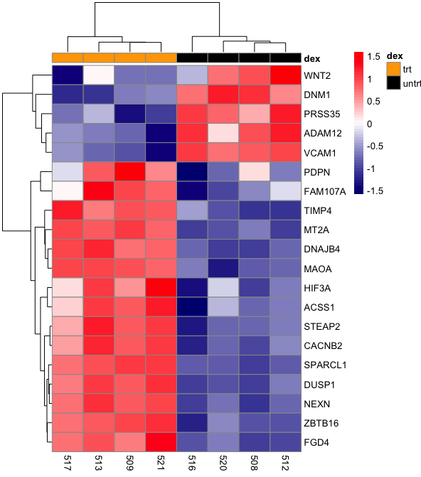
- gene expression across samples (Figure 1)
- correlation (Figure 2)
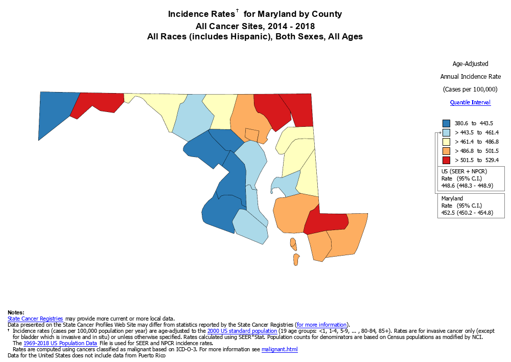
- disease cases (Figure 3)
- hot/cold zones
- topography
What is a dendrogram?
A dendrogram (or tree diagram) is a network structure and can be used to visualize hierarchy or clustering in data. --- R Graph Gallery
Applications of dendrograms
Dendrograms are used in phylogenetics to help visualize relatedness of or dissimilarities between species.
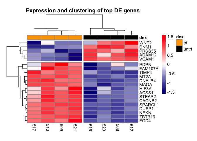
In RNA sequencing, dendrogram can be combined with heatmap to show clustering of samples by gene expression or clustering of genes that are similarly expressed (Figure 1).
Figure 1: Heatmap and dendrogram showing clustering of samples with similar gene expression and clustering of genes with similar expression patterns.
Further heatmap and dendrogram can be used as a diagnostic tool in high throughput sequencing experiments. As an example, we can look at the heatmap and dendrogram in Figure 2. In Figure 2, the heatmap shows correlation of RNA sequencing samples with the idea that biological replicates should be more highly correlated compared to samples between treatment groups. The dendrogram clusters similar samples together. Figure 2 tells us that heatmaps can also be used to visualize correlation.
Figure 2: Heatmap and dendrogram showing sample correlation in an RNA sequecing experiment. This heatmap and dendrogram is generated using DeepTools.
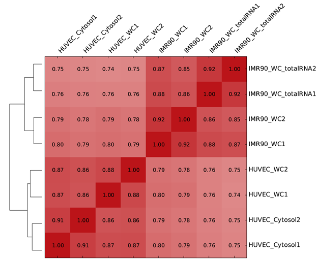
Figure 3: Maryland cancer cases - source: https://statecancerprofiles.cancer.gov
Methods available to produce a heatmap in R
ggplot2
- We would use geom_tile to construct the heatmap
- A disadvantage to this approach is that we have to generate the dendrogram separately, then merge and align the dendrogram with the heatmap.
heatmap built into R
- It appears that this by default does not generate a legend showing the correlation between values and color.
- It also appears that assigning distance calculation and clustering methods are not intuitive for the users.
heatmap.2 from the gplots package
- It appears assigning distance calculation and clustering methods are not intuitive for the users.
- Click here to learn about heatmap.2
ComplexHeatmap
- There is no scaling option so the user will have to scale the data separately using
scale. (see https://support.bioconductor.org/p/68340/ and https://github.com/jokergoo/ComplexHeatmap/issues/313 for a discussion on scaling in ComplexHeatmap). - Click here to learn about ComplextHeatmap.
pheatmap
- This is a versatile package that draws clustered heatmaps.
- This package has built-in scaling function, provides ways to incorporate legends, and many features that allows for customization and construction of a publication quality figure.
- Click here to learn about pheatmap
heatmaply
- This package generates interactive heatmaps that allows the user to mouse over a tile to see information such as sample id, gene, and expression value.
- Click here to learn about heatmaply
While most of the tools listed above can be used to produce publication quality heatmaps, we find that pheatmap is perhaps the most comprehensive. Therefore, in this class, we will show how to construct heatmaps using pheatmap. Because heatmaps can be filled with a lot of data, we will also demonstrate the use of heatmaply to construct interactive heatmaps that you could use to explore your data more efficiently.
Load the libraries
library(pheatmap) ## for heatmap generation
library(tidyverse) ## for data wrangling
library(ggplotify) ## to convert pheatmap to ggplot2
library(heatmaply) ## for constructing interactive heatmap
Import data
The data that we will be working with comes from the airway study that profiled the transcriptome of several airway smooth muscle cell lines under either control or dexamethasone treatment Himes et al 2014. The dataset is available from Bioconductor (https://bioconductor.org/packages/release/data/experiment/html/airway.html).
Specifically, our dataset represents the normalized (log2 counts per million or log2 CPM) of count values from the top 20 differential expressed genes. This data is saved as the comma separated file RNAseq_mat_top20.csv and thus we will be using the read.csv command to import.
As a refresher, inside the read.csv command we have the following arguments
- "./data/RNAseq_mat_top20.csv" is the file path
header=TRUEindicates that we have column headings- we set the first column of our dataset, which contains gene names as the row names in the imported data using
row.names=1, where 1 indicates the column number that we want to import as row names - we set
check.names=FALSEso that R leaves the column headings alone
The data is assigned to R object mat.
mat<-read.csv("./data/RNAseq_mat_top20.csv",header=TRUE,row.names=1,
              check.names=FALSE)
We will now use head to look at the first 6 rows of mat. The column headings represent sample names and the row names are the genes.
head(mat)
##              508      509       512      513        516        517        520
## WNT2    4.694554 1.332858  5.983720 2.898648  2.1105784 -0.1655252  4.2828513
## DNM1    6.180735 4.441965  5.660024 3.981513  5.8002923  3.9603755  6.2853003
## ZBTB16 -1.863523 5.257967 -1.777152 4.902223 -2.9319722  4.2830866 -0.5150407
## DUSP1   4.936551 8.019074  5.607568 8.302196  5.0283417  7.7229898  5.1432459
## HIF3A   1.013991 3.374457  1.575250 4.154740  0.4928878  2.8335879  2.2501244
## MT2A    6.248514 8.276988  5.782855 8.070846  5.7583897  8.2015855  5.9163628
##             521
## WNT2   1.237000
## DNM1   4.488955
## ZBTB16 5.779173
## DUSP1  8.396709
## HIF3A  4.790581
## MT2A   7.933492
Heatmap of the top 20 genes from differential expression analysis
Below we generate a basic heatmap using the pheatmap package. We use the pheatmap command and include the data that we want to construct a heatmap of as the argument. In the heatmap below, we have the sample IDs plotted along the bottom horizontal axis, while the genes names are presented long the right vertical axis. Each tile in the heatmap corresponds to the expression of a gene for the corresponding sample and as mentioned earlier, the expression level is indicated by the color scale. Note that later on in this lesson, we can add an additional legend that color codes the treatment group that each sample belongs to. The dendrogram that spans the columns indicates how samples are clustered together, while that which spans the rows tells us how the genes are clustered together.
pheatmap(mat)
Distance, clustering, and scaling
When generating a heatmap and dendrogram to show clustering three parameters to consider are
- method for calculating distance between objects (ie. experimental samples)
- method for clustering
- scaling of data prior to inputting into heatmap generating algorithm
Distance calculation
The idea behind cluster analysis is to calculate some sort of distance between objects in order to identify the ones that are closer together. When two objects have a small distance, we can conclude they are closer and should cluster together. On the other hand, two objects that are further apart will have a larger distance. There are various approaches to calculating distance in cluster analysis so considerations should be taken for choosing the appropriate one. To learn more about distance calculation methods as well as advantages and disadvantages of each see Shirkhorshidi et al, PLOS ONE, 2015. In pheatmap, we can specify the clustering distance using either the clustering_distance_rows argument or clustering_distance_cols depending on whether we would like to cluster by row or column variables.
Cluster generation
After the distance matrix has been calculated, it is time to perform the actual clustering and again, various approaches can be used to generate clusters. The following resources are good for learning about the variouse hierarchical clustering methods. In pheatmap, the clustering method is specified by the clustering_method argument.
- https://hlab.stanford.edu/brian/forming_clusters.htm
- https://dataaspirant.com/hierarchical-clustering-algorithm/
- https://www.learndatasci.com/glossary/hierarchical-clustering/
Scaling
Prior to sending our data into the heatmap generating algorithm, it is a good idea to sacle. There are several reasons for doing this
- Variables in the data might not have the same units, thus without scaling we will be, to borrow a phrase, comparing apples to oranges
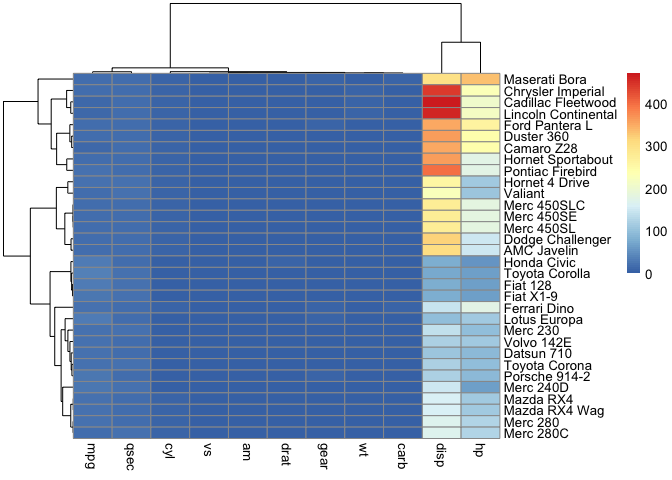
- Scaling allows us to discern patterns in variables with low values when plotting on the color scale. Without scaling, variables with large values will drown out the signal from those with low values. We will see an example of this using the mtcars data.
- Scaling also prevents variables with large values from contributing too much weight to distance https://medium.com/analytics-vidhya/why-is-scaling-required-in-knn-and-k-means-8129e4d88ed7. Without scaling, it will hard to discern whether variables with lower values contribute to separation.
A common method for scaling is to use the z score (see z score formula), which tells us how many standard deviations away from the mean is a given value in our data. This is the scaling method for pheatmap.
z score=(individual value - mean) \ (standard deviation)
Below, we will use the mtcars data to look at how scaling influences a heatmap. Because mtcars is built into R, we can use the data command to load it and we will save this as an object named cars. Next, we will use the head command to view the first few rows of the cars data.
data(mtcars)
cars <- mtcars
head(cars)
##                    mpg cyl disp  hp drat    wt  qsec vs am gear carb
## Mazda RX4         21.0   6  160 110 3.90 2.620 16.46  0  1    4    4
## Mazda RX4 Wag     21.0   6  160 110 3.90 2.875 17.02  0  1    4    4
## Datsun 710        22.8   4  108  93 3.85 2.320 18.61  1  1    4    1
## Hornet 4 Drive    21.4   6  258 110 3.08 3.215 19.44  1  0    3    1
## Hornet Sportabout 18.7   8  360 175 3.15 3.440 17.02  0  0    3    2
## Valiant           18.1   6  225 105 2.76 3.460 20.22  1  0    3    1
Note that variables like disp and hp has larger magnitudes as compared to one like mpg. Also, the variables in this data does not have the same units. If we constructed a heatmap of the mtcars data without scaling, we will not be able to discern patterns in variables like mpg among the samples. This is because the values for mpg are small in comparison to those for disp and hp, they get squeeze towards the bottom of color scale.
pheatmap(cars)
However, if we scaled then it becomes easier to observe differences in values for each of the variables. We are interested in the differences in each variable across the car types, thus, we scale by column because the sample names (ie. car brands) are listed down the rows. If the car brands were listed across columns, we would have scaled by row.
pheatmap(cars, scale="column")

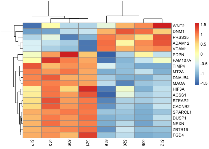
Getting back to RNA seq and something more biologically relevant, we can scale by row in mat.
pheatmap(mat, scale="row")
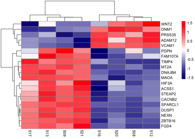
Working with color customization
pheatmap(mat,scale="row",
         color=colorRampPalette(c("navy", "white", "red"))(50))
Adding treatment group information to samples (annotation_col, annotation_colors)
The code below generates a data frame, dfh, that contains information on the treatment group in which a sample was assigned. To create a data frame in R, we use the data.frame command. In the data.frame command, we set the sample to the column names of the data mat using colnames(mat) to extract the mat column headings. We then want to convert the column headings in mat to character using as.character. Next, also in the data.frame command, we set the column dex to "Treatment".
Using %>%, we pass the dfh data frame to the column_to_rownames command to set the rownames of the dfh data frame to the sample IDs. Finally, we will change the values in the dex column to either untrt (untreated) or trt (treated) using ifelse to check if the row names of dfh (rownames(dfh)) are samples 508, 512, 516, or 520. If yes, then the value for these samples in the dex column becomes untrt. In other words, 508, 512, 516, and 520 are untreated samples. Else, we will assign the samples to the trt group, which indicates they are treated.
#create data frame for annotations
dfh<-data.frame(sample=as.character(colnames(mat)),dex="Treatment")%>%
                column_to_rownames("sample")
dfh$dex<-ifelse(rownames(dfh) %in% c("508","512","516","520"),
                "untrt","trt")
dfh
##       dex
## 508 untrt
## 509   trt
## 512 untrt
## 513   trt
## 516 untrt
## 517   trt
## 520 untrt
## 521   trt
Add the annotations column
We can add the sample treatment annotation by setting the annotation_col argument to dfh in pheatmap. We use annotation_col rather than annotation_row because the samples IDs are listed along the horizontal axis so essentially corresponding to the columns of the heatmap. The result is that the samples are now color coded by the treatment group in which they belong and this color coding is provided in the legend.
pheatmap(mat,scale="row", annotation_col = dfh,
         color=colorRampPalette(c("navy", "white", "red"))(50))

Modify the annotations colors
Using the annotation_colors argument, we can reassign the colors of the sample to treatment mapping legend.
pheatmap(mat,scale="row", annotation_col = dfh,
         annotation_colors=list(dex=c(trt="orange",untrt="black")),
         color=colorRampPalette(c("navy", "white", "red"))(50))

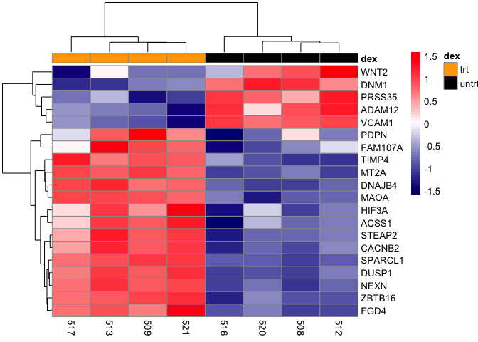
Splitting heatmap into multiple columns and rows
It maybe helpful to split the heatmap into different portions to illustrate clusters more efficiently. Here, we can split the heatmap into two columns using the argument cutree_col and setting this to 2. Doing so will split the heatmap into a column containing the dexamethasone (dex) treated samples (trt) and untreated samples (untrt).
pheatmap(mat,scale="row", annotation_col = dfh,
         annotation_colors=list(dex=c(trt="orange",untrt="black")),
         color=colorRampPalette(c("navy", "white", "red"))(50),
         cutree_cols=2)

If we include cutree_rows=2, then the heatmap will be split into two rows. Note that it is split in a way that the top row represents genes that are down-regulated in the treated group and up-regulated in the untreated group. The bottom row represents those genes that are up-regulated by dexamethasone treatment but down-regulated when not treated.
pheatmap(mat,scale="row", annotation_col = dfh,
         annotation_colors =list(dex=c(trt="orange",untrt="black")),
         color=colorRampPalette(c("navy", "white", "red"))(50),
         cutree_cols=2, cutree_rows=2)
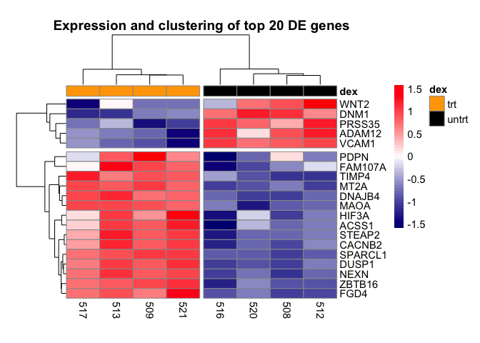
Add a title to heatmap
A title for our heatmap can be included using the main argument
pheatmap(mat,scale="row", annotation_col = dfh,
         annotation_colors =list(dex=c(trt="orange",untrt="black")),
         color=colorRampPalette(c("navy", "white", "red"))(50),
         cutree_cols=2, cutree_rows=2,
         main="Expression and clustering of top 20 DE genes")

The last few customization we will do with the heatmap is to adjust the fontsize using argument fontsize. We will adjust the cellwidth to move the treatment legend into the plot canvas. We also use cellheight to adjust the height of the heatmap to fill more of the plotting canvas.
pheatmap(mat,scale="row", annotation_col = dfh,
         annotation_colors=list(dex=c(trt="orange",untrt="black")),
         color=colorRampPalette(c("navy", "white", "red"))(50),
         cutree_cols=2, cutree_rows=2,
         main="Expression and clustering of top 20 DE genes",
         fontsize=11, cellwidth=35, cellheight=10.25)
Saving a non-ggplot
Recall that we can use the ggsave command to save a ggplot. However, heatmaps generated using the pheatmap package are not ggplots, therefore we need to turn to either the image export feature (Figure 7) in R studio or use one of the several image saving commands.
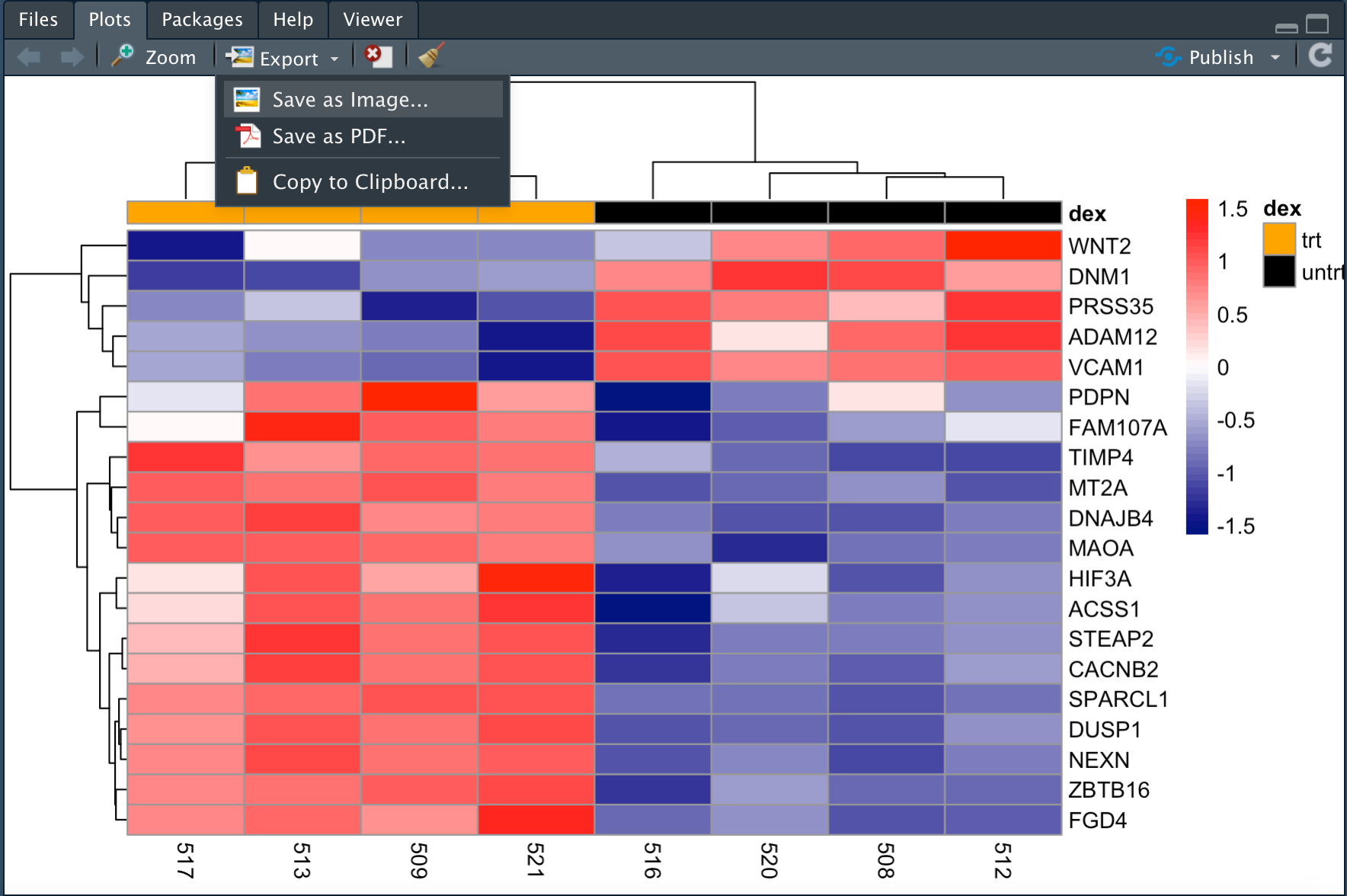
The programmatic ways to save an image include the following commands
- jpeg
- bmp
- tiff
- png
All of these take the file name in which we would like to save the image, resolution (res), image width (width), image height (height), and units of image dimension (unit) as arguments.
Below, we use png to save our heatmap as file pheatmap_1.png at 300 dpi as specified in res. The workflow is to first create the file using one of the image save commands, then generate the plot, and set dev.off() to turn off the current graphical device. If we do not set dev.off(), subsequent plots will overwrite the file that we just saved and will not show up in the plot pane.
dev.new()
png("./data/pheatmap_1.png", res=300, width=7, height=4.5, unit="in")
pheatmap(mat,scale="row", annotation_col = dfh,
         annotation_colors=list(dex=c(trt="orange",untrt="black")),
         color=colorRampPalette(c("navy", "white", "red"))(50),
         cutree_cols=2, cutree_rows=2,
         main="Expression and clustering of top DE genes",
         fontsize=11, cellwidth=35, cellheight=10.25)
dev.off()
## quartz_off_screen
##                 3
Make this plot compatible with ggplot2 using the package ggplotify.
hm_gg<-as.ggplot(pheatmap(mat,scale="row", annotation_col=
                dfh,annotation_colors =list(dex=c(trt="orange",
                untrt="black")),color=colorRampPalette(c("navy",
                "white", "red"))(50)))
Save as an R object
Below, we assign the heatmap to the R object hm_ph and we can import this back to R in the future.
hm_ph <- pheatmap(mat,scale="row", annotation_col =
                  dfh,annotation_colors =list(dex=c(trt="orange",
                  untrt="black")), color=colorRampPalette(c("navy",
                  "white", "red"))(50),cutree_cols=2, cutree_rows=2,
                  main="Expression and clustering of top DE genes",
                  fontsize=11, cellwidth=35, cellheight=10.25)
saveRDS(hm_ph, file="./data/airways_pheatmap.rds")
We will wrap up lesson 5 with an introduction to the package heatmaply, which can be used to generate interactive heatmaps. Below is a basic interactive heatmap generated using this package for the airway top 20 differentially expressed genes (mat).
Similar to pheatmap, we will start by providing heatmaply the data that we would like to plot.
We can also scale by row like we did in pheatmap. Plot margins can also be set to ensure the entire plot fits on the canvas. Like in pheatmap, we assign the plot title using the argument main. Setting col_side_colors to the data frame dfh, which contains the sample to treatment mapping, creates a legend that spans the columns of the heatmap, informing us of the treatment group to which the samples belong.
heatmaply(mat, scale="row", margins=c(0.5,1,50,1),
          main="Interactively explore airway DE genes",
          col_side_colors=dfh)