Introduction to ggplot2
Objectives
-
Learn how to import spreadsheet data.
-
Learn the ggplot2 syntax.
-
Build a ggplot2 general template.
By the end of the course, students should be able to create simple, pretty, and effective figures.
Going beyond Excel
Excel is a great program for visualizing and manipulating small data sets. However, it isn't great for working with "big data", and resulting plots are generally not publishable. Learning R and associated plotting packages is a great way to generate publishable figures in a reproducible fashion. Using R will not only keep you from accidentally editing your data, but it will also allow you to generate scripts that can be viewed later or reused to generate the same plot using different data. This will keep you from having to rely on your memory when wondering what data was used or how a plot was generated.
Let's read in and look at some excel data.
#If the package readxl is not installed,
#you will need to install the package and load the library
#install.packages("readxl")
#library(readxl)

#data import from excel
data<-readxl::read_xlsx(
  "./data/RNASeq_totalcounts_vs_totaltrans.xlsx",1)

#View data
data
## # A tibble: 8 × 4
##   `Sample Name` Treatment     `Number of Transcripts` `Total Counts`
##   <chr>         <chr>                           <dbl>          <dbl>
## 1 GSM1275863    Dexamethasone                   10768       18783120
## 2 GSM1275867    Dexamethasone                   10051       15144524
## 3 GSM1275871    Dexamethasone                   11658       30776089
## 4 GSM1275875    Dexamethasone                   10900       21135511
## 5 GSM1275862    None                            11177       20608402
## 6 GSM1275866    None                            11526       25311320
## 7 GSM1275870    None                            11425       24411867
## 8 GSM1275874    None                            11000       19094104
These data include total transcript read counts summed by sample and the total number of transcripts recovered by sample that had at least 100 reads. These data derive from a bulk RNAseq experiment described by Himes et al. (2014). In the experiment, the authors "characterized transcriptomic changes in four primary human ASM cell lines that were treated with dexamethasone," a common therapy for asthma. Each cell line included a treated and untreated negative control resulting in a total sample size of 8.
Notice those column names.
#Notice those column names
colnames(data)
## [1] "Sample Name"           "Treatment"             "Number of Transcripts"
## [4] "Total Counts"
Spaces cause problems for data wrangling in R, but we can change our load parameters to repair our column names.
#data import from excel
data<-readxl::read_xlsx("./data/RNASeq_totalcounts_vs_totaltrans.xlsx",
                        1,.name_repair = "universal")
## New names:
## • `Sample Name` -> `Sample.Name`
## • `Number of Transcripts` -> `Number.of.Transcripts`
## • `Total Counts` -> `Total.Counts`
Readxl’s default is .name_repair = "unique", which ensures each column has a unique name. If that is already true of the column names, readxl won’t touch them. The value .name_repair = "universal" goes further and makes column names syntactic, i.e. makes sure they don’t contain any forbidden characters or reserved words. This makes life easier if you use packages like ggplot2 and dplyr downstream, because the column names will “just work” everywhere and won’t require protection via backtick quotes --- readxl.tidyverse.org.
We could plot this data in excel. If we did, we would get something like this:
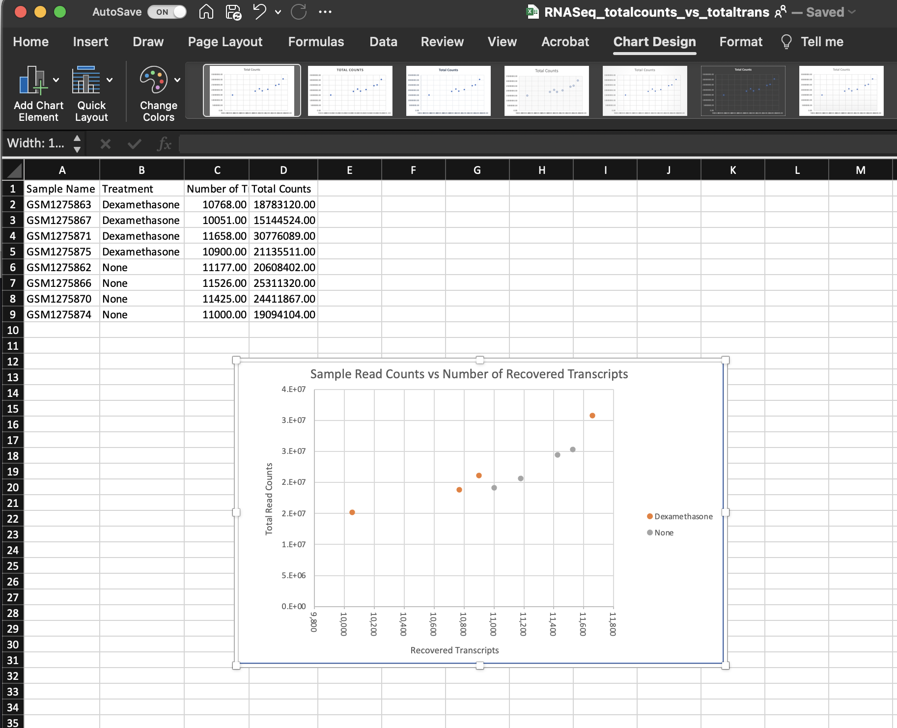
This isn't too bad, but it took an unnecessary amount of time, and there weren't a lot of options for customization.
RECOMMENDATION
You should save metadata or other tabular data as either comma separated files (.csv) or tab-delimited files (.txt, .tsv). Using these file extensions will make it easier to use the data with bioinformatic programs. There are multiple functions available to read in delimited data in R. We will see a few of these over the next few weeks.
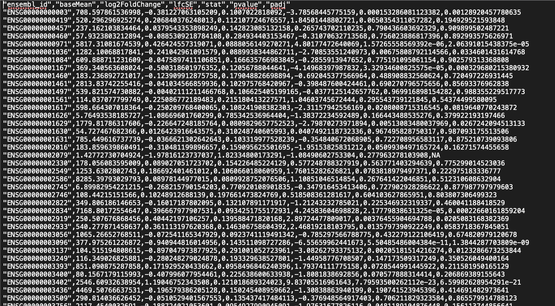
Example of .csv structure:
Why ggplot2?
Outside of base R plotting, one of the most popular packages used to generate graphics in R is ggplot2, which is associated with a family of packages collectively known as the tidyverse. GGplot2 allows the user to create informative plots quickly by using a 'grammar of graphics' implementation, which is described as "a coherent system for describing and building graphs" (R4DS). We will see this in action shortly. The power of this package is that plots are built in layers and few changes to the code result in very different outcomes. This makes it easy to reuse parts of the code for very different figures. GGplot2 is incredibly versatile and can create most types of plots, especially when you consider the numerous packages that further extend its capabilities.
Being a part of the tidyverse collection, ggplot2 works best with data organized so that individual observations are in rows and variables are in columns ("tidy data").
Getting started with ggplot2
To begin plotting, we need to load our ggplot2 library. Package libraries must be loaded every time you open and use R. If you haven't yet installed the ggplot2 package on your local machine, you will need to do that using install.packages("ggplot2").
#load the ggplot2 library
library(ggplot2)
Getting help
The R community is extensive and getting help is now easier than ever with a simple web search. If you can't figure out how to plot something, give a quick web search a try. Great resources include internet tutorials, R bookdowns, and stackoverflow. You should also use the help features within RStudio to get help on specific functions or to find vignettes. Try entering ggplot2 in the help search bar in the lower right panel under the Help tab.
Note
You may also find Microsoft's Bing GPT-4 chatbot useful for creating code examples that can be modified to fit your data. Currently, Bing is the only GPT-4 browser that is authorized for use by NCI.
Though it was created for ChatGPT, you may find this resource from Datacamp useful for prompting appropriate responses.
The ggplot2 template
The following represents the basic ggplot2 template.
ggplot(data = <DATA>) +
  <GEOM_FUNCTION>(mapping = aes(<MAPPINGS>))
+ symbol following the ggplot() function. This symbol will precede each additional layer of code for the plot, and it is important that it is placed at the end of the line. More on geom functions and mapping aesthetics to come.
Let's see this template in practice.
What is the relationship between total transcript sums per sample and the number of recovered transcripts per sample?
#let's plot our data
ggplot(data=data) +
  geom_point(aes(x=Number.of.Transcripts, y = Total.Counts))
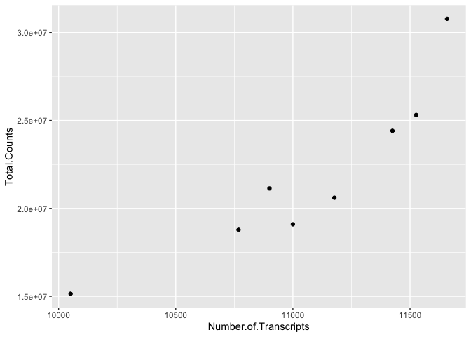
We can easily see that there is a relationship between the number of transcripts per sample and the total transcripts recovered per sample. ggplot2 default parameters are great for exploratory data analysis. But, with only a few tweaks, we can make some beautiful, publishable figures.
Let's take a closer look at the above code
The first step in creating this plot was initializing the ggplot object using the function ggplot(). Remember, we can look further for help using ?ggplot(). The function ggplot() takes data, mapping, and further arguments. However, none of this needs to actually be provided at the initialization phase, which creates the coordinate system from which we build our plot. But, typically, you should at least call the data at this point.
The data we called was from the data frame data, which we created above. Next, we provided a geom function (geom_point()), which created a scatter plot. This scatter plot required mapping information, which we provided for the x and y axes. More on this in a moment.
Let's break down the individual components of the code.
#What does running ggplot() do?
ggplot(data=data)

#What about just running a geom function?
geom_point(data=data,aes(x=Number.of.Transcripts, y = Total.Counts))
## mapping: x = ~Number.of.Transcripts, y = ~Total.Counts
## geom_point: na.rm = FALSE
## stat_identity: na.rm = FALSE
## position_identity
#what about this
ggplot() +
geom_point(data=data,aes(x=Number.of.Transcripts, y = Total.Counts))

Geom functions
A geom is the geometrical object that a plot uses to represent data. People often describe plots by the type of geom that the plot uses. --- R4DS
There are multiple geom functions that change the basic plot type or the plot representation. We can create scatter plots (geom_point()), line plots (geom_line(),geom_path()), bar plots (geom_bar(), geom_col()), line modeled to fitted data (geom_smooth()), heat maps (geom_tile()), geographic maps (geom_polygon()), etc.
ggplot2 provides over 40 geoms, and extension packages provide even more (see https://exts.ggplot2.tidyverse.org/gallery/ for a sampling). The best way to get a comprehensive overview is the ggplot2 cheatsheet, which you can find at http://rstudio.com/resources/cheatsheets. --- R4DS
You can also see a number of options pop up when you type geom into the console, or you can look up the ggplot2 documentation in the help tab.
We can see how easy it is to change the way the data is plotted. Let's plot the same data using geom_line().
ggplot(data=data) +
  geom_line(aes(x=Number.of.Transcripts, y = Total.Counts))

Mapping and aesthetics (aes())
The geom functions require a mapping argument. The mapping argument includes the aes() function, which "describes how variables in the data are mapped to visual properties (aesthetics) of geoms" (ggplot2 R Documentation). If not included it will be inherited from the ggplot() function.
An aesthetic is a visual property of the objects in your plot.---R4DS
Mapping aesthetics include some of the following:
1. the x and y data arguments
2. shapes
3. color
4. fill
5. size
6. linetype
7. alpha
This is not an all encompassing list.
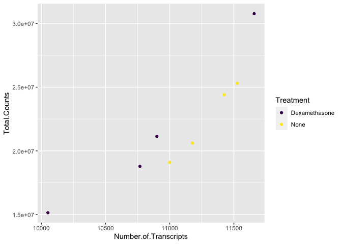
Let's return to our plot above. Is there a relationship between treatment ("dex") and the number of transcripts or total counts?
#adding the color argument to our mapping aesthetic
ggplot(data=data) +
  geom_point(aes(x=Number.of.Transcripts, y = Total.Counts,
                 color=Treatment))
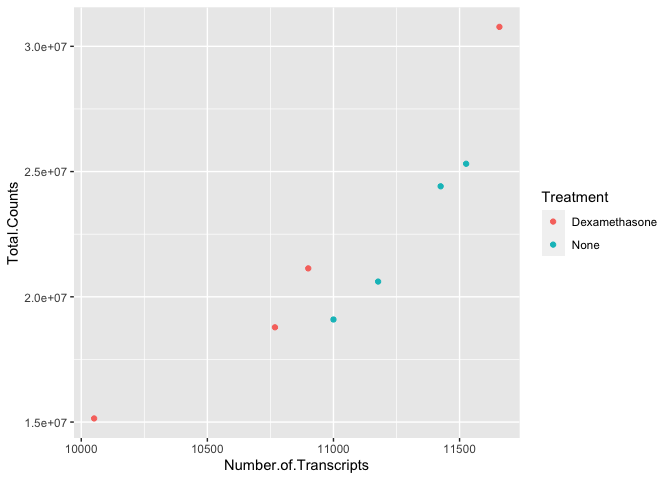
There is potentially a relationship. ASM cells treated with dexamethasone in general have lower total numbers of transcripts and lower total counts.
Notice how we changed the color of our points to represent a variable, in this case. To do this, we set color equal to 'Treatment' within the aes() function. This mapped our aesthetic, color, to a variable we were interested in exploring. Aesthetics that are not mapped to our variables are placed outside of the aes() function. These aesthetics are manually assigned and do not undergo the same scaling process as those within aes().
For example
#map the shape aesthetic to the variable "dex"
#use the color purple across all points (NOT mapped to a variable)
ggplot(data=data) +
  geom_point(aes(x=Number.of.Transcripts, y = Total.Counts,
                 shape=Treatment), color="purple")
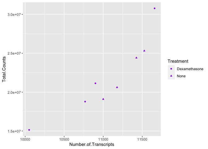
We can also see from this that 'Treatment' could be mapped to other aesthetics. In the above example, we see it mapped to shape rather than color. By default, ggplot2 will only map six shapes at a time, and if your number of categories goes beyond 6, the remaining groups will go unmapped. This is by design because it is hard to discriminate between more than six shapes at any given moment. This is a clue from ggplot2 that you should choose a different aesthetic to map to your variable. However, if you choose to ignore this functionality, you can manually assign more than six shapes.
We could have just as easily mapped it to alpha, which adds a gradient to the point visibility by category, or we could map it to size. There are multiple options, so feel free to explore a little with your plots.
Other things to note
The assignment of color, shape, or alpha to our variable was automatic, with a unique aesthetic level representing each category (i.e., 'Dexamethasone', 'none') within our variable. You will also notice that ggplot2 automatically created a legend to explain the levels of the aesthetic mapped. We can change aesthetic parameters - what colors are used, for example - by adding additional layers to the plot.
R objects can also store figures
As we have discussed, R objects are used to store things created in R to memory. This includes plots.
scatter_plot<-ggplot(data=data) +
  geom_point(aes(x=Number.of.Transcripts, y = Total.Counts,
                 color=Treatment))

scatter_plot

We can add additional layers directly to our object. We will see how this works by defining some colors for our 'dex' variable.
Colors
ggplot2 will automatically assign colors to the categories in our data. Colors are assigned to the fill and color aesthetics in aes(). We can change the default colors by providing an additional layer to our figure. To change the color, we use the scale_color functions: scale_color_manual(), scale_color_brewer(), scale_color_grey(), etc. We can also change the name of the color labels in the legend using the labels argument of these functions
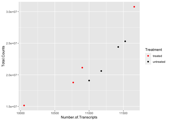
scatter_plot +
  scale_color_manual(values=c("red","black"),
                     labels=c('treated','untreated'))
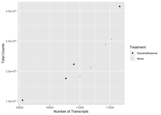
scatter_plot +
  scale_color_grey()
scatter_plot +
  scale_color_brewer(palette = "Paired")

Similarly, if we want to change the fill, we would use the scale_fill options. To apply scale_fill to shape, we will have to alter the shapes, as only some shapes take a fill argument.
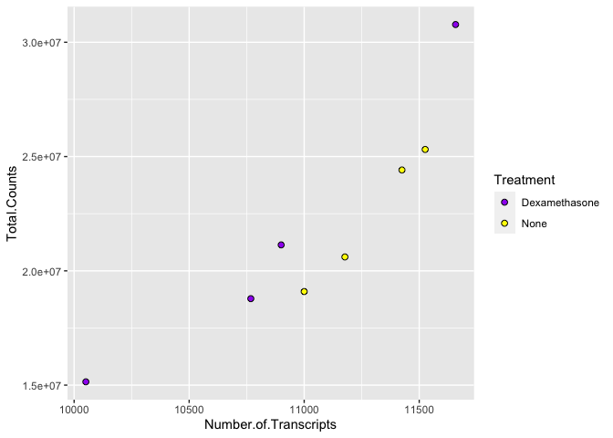
Image from https://ggplot2.tidyverse.org/articles/ggplot2-specs.html:
ggplot(data=data) +
  geom_point(aes(x=Number.of.Transcripts, y = Total.Counts,fill=Treatment),
             shape=21,size=2) + #increase size and change points
  scale_fill_manual(values=c("purple", "yellow"))
There are a number of ways to specify the color argument including by name, number, and hex code. Here is a great resource from the R Graph Gallery for assigning colors in R.
There are also a number of complementary packages in R that expand our color options. One of my favorites is viridis, which provides colorblind friendly palettes. randomcoloR is a great package if you need a large number of unique colors.
library(viridis) #Remember to load installed packages before use
## Loading required package: viridisLite
scatter_plot + scale_color_viridis(discrete=TRUE, option="viridis")
Paletteer contains a comprehensive set of color palettes, if you want to load the palettes from multiple packages all at once. See the Github page for details.
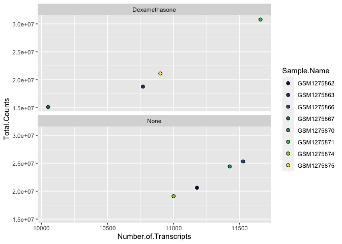
Facets
A way to add variables to a plot beyond mapping them to an aesthetic is to use facets or subplots. There are two primary functions to add facets, facet_wrap() and facet_grid(). If faceting by a single variable, use facet_wrap(). If multiple variables, use facet_grid(). The first argument of either function is a formula, with variables separated by a ~ (See below). Variables must be discrete (not continuous).
#plot
ggplot(data=data) +
  geom_point(aes(x=Number.of.Transcripts, y = Total.Counts,fill=Sample.Name),
             shape=21,size=2) + #increase size and change points
  scale_fill_viridis(discrete=TRUE, option="viridis") +
  facet_wrap(~Treatment)

Note the help options with ?facet_wrap(). How would we make our plot facets vertical rather than horizontal?
ggplot(data=data) +
  geom_point(aes(x=Number.of.Transcripts, y = Total.Counts,fill=Sample.Name),
             shape=21,size=2) + #increase size and change points
  scale_fill_viridis(discrete=TRUE, option="viridis") +
  facet_wrap(~Treatment, ncol=1)
Be sure to take a look at facet_grid(). Facet_grid would allow us to map even more variables in our data
ggplot(data=data) +
  geom_point(aes(x=Number.of.Transcripts, y = Total.Counts,fill=Sample.Name),
             shape=21,size=2) + #increase size and change points
  scale_fill_viridis(discrete=TRUE, option="viridis") +
  facet_grid(Sample.Name~Treatment)
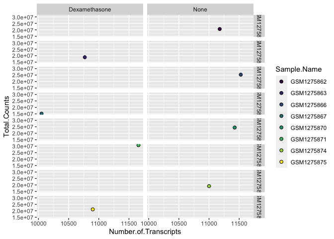
This is a silly example, but hopefully it gets across the point.
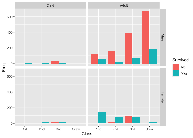
A better example of facet_grid() using data("Titanic").
This data set provides information on the fate of passengers on the fatal maiden voyage of the ocean liner ‘Titanic’, summarized according to economic status (class), sex, age and survival. --- R Documentation
?Titanic
data("Titanic")
Titanic <- as.data.frame(Titanic)
head(Titanic)
##   Class    Sex   Age Survived Freq
## 1   1st   Male Child       No    0
## 2   2nd   Male Child       No    0
## 3   3rd   Male Child       No   35
## 4  Crew   Male Child       No    0
## 5   1st Female Child       No    0
## 6   2nd Female Child       No    0
ggplot() + geom_col(data = Titanic, aes(x = Class, y = Freq, fill = Survived), position = "dodge") +
    facet_grid(Sex ~ Age)
Building upon our template
This is the grammar of graphics. Adding layers to create unique figures.
ggplot(data = <DATA>) +
  <GEOM_FUNCTION>(
     mapping = aes(<MAPPINGS>),
  ) +
  <FACET_FUNCTION>
Note that there are a lot of invisible (default) layers that often go into each ggplot2, and there are ways to customize these layers. See this chapter from R for Data Science for more information on the grammar of graphics.
Using multiple geoms per plot
Because we build plots using layers in ggplot2. We can add multiple geoms to a plot to represent the data in unique ways.
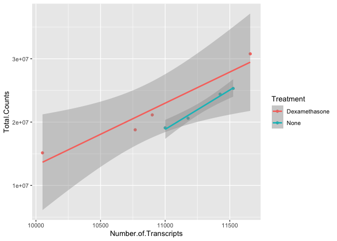
 #We can combine geoms; here we combine a scatter plot with a
#with a linear model regression line using geom_smooth
ggplot(data=data) +
  geom_point(aes(x=Number.of.Transcripts, y = Total.Counts,
                 color=Treatment)) +
  geom_smooth(method='lm', aes(x=Number.of.Transcripts,
                               y = Total.Counts, color= Treatment))
## `geom_smooth()` using formula = 'y ~ x'

#to make our code more effective, we can put shared aesthetics in the
#ggplot function
ggplot(data=data, aes(x=Number.of.Transcripts,
                               y = Total.Counts, color= Treatment)) +
  geom_point() +
  geom_smooth(method='lm')
## `geom_smooth()` using formula = 'y ~ x'
Labels, legends, scales, and themes
How do we ultimately get our figures to a publishable state? The bread and butter of pretty plots really falls to the additional non-data layers of our ggplot2 code. These layers will include code to label the axes, scale the axes, and customize the legends and theme. We will be working with these additional plot features in the weeks to come, so stay tuned.
Here's a teaser.
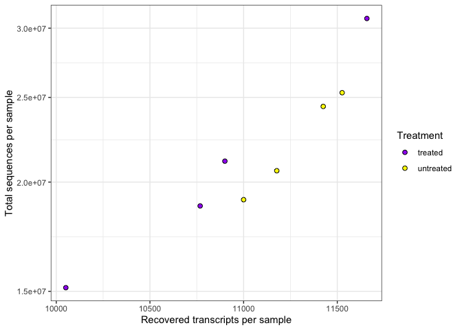
ggplot(data=data) +
  geom_point(aes(x=Number.of.Transcripts, y = Total.Counts,
                 fill=Treatment),
             shape=21,size=2) +
  scale_fill_manual(values=c("purple", "yellow"),
                    labels=c('treated','untreated'))+
  #can change labels of fill levels along with colors
  xlab("Recovered transcripts per sample") + #add x label
  ylab("Total sequences per sample") +#add y label
  guides(fill = guide_legend(title="Treatment")) + #label the legend
  scale_y_continuous(trans="log10") + #log transform the y axis
  theme_bw()
Saving plots (ggsave())
Finally, we have a quality plot ready to publish. The next step is to save our plot to a file. The easiest way to do this with ggplot2 is ggsave(). This function will save the last plot that you displayed by default. Look at the function parameters using ?ggsave().
ggsave("Plot1.png",width=5.5,height=3.5,units="in",dpi=300)
Check out this article for recommendations on effectively scaling plots.
Resource list
Acknowledgements
Material from this lesson was adapted from Chapter 3 of R for Data Science and from a 2021 workshop entitled Introduction to Tidy Transciptomics by Maria Doyle and Stefano Mangiola.