Lesson 6: Multi-figure panel
Objectives
-
Combine multiple plots into a single figure
-
Learn how to use aspects of
cowplotandpatchwork
The primary purpose of this lesson is to learn how to combine multiple figures into a single multi-panel figure using patchwork and a few features of cowplot. While we will learn how to customize and arrange plots in a multi-figure panel, this is not a comprehensive lesson on all aspects of patchwork and cowplot. If you have something specific in mind for your own data, I implore you to read the documentation for these packages to understand their full potential for customization.
Why do we need to learn to combine figures?
Combining multiple figures is advantageous when preparing results for conference presentations (via poster) or publication. Most journals place limits on the number of figures permitted per publication.
Example journals and their figure limits:
| Journal | Impact Factor | Number of Figures |
|---|---|---|
| Nature Cancer | 60.72 | 5-8 |
| Science | 47.73 | 6 |
| Cancer Cell | 31.74 | 8 |
| Journal of Clinical Oncology | 44.54 | 6 |
| JAMA Oncology | 31.78 | 5 |
| Cell Host and Microbe | 21.02 | 7 |
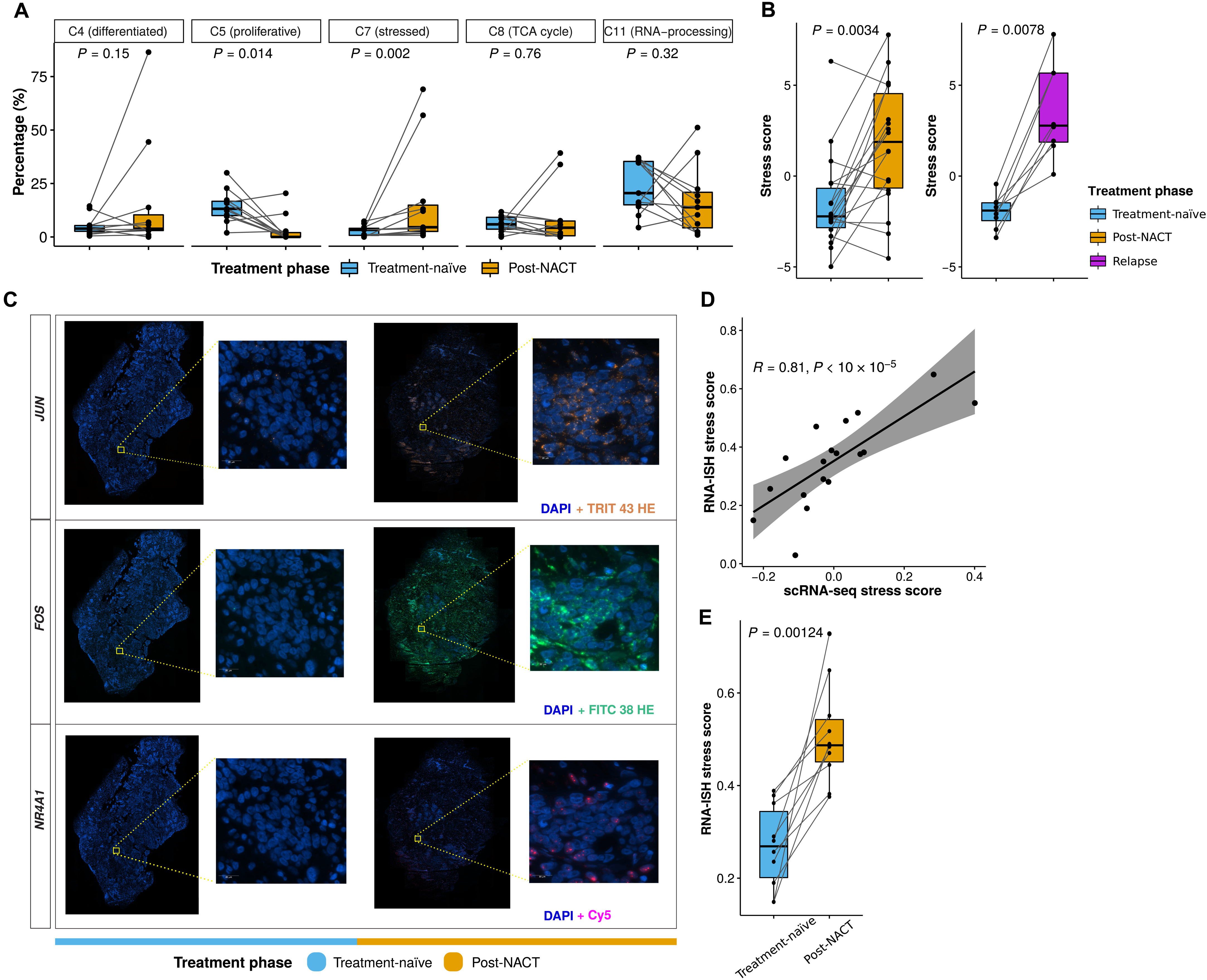
Example Multi-figure panel from Zhang et al.(2022). Longitudinal single-cell RNA-seq analysis reveals stress-promoted chemoresistance in metastatic ovarian cancer. Science advances, 8(8), eabm1831.
Load the libraries
There are multiple ways to combine figures using R. In this lesson, we will learn how to combine figures primarily with patchwork. Though, we will also learn some components of cowplot.
To get started, load the libraries. All packages used today can be installed from CRAN using install.packages().
#Get patchwork
#To install use install.packages('patchwork')
#load
library(patchwork)

#Get cowplot
#To install use install.packages('cowplot')
#load
library(cowplot)

#We will also use ggplot2
library(ggplot2)
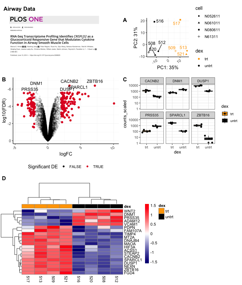
The Data
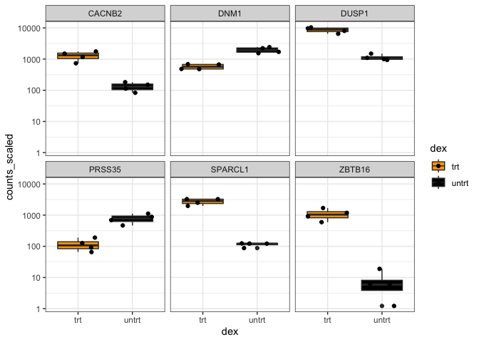
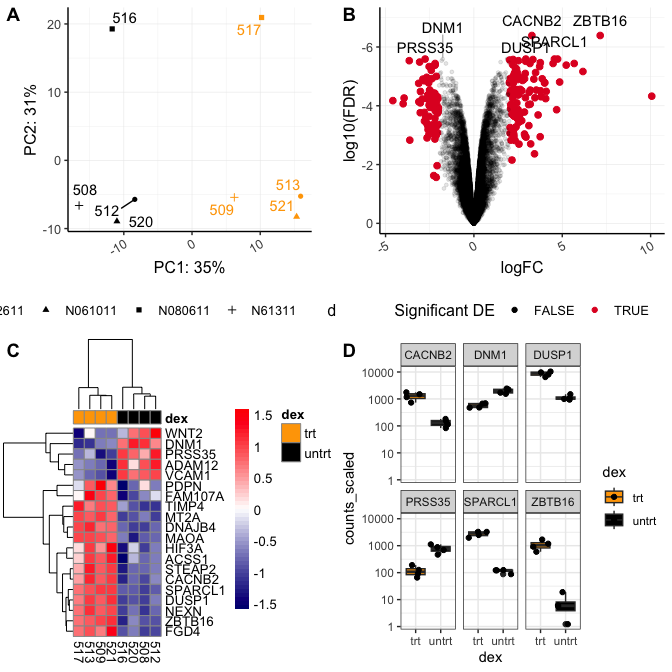
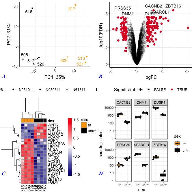
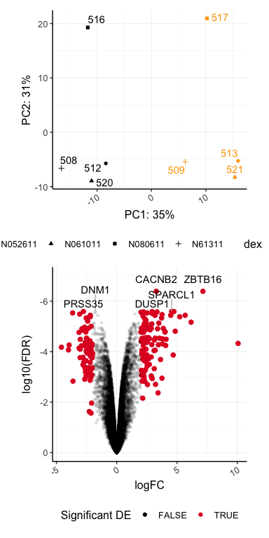
This is the sixth lesson in our Data Visualization with R Series. At this point, we have created quite a few plots. For this lesson, we will focus on the RNA-Seq plots that we created in previous lessons. We will also include other related plots that were created using the same RNA-Seq data, but were not created throughout this course series. All plots were saved as R objects (.rds). To load the data into R, we will need to use the readRDS() function.
Let's load and view our plots. To view our plots, we can simply call the objects by name.
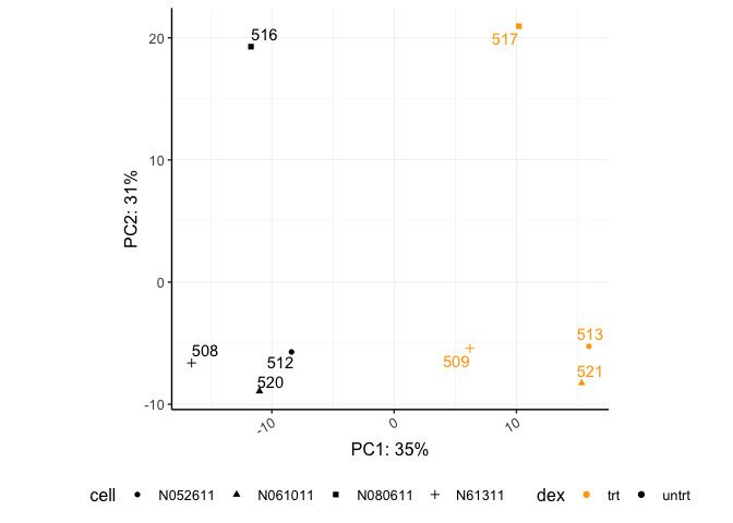
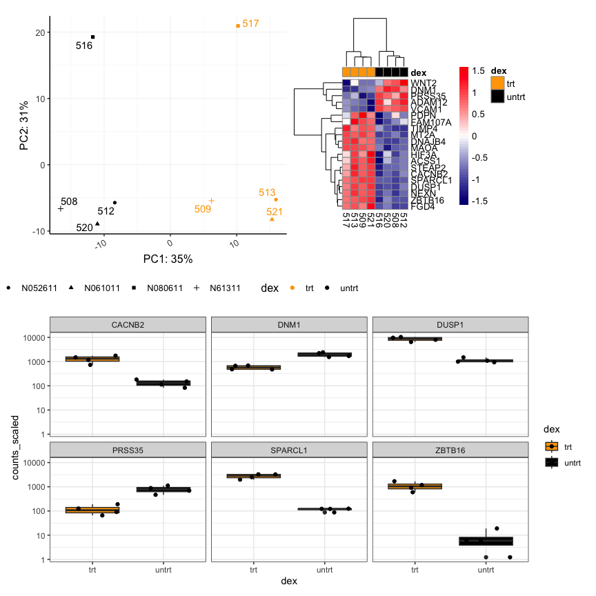
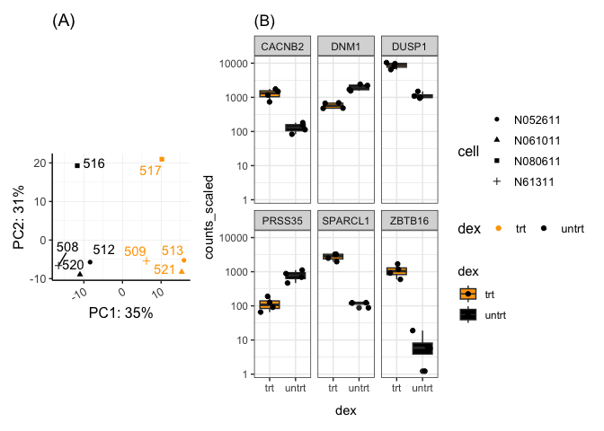
pca<-readRDS("./data/airwaypca.rds")
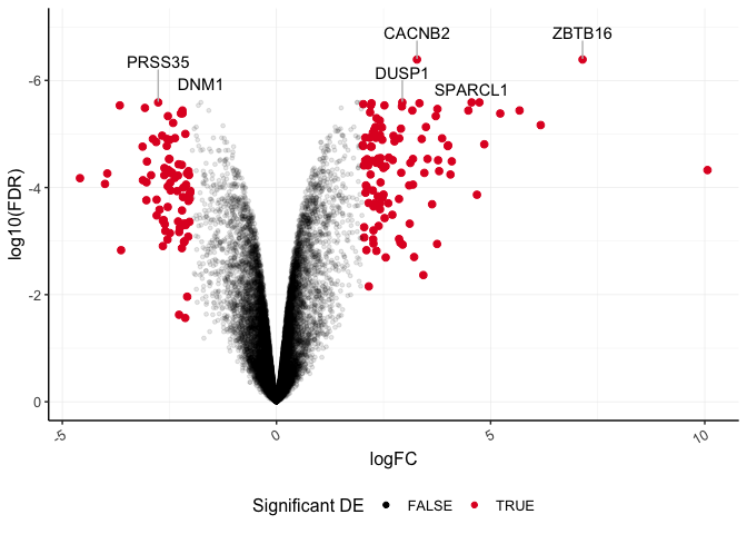
volcano<-readRDS("./data/volcanoplot.rds")
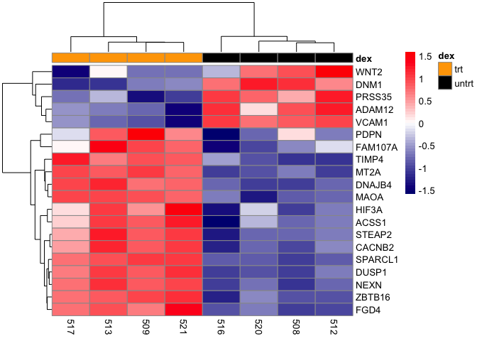
hmap<-readRDS("./data/airwayhm.rds")
sc<-readRDS("./data/stripchart.rds")
#view objects
pca
volcano
## Warning: Using alpha for a discrete variable is not advised.
hmap
sc
What is cowplot?
The cowplot package provides various features that help with creating publication-quality figures, such as a set of themes, functions to align plots and arrange them into complex compound figures, and functions that make it easy to annotate plots and or mix plots with images. The package was originally written for internal use in the Wilke lab, hence the name (Claus O. Wilke’s plot package). --- cowplot 1.1.1
The cowplot documentation is very user friendly, so be sure to check it out. Until recently cowplot has been my go to for arranging and combining plots in a multi-figure plot panel. Today we will primarily focus on patchwork, described below, for this purpose because it is, in my opinion, far easier to use for simple figure alignment in a grid format. However, cowplot does have some features that are notable, especially related to label customization, unique plot arrangements, and image drawing. The drawing functions, which allow you to easily integrate outside images onto your plots, are especially useful, so take a look at the linked documentation. Some of the more difficult features of cowplot, such as getting a combined legend, have been simplified by wrapper functions from other packages (See ggarrange() from ggpubr).
Using cowplot to arrange figures
The main function to combine figures using cowplot is plot_grid(). Let's check out the help documentation using ?plot_grid(). The first and most important parameter is the list of plots we want to combine, plotlist.
Let's check out the basic use of this function by calling the plots we want to combine and by providing labels using the labels argument.
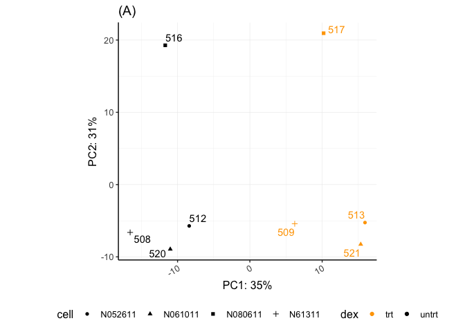
plot_grid(pca,volcano,hmap,sc, labels="AUTO")
## Warning: Using alpha for a discrete variable is not advised.
This figure isn't bad. Though, we would likely want to change the relative sizes of the plots and work on the plot alignments. This can be done with rel_heights, rel_widths, align, and axis. We are not going to work with these today because cowplot does not do well with plot alignments when a given plot's aspect ratio has been fixed (e.g., coord_fixed(), coord_equal()).
However, I do want to point out some of the options for label customization before moving on to ggdraw().
Plotting labels with cowplot
There are quite a few parameters to adjust figure labels. To re-position labels, see label_x, label_y, hjust, and vjust. These each take either a single value to move all labels or a vector of values, one for each subplot. We can also change the size of the labels (label_size), the font (label_fontface), the label color (label_colour), and the font type (label_fontfamily). In general, there seem to be more options for plot customization (without adding ggplot2 layers) with cowplot.
plot_grid(pca,volcano,hmap,sc, labels="AUTO",label_size = 14,
          label_fontface  = "bold.italic", label_colour  ="blue",
          label_fontfamily ="Times New Roman",
                   label_y=0.25)
## Warning: Using alpha for a discrete variable is not advised.
Here we changed the size of the labels to 14 pt and the color to blue. Also, the labels are now bold and italicized, and the font is Times New Roman. We also re-positioned the labels.
Other notable features of cowplot
You can nest figures by combining figures using plot_grid(), saving that to an object, and then plotting those pre-combined figures with another figure using plot_grid() again. Shared legends can be obtained using cowplot's get_legend(). cowplot also has its own function to save plots (save_plot()), which is a bit more dynamic for multi-figure panels, but you may also use ggsave().
Taking advantage of ggdraw
An extremely useful feature of cowplot is ggdraw() combined with draw_plot(), draw_grob(), draw_image() and draw_label(). These can be used to add or combine text, images, and plots and create more complicated plot arrangements. ggdraw() can be used directly with any package that creates grid grobs. It can also be used with lattice and base R graphics. The output of these functions can be treated like ggplot2 objects.
Note: Grobs are graphical objects that you can make and change with grid graphics functions. The ggplot2 package is built on top of grid graphics, so the grid graphics system “plays well” with ggplot2 objects. --- Pang, Kross, and Andersen, 2020
Let's look at the basics of drawing an image.
Note: Drawing an image requires library(magick).
plos <- "./images/himesetal2014_plos.png" #save our image file path

#Create an image to add to a multi-figure plot.
a<-ggdraw() + #create blank canvas
  draw_image(plos,scale=1) # draw the image and save to object

a

ggdraw()creates a new ggplot2 canvas without visible axes or background grid. The draw_* functions are simply wrappers around regular geoms. --- cowplot documentation
Let's add this to the background of our PCA.
pca + draw_image(plos,x=-15,y=-2,width=30,height=20)
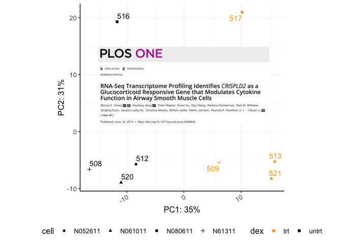
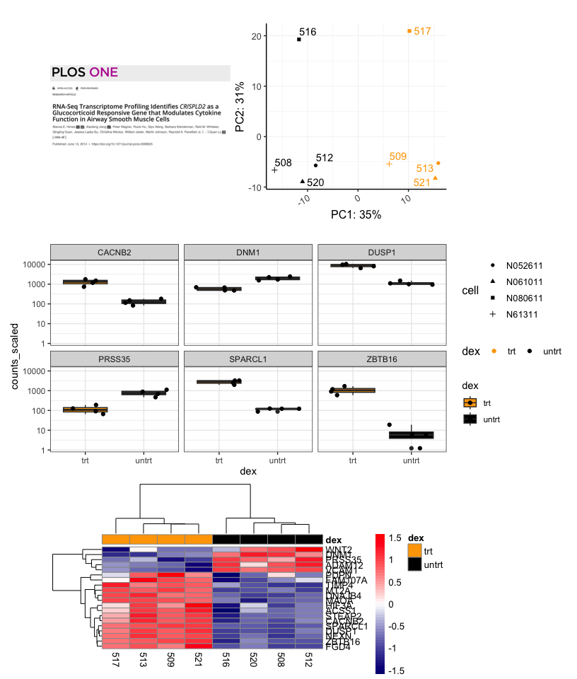
Using cowplot we can get an image such as this:
p1<-plot_grid(NULL,a,NULL,(pca+theme(legend.position="right")),labels=c("","","A"),align="h",axis="b",nrow=1,rel_widths= c(0.05,0.75,0.1,1),label_x=1.5)

bc<-plot_grid(volcano,sc,labels = c("B","C"),align="h",axis="b")
## Warning: Using alpha for a discrete variable is not advised.

p2<-plot_grid(p1,NULL,bc,ncol=1,align="v",axis="l",rel_heights = c(1,0.05,1.75))

p2b<-plot_grid(hmap,NULL,nrow=1,align="h",axis="b",rel_widths=c(0.65,0.25))

p3<-plot_grid(NULL,p2,NULL,p2b,ncol=1,labels=c("","","D"),align="v",axis="l",rel_heights=c(0.1,1,0.05,0.65))

labp<-ggdraw(p3)+
   draw_label("Airway Data", color = "Black", size = 14, x=0.1,y=0.97,hjust=0.65,fontface="bold")

labp
What is patchwork?
The goal of patchwork is to make it ridiculously simple to combine separate ggplots into the same graphic. As such it tries to solve the same problem as gridExtra::grid.arrange() and cowplot::plot_grid but using an API that incites exploration and iteration, and scales to arbitrily complex layouts. ---Thomas Lin Pederson, Patchwork documentation.
Patchwork allows users to combine plots using simple mathematic operations such as + and /.
Combining two plots
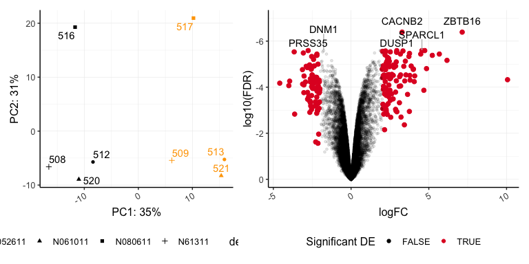
Let's combine our PCA and volcano plots.
pca + volcano
## Warning: Using alpha for a discrete variable is not advised.
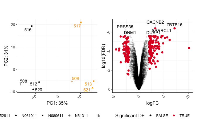
The last plot included in patchwork statements is considered the active plot, to which we can add additional ggplot2 layers. Notice the seamless alignment of these plots. Without any additional parameters, coord_fixed() is maintained in the pca plot. patchwork does a lot better with a fixed aspect plot.
Let's customize the legend position of the active plot.
pca + volcano +
  theme(legend.position="right")
## Warning: Using alpha for a discrete variable is not advised.
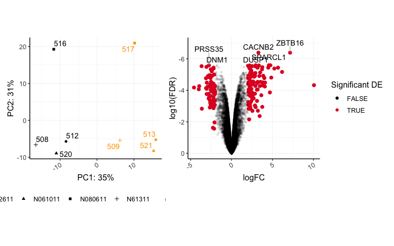
We can easily add ggplot2 layers within our patchwork code.
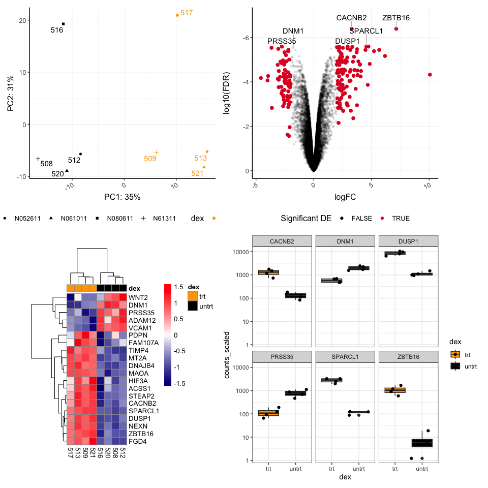
We can continue to add plots using the + symbol, and patchwork will try to form a grid, proceeding from left to right row-wise. Let's see this in action.
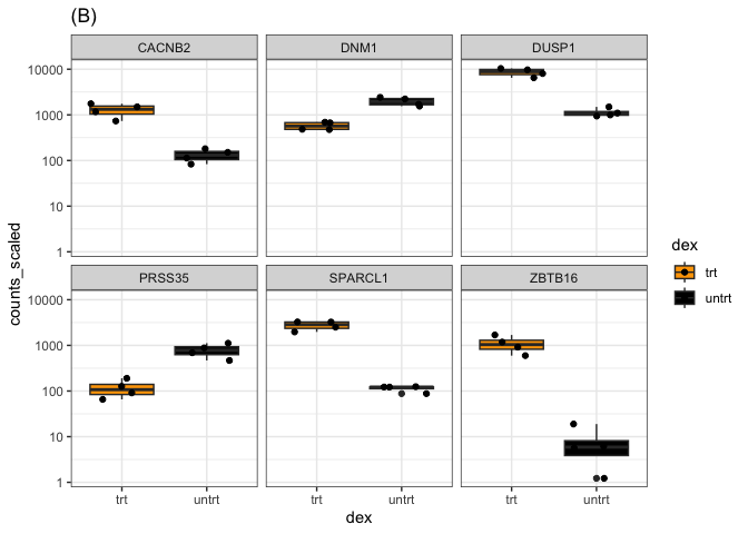
pca + volcano + hmap + sc
## Warning: Using alpha for a discrete variable is not advised.
The plot layout can be controlled further with additional operators. The | symbol is used to place plots side by side, while the / symbol is used to stack plots vertically. Plotting layouts kind of follow the rules designated by the order of operations (Remember back to PEMDAS), the / occurs before | and +.
#vertical stacking
pca / volcano
## Warning: Using alpha for a discrete variable is not advised.
#horizontal
pca | volcano
## Warning: Using alpha for a discrete variable is not advised.
pca | volcano / sc
## Warning: Using alpha for a discrete variable is not advised.
For specific layouts, it is a good idea to use parentheses for correct evaluation.
For example, what if we want our pca and heatmap side by side stacked on top of our box plot?
Compare the following:
pca | hmap / sc
((pca | hmap) / sc)
Using plot_layout()
The function plot_layout() can be used to control the layout, combine legends, and overwrite plot titles.
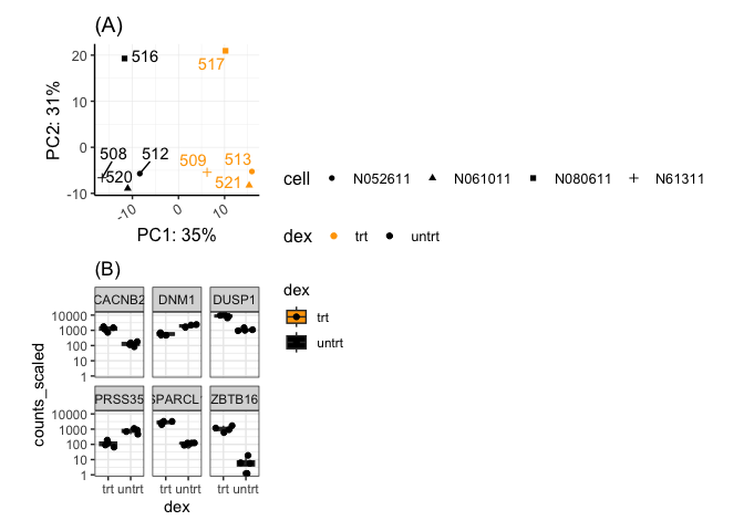
pca1 <-pca + ggtitle("(A)")
pca1
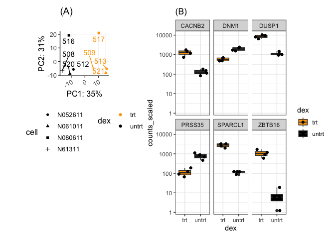
sc1 <- sc + ggtitle("(B)")
sc1
#combine legends
pca1 + sc1 + plot_layout(ncol =1, guides = 'collect')
#Can control the relative heights and widths
pca1 +  guides(shape = guide_legend(nrow=4)) + sc1 +
  plot_layout(nrow=1,guides = 'collect',widths=c(1.5,2))
Changing the relative sizes of the figures alters the alignment. Units may also be specified to control the height or width.
It is possible to design unique (non-grid) layouts using patchwork, but it seems a bit more difficult than cowplot in that regard.
Adding a spacer
We can add a spacer using plot_spacer() to add blank sections to our plot. These blank sections are the size of our figure panels and may be different depending on how the plot is arranged.
(pca1 + guides(shape = guide_legend(nrow=4),
               color = guide_legend(nrow=2))) / plot_spacer() | sc1
Add our cowplot image
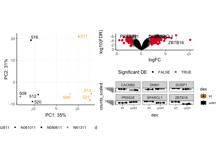
pca2<- pca + guides(shape = guide_legend(nrow=4))
((a |pca2) / sc / hmap) + plot_layout(guides='collect')
Including a title
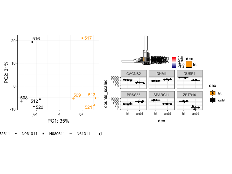
To include a title, subtitle, or caption use the function plot_annotation().
patchf<-((a | pca2) / sc / hmap) +
  plot_layout(guides='collect',heights=c(1,1,3)) +
  plot_annotation(title = 'Airway Data', tag_levels = "A")  &
    theme(plot.tag = element_text(face = 'bold'),
          title= element_text(face = 'bold'))
patchf
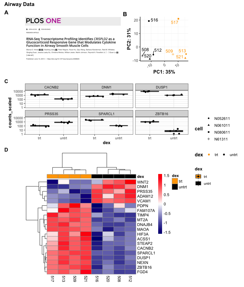
Notice that the assignment of "A" and "B" were automatic with the tag_levels parameter. The parentheses here are required. Also, & was used to apply theme() to all subplots in the patchwork.
Save the plot
ggsave("patchf.png",height=5,width=4.25,dpi=300,units="in",scale=2)
Which package to use?
This is ultimately up to you. In general, patchwork is easier to combine nicely aligned grid style plots. cowplot seems to include greater opportunities for customization, but you could easily customize things like titles using ggplot2 layers with either package prior to combining figures. patchwork also allows integration of ggplot2 layers. Both packages also allow you to inset figures and add non-ggplot2 figures. As you gain more experience with R, you may find yourself using both packages to achieve specific goals, or you may look to other packages. egg is another popular package for combining figures. ggarrange() from the package ggpubris also popular.
Acknowledgements
Content in this tutorial was adapted from information in the cowplot documentation and patchwork documentation.