Practice plotting using ggplot2: Lesson 2
Load the data
For these exercises, you will explore the titanic data from kaggle.com, which was downloaded from here. You will need to download the data and load into R. As this is a comma separated file, you will need to explore the read.csv() function.
Description of the data:
| Column | Description |
|---|---|
| Survived | 0 = No, 1 = Yes |
| Pclass | Ticket Class / Socioeconomic status (1 = 1st, 2 = 2nd, 3 = 3rd) |
| Name | Passenger name |
| Sex | Male / Female |
| Age | Numeric age in years |
| Siblings/Spouses Aboard | # of siblings / spouses aboard the Titanic |
| Parents/Children Aboard | # of parents / children aboard the Titanic |
| Fare | Passenger fare |
Get the data here.
Load ggplot2.
library(ggplot2)
Exercise Questions
Question 1
Load titanic.csv and save to an object named titanic.
Possible Solution
titanic <- read.csv("https://web.stanford.edu/class/archive/cs/cs109/cs109.1166/stuff/titanic.csv",header=TRUE)
Question 2
Explore the data. What is the structure of the data? Try str(). What are the column names? Try colnames(). How can you get help if you do not know how to use these functions?
Possible Solution
str(titanic) # get the structure
## 'data.frame':    887 obs. of  8 variables:
##  $ Survived               : int  0 1 1 1 0 0 0 0 1 1 ...
##  $ Pclass                 : int  3 1 3 1 3 3 1 3 3 2 ...
##  $ Name                   : chr  "Mr. Owen Harris Braund" "Mrs. John Bradley (Florence Briggs Thayer) Cumings" "Miss. Laina Heikkinen" "Mrs. Jacques Heath (Lily May Peel) Futrelle" ...
##  $ Sex                    : chr  "male" "female" "female" "female" ...
##  $ Age                    : num  22 38 26 35 35 27 54 2 27 14 ...
##  $ Siblings.Spouses.Aboard: int  1 1 0 1 0 0 0 3 0 1 ...
##  $ Parents.Children.Aboard: int  0 0 0 0 0 0 0 1 2 0 ...
##  $ Fare                   : num  7.25 71.28 7.92 53.1 8.05 ...
colnames(titanic) # get the column names.
## [1] "Survived"                "Pclass"
## [3] "Name"                    "Sex"
## [5] "Age"                     "Siblings.Spouses.Aboard"
## [7] "Parents.Children.Aboard" "Fare"
?str # get help
?colnames
Question 3
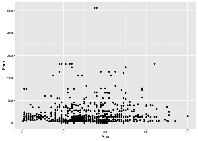
Make a simple scatter plot. Is there a relationship between the age of the passenger and the passenger fare?
Possible Solution
ggplot(titanic) +
  geom_point(aes(x=Age, y=Fare))
Question 4
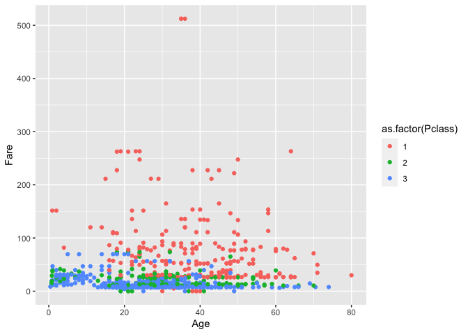
Color the points from question 3 by Pclass. Remember that Pclass is a proxy for socioeconomic status. While the values are treated as numeric upon loading, they are really categorical and should be treated as such. You will need to coerce Pclass into a categorical (factor) variable. See factor() and as.factor().
Possible Solution
ggplot(titanic) +
  geom_point(aes(x=Age, y=Fare, color=as.factor(Pclass)))
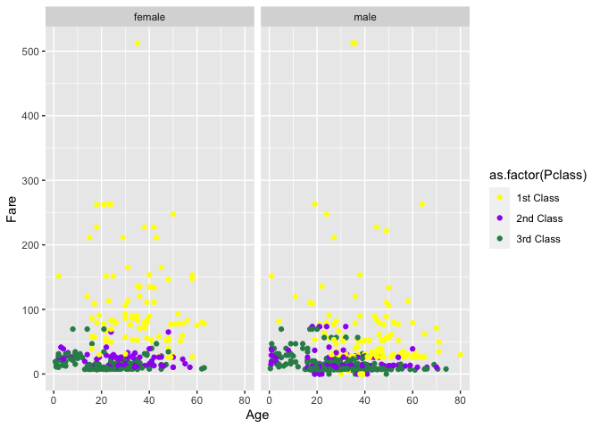
Question 5
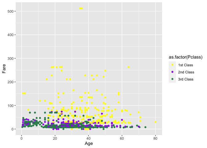
Manually scale the colors in question 4. 1st class = yellow, 2nd class = purple, 3rd class = seagreen. Also change the legend labels (1 = 1st Class, 2 = 2nd Class, 3 = 3rd Class).
Possible Solution
ggplot(titanic) +
  geom_point(aes(x=Age, y=Fare, color=as.factor(Pclass)))+
  scale_color_manual(values=c("yellow","purple","seagreen"),
                     labels=c("1st Class","2nd Class","3rd Class"))
Question 6
Facet the plot made in 5 by the column 'Sex'.
Possible Solution
ggplot(titanic) +
  geom_point(aes(x=Age, y=Fare, color=as.factor(Pclass))) +
  scale_color_manual(values=c("yellow","purple","seagreen"),
                     labels=c("1st Class","2nd Class","3rd Class")) +
  facet_wrap(~Sex)
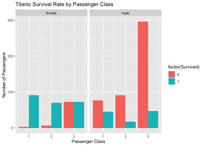
Challenge question 1
Let's use some other geoms. Plot the number of passengers (a simple count) that survived by ticket class and facet by sex.
Possible Solution
ggplot(titanic) +
  geom_bar(aes(x=Pclass, fill=factor(Survived)),
           position=position_dodge()) +
  facet_wrap(~Sex)+
  labs( y="Number of Passengers", x="Passenger Class",
        title="Titanic Survival Rate by Passenger Class")
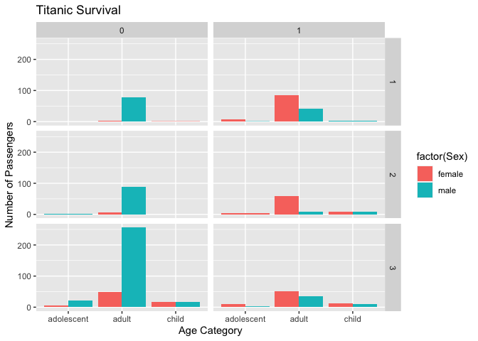
Challenge question 2
Add a variable to the data frame called age_cat (child = <12, adolescent = 12-17,adult= 18+). Plot the number of passengers (a simple count) that survived by age_cat, fill by Sex, and facet by class and survival.
Possible Solution
library(dplyr)
##
## Attaching package: 'dplyr'
## The following objects are masked from 'package:stats':
##
##     filter, lag
## The following objects are masked from 'package:base':
##
##     intersect, setdiff, setequal, union
titanic %>%
  mutate(age_cat= case_when(Age < 12 ~ "child",
  Age >= 12 & Age < 18  ~ "adolescent",
  Age >= 18 ~ "adult"
)) %>%
  ggplot() +
  geom_bar(aes(x=age_cat, fill=factor(Sex)),
           position=position_dodge()) +
  facet_grid(Pclass~Survived)+
  labs( y="Number of Passengers", x="Age Category",
        title="Titanic Survival")
Want more practice?
Let's use the dataset mtcars. According to the help documentation (?mtcars), "the data was extracted from the 1974 Motor Trend US magazine, and comprises fuel consumption and 10 aspects of automobile design and performance for 32 automobiles (1973–74 models)." Each question below will depend on code from the previous question.
Question 1
Let's check out the structure of the data.
Possible Solution
str(mtcars)
## 'data.frame':    32 obs. of  11 variables:
##  $ mpg : num  21 21 22.8 21.4 18.7 18.1 14.3 24.4 22.8 19.2 ...
##  $ cyl : num  6 6 4 6 8 6 8 4 4 6 ...
##  $ disp: num  160 160 108 258 360 ...
##  $ hp  : num  110 110 93 110 175 105 245 62 95 123 ...
##  $ drat: num  3.9 3.9 3.85 3.08 3.15 2.76 3.21 3.69 3.92 3.92 ...
##  $ wt  : num  2.62 2.88 2.32 3.21 3.44 ...
##  $ qsec: num  16.5 17 18.6 19.4 17 ...
##  $ vs  : num  0 0 1 1 0 1 0 1 1 1 ...
##  $ am  : num  1 1 1 0 0 0 0 0 0 0 ...
##  $ gear: num  4 4 4 3 3 3 3 4 4 4 ...
##  $ carb: num  4 4 1 1 2 1 4 2 2 4 ...
Question 2
How might we plot automobile weight (wt) versus miles per gallon (mpg).
Possible Solution
ggplot(mtcars, aes(wt, mpg)) +
  geom_point()
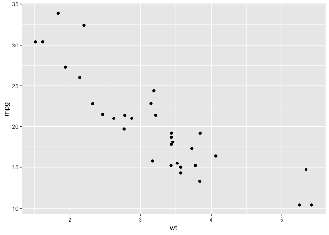
Question 3
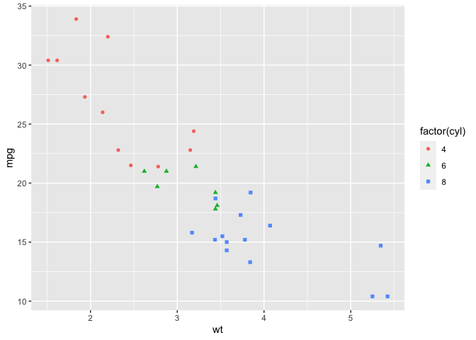
What if we want to represent the number of cylinders (cyl) by color and shape?
Possible Solution
ggplot(mtcars, aes(wt, mpg)) +
  geom_point(aes(color = factor(cyl),shape = factor(cyl)))
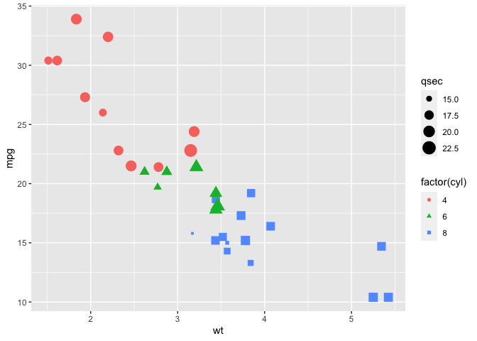
Question 4
Make the size of the points change by the quarter mile time (qsec).
Possible Solution
ggplot(mtcars, aes(wt, mpg)) +
  geom_point(aes(color = factor(cyl),shape = factor(cyl),size=qsec))
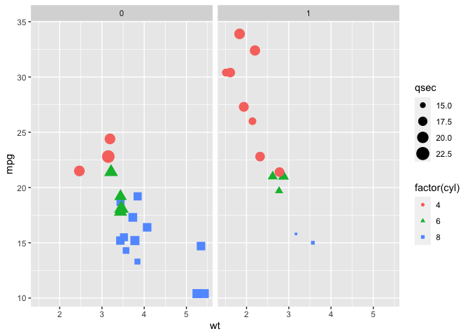
Question 5
Create subplots by transmission (am).
Possible Solution
ggplot(mtcars, aes(wt, mpg)) +
  geom_point(aes(color = factor(cyl),shape = factor(cyl),size=qsec))+
  facet_wrap(~am)
Question 6
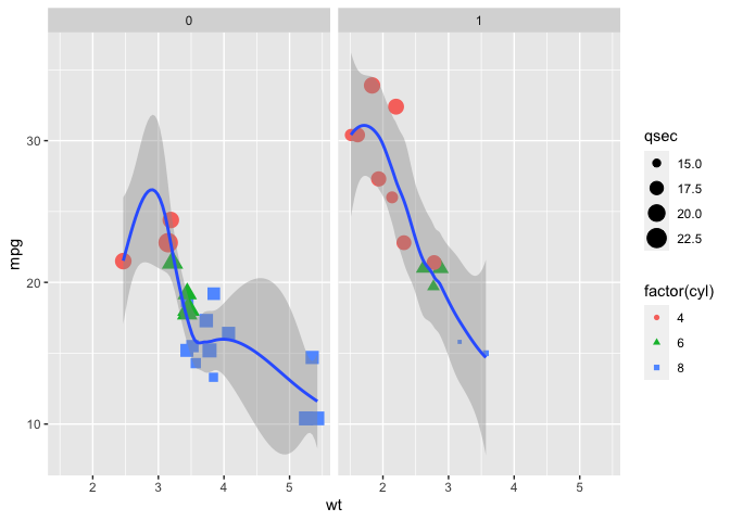
Model the trend using geom_smooth(). What is the default method used by geom_smooth()?
Possible Solution
ggplot(mtcars, aes(wt, mpg)) +
  geom_point(aes(color = factor(cyl),shape = factor(cyl),size=qsec))+
  facet_wrap(~am) +
  geom_smooth()
## `geom_smooth()` using method = 'loess' and formula = 'y ~ x'