Scatter plots and plot customization
Objectives
-
Learn to customize your ggplot with labels, axes, text annotations, and themes.
-
Learn how to make and modify scatter plots to make fairly different overall plot representations.
-
Load a different data set using new load functions
The primary purpose of this lesson is to learn how to customize our ggplot2 plots. We will do this by focusing on different types of scatter plots.
The Data
In this lesson we will use two different sets of data. First, we will use data available with your base R installation, the iris data set, which is stored in object iris. These data include measurements from the petals and sepals of different Iris species including Iris setosa, versicolor, and virginica. See ?iris for more information about these data.
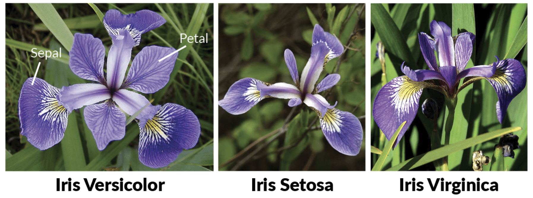
The Irises: image from https://www.datacamp.com/community/tutorials/machine-learning-in-r
Second, we will use some more complicated bioinformatics data related to the RNAseq project introduced in Lesson 2.
First, let's load our libraries using the library function, library():
library(ggrepel) #Needed for label repel
## Loading required package: ggplot2
library(ggplot2)
library(dplyr)
##
## Attaching package: 'dplyr'
## The following objects are masked from 'package:stats':
##
##     filter, lag
## The following objects are masked from 'package:base':
##
##     intersect, setdiff, setequal, union
Now, let's load the RNA data that we will use toward the end of this lesson. We will use the function read.delim() to load tab delimited RNASeq data and the function readLines() to load the list of top genes.
dexp_sigtrnsc<-read.delim("../data/sig_dexp_results.txt",
                 as.is=TRUE)
topgenes<-readLines("../data/topgenes.txt")
The grammar of graphics
We are returning to the core grammar of graphics concept introduced in Lesson 2. Remember, to create a plot all you you need are data, geom_function(s), and mapping arguments.
Here is the basic template we left off with:
ggplot(data = <DATA>) +
  <GEOM_FUNCTION>(
     mapping = aes(<MAPPINGS>),
  ) +
  <FACET_FUNCTION>
However, there are additional components, highlighted in bold, that can be added to our core components to enable us to generate even more diverse plot types.
Our grammar of graphics:
one or more datasets,
one or more geometric objects that serve as the visual representations of the data, – for instance, points, lines, rectangles, contours,
descriptions of how the variables in the data are mapped to visual properties (aesthetics) of the geometric objects, and an associated scale (e. g., linear, logarithmic, rank),
a facet specification, i.e. the use of multiple similar subplots to look at subsets of the same data,
one or more coordinate systems,
optional parameters that affect the layout and rendering, such text size, font and alignment, legend positions.
statistical summarization rules, [See LESSON 4]
We will extend our basic template throughout this lesson as we make a variety of scatter plots and in lesson 4.
Scatter plots
Scatterplots are useful for visualizing treatment–response comparisons, associations between variables, or paired data (e.g., a disease biomarker in several patients before and after treatment).Holmes and Huber, 2021
Because scatter plots involve mapping each data point, the geom function used is geom_point(). We saw a fairly basic implementation of this in Lesson 2.
Basic Scatter
Let's take another look at a simple scatter plot using the iris data. We can look at the relationship between petal length and petal width (i.e., variable association) for the various Iris species.
ggplot(data = iris) + #include our data
  geom_point(aes(x = Petal.Length, y = Petal.Width,
                 color = Species, shape = Species)) +
  #geom and mappings
  coord_fixed(xlim = c(0,7),
              ylim=c(0,3),expand=FALSE) # NEW CORE COMPONENT
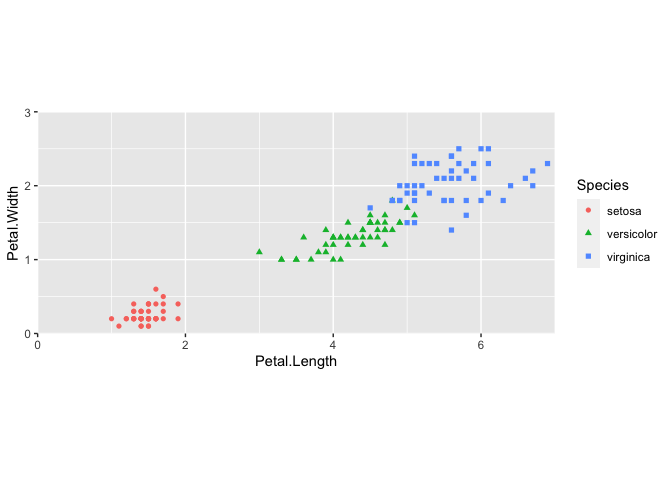
This code should look fairly familiar, with the exception of a new function, coord_fixed(). This is a modification of the ggplot2 coordinate system.
Coordinate Systems
Coordinate systems are probably the most complicated part of ggplot2. The default coordinate system is the Cartesian coordinate system where the x and y positions act independently to determine the location of each point. --- R4DS
coord_fixed() with the default argument ratio=1 ensures that the units are represented equally in physical space on the plot. Because the x and y measurements were both taken in centimeters, it is good practice to make sure that the "same mapping of data space to physical space is used." --- Holmes and Huber, 2021
You will not need to worry about the coordinate system of your plot in most cases, but it is likely you will need to mess with the coordinate system at some point in the future. Another commonly used coordinate function is coord_flip(), which allows you to flip the representation of the plot, for example, by switching bars in a bar plot from vertical to horizontal. See ?coord_flip() for more information.
Our new template:
ggplot(data = <DATA>) +
  <GEOM_FUNCTION>(
     mapping = aes(<MAPPINGS>),
  ) +
  <FACET_FUNCTION> +
  <COORDINATE SYSTEM>
Perform and plot PCA data using iris.
Many complex plots (e.g., PCA ordinations) are in their basic form a scatter plot. Here we are going to apply PCA to the iris data and generate a plot using ggplot2.
What is PCA?
Principal component analysis (PCA) is a linear dimension reduction method applied to highly dimensional data. The goal of PCA is to reduce the dimensionality of the data by transforming the data in a way that maximizes the variance explained. Read more here and here.
Key points:
New variables are defined by a linear combination of original variables
Each subsequent new variable contains less information
Applications: dimensionality reduction, clustering, outlier identification --- Shawhin Talebi, 2021
Note
PCAs are used frequently in -omics fields. However, often than not, there will be package specific functions for PCA and plotting PCA for different -omics analyses. Because of this, we will show the main features here using a simpler data set, iris.
Perform PCA
We can use the function prcomp() to run PCA on the first four columns of the iris data. The function takes numeric data.
colnames(iris)[1:4]
## [1] "Sepal.Length" "Sepal.Width" "Petal.Length" "Petal.Width"
pca <- prcomp(iris[,1:4], scale = TRUE)
pca
## Standard deviations (1, .., p=4):
## [1] 1.7083611 0.9560494 0.3830886 0.1439265
##
## Rotation (n x k) = (4 x 4):
##                     PC1         PC2        PC3        PC4
## Sepal.Length  0.5210659 -0.37741762  0.7195664  0.2612863
## Sepal.Width  -0.2693474 -0.92329566 -0.2443818 -0.1235096
## Petal.Length  0.5804131 -0.02449161 -0.1421264 -0.8014492
## Petal.Width   0.5648565 -0.06694199 -0.6342727  0.5235971
#get structure of df
str(pca)
## List of 5
##  $ sdev    : num [1:4] 1.708 0.956 0.383 0.144
##  $ rotation: num [1:4, 1:4] 0.521 -0.269 0.58 0.565 -0.377 ...
##   ..- attr(*, "dimnames")=List of 2
##   .. ..$ : chr [1:4] "Sepal.Length" "Sepal.Width" "Petal.Length" "Petal.Width"
##   .. ..$ : chr [1:4] "PC1" "PC2" "PC3" "PC4"
##  $ center  : Named num [1:4] 5.84 3.06 3.76 1.2
##   ..- attr(*, "names")= chr [1:4] "Sepal.Length" "Sepal.Width" "Petal.Length" "Petal.Width"
##  $ scale   : Named num [1:4] 0.828 0.436 1.765 0.762
##   ..- attr(*, "names")= chr [1:4] "Sepal.Length" "Sepal.Width" "Petal.Length" "Petal.Width"
##  $ x       : num [1:150, 1:4] -2.26 -2.07 -2.36 -2.29 -2.38 ...
##   ..- attr(*, "dimnames")=List of 2
##   .. ..$ : NULL
##   .. ..$ : chr [1:4] "PC1" "PC2" "PC3" "PC4"
##  - attr(*, "class")= chr "prcomp"
The object pca is a list of 5: the standard deviations of the principal components, a matrix of variable loadings, the scaling used, and the data projected on the principal components.
Plot PCA
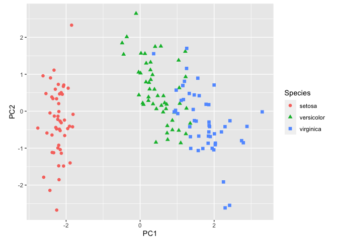
To plot the first two axes of variation along with species information, we will need to make a data frame with this information. The axes are in pca$x.
#Build a data frame
pcaData <- as.data.frame(pca$x[, 1:2]) # extract first two PCs
pcaData <- cbind(pcaData, iris$Species) # add species to df
colnames(pcaData) <- c("PC1", "PC2", "Species") # change column names

#Plot
ggplot(pcaData) +
  aes(PC1, PC2, color = Species, shape = Species) + # define plot area
  geom_point(size = 2) + # adding data points
  coord_fixed() # fixing coordinates
Info
Tip 6, here, discusses the importance of aspect ratio and using coord_fixed() more in detail.
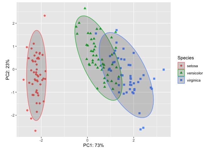
This is a decent plot showing us how the species relate based on characteristics of their sepals and petals. From this plot, we see that Iris virginica and Iris versicolor are more similar than Iris setosa.
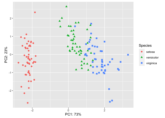
But, the axes are missing the % explained variance. Let's add custom axes. We can do this with the xlab() and ylab() functions or the functions labs(). But first we need to grab some information from our PCA analysis. Let's use summary(pca). This function provides a summary of results for a variety of model fitting functions and methods.
#Extract % Variance Explained
summary(pca)
## Importance of components:
##                           PC1    PC2     PC3     PC4
## Standard deviation     1.7084 0.9560 0.38309 0.14393
## Proportion of Variance 0.7296 0.2285 0.03669 0.00518
## Cumulative Proportion  0.7296 0.9581 0.99482 1.00000
PC1 and PC2 combined account for 96% of variance in the data. We can add this information directly to our plot using custom axes labels.
Add custom axes labels
#Plot
ggplot(pcaData) +
  aes(PC1, PC2, color = Species, shape = Species) +
  geom_point(size = 2) +
  coord_fixed() +
  xlab("PC1: 73%")+ #x axis label text
  ylab("PC2: 23%") # y axis label text
Automating % Variance in axis labels
If you want to automate the "Proportion of Variance", you should call it directly in the code. For example,
ggplot(pcaData) +
  aes(PC1, PC2, color = Species, shape = Species) +
  geom_point(size = 2) +
  coord_fixed() +
  labs(x=paste0("PC1: ",summary(pca)$importance[2,1]*100,"%"),
       y=paste0("PC2: ",summary(pca)$importance[2,2]*100,"%"))

Add a stat to our plot with stat_ellipse().
In scatter plots, the raw data is the focus of the plot, but for many other plots, this is not the case. We will discuss statistical transformation more in lesson 4 and how they apply. However, you may wish to overlay a stat on your PCA. For example, ellipses are often added to PCA ordinations to emphasize group clustering with confidence intervals. By default, stat_ellipse() uses the bivariate t distribution, but this can be modified. Let's add ellipses with 95% confidence intervals to our plot.
ggplot(pcaData) +
  aes(PC1, PC2, color = Species, shape = Species) +
  geom_point(size = 2) +
  coord_fixed() +
  xlab("PC1: 73%")+
  ylab("PC2: 23%") +
  stat_ellipse(geom="polygon", level=0.95, alpha=0.2) #adding a stat
Plot customization
Themes
The plot above is looking pretty good, but there are many more features that can be customized to make this publishable or fit a desired style. Changing non-data elements (related to axes, titles subtitles, gridlines, legends, etc.) of our plot can be done with theme(). GGplot2 has a definitive default style that falls under one of their precooked themes, theme_gray(). theme_gray() is one of eight complete themes provided by ggplot2.
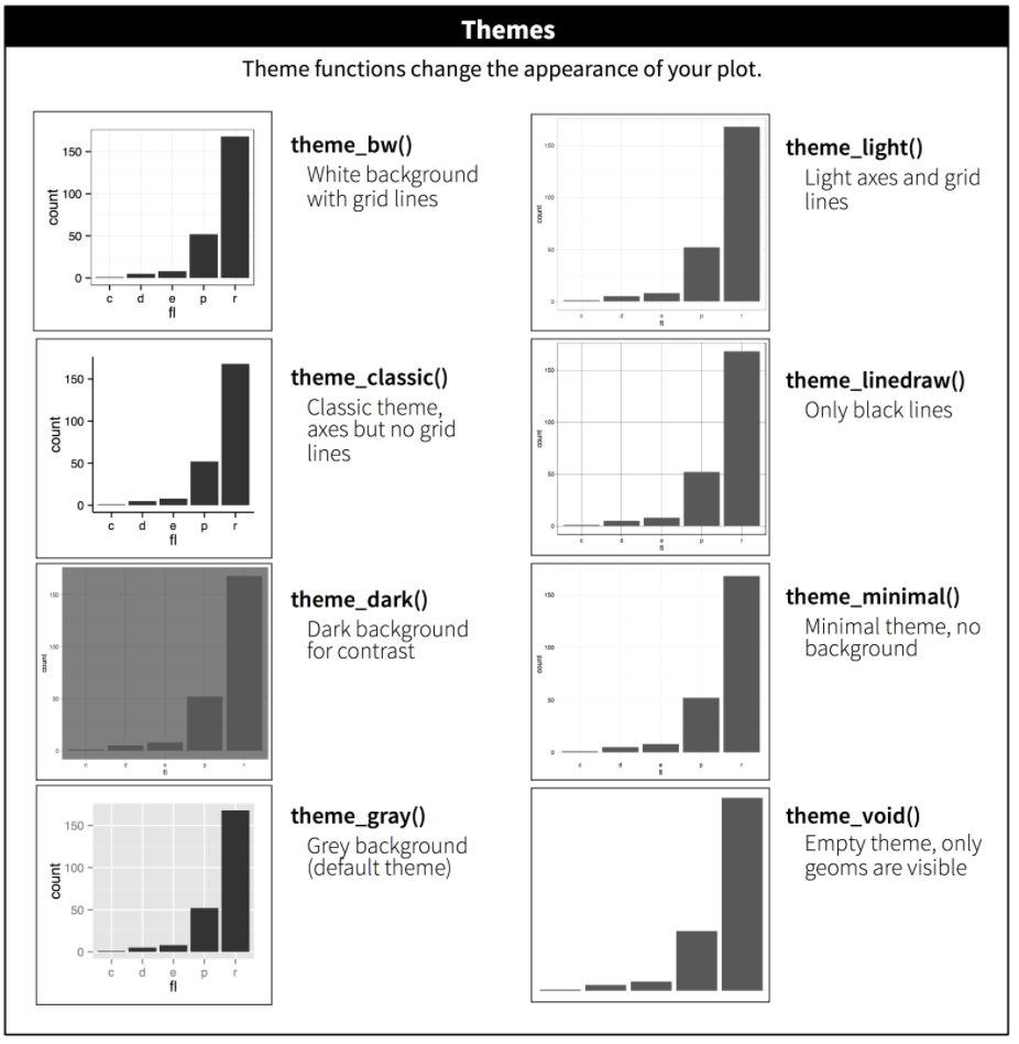
We can also specify and build a theme within our plot code or develop a custom theme to be reused across multiple plots. The theme function is the bread and butter of plot customization. Check out ?ggplot2::theme() for a list of available parameters. There are many.
Let's see how this works by changing the fonts and text sizes and dropping minor grid lines:
ggplot(pcaData) +
  aes(PC1, PC2, color = Species, shape = Species) + # define plot area
  geom_point(size = 2) + # adding data points
  coord_fixed() +
  xlab("PC1: 73%")+
  ylab("PC2: 23%") +
  stat_ellipse(geom="polygon", level=0.95, alpha=0.2) +
  theme_bw() + #start with a custom theme
  theme(axis.text=element_text(size=12,family="Times New Roman"),
        axis.title = element_text(size=12,family="Times New Roman"),
        legend.text = element_text(size=12,family="Times New Roman"),
        legend.title = element_text(size=12,family="Times New Roman"),
        panel.grid.minor = element_blank())
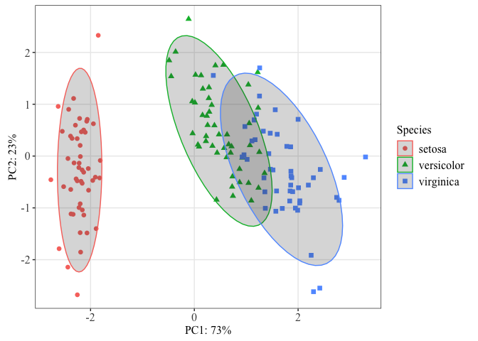
You may want to establish a custom theme for reuse with a number of plots. See this great tutorial by Madeline Pickens for steps on how to do that.
A helpful color trick
When you have a lot of colors and you want to keep these colors consistent, you can use the following convenient functions to set a name attribute for a vector of colors.
Let's do this for our iris species.
#defining colors
iriscolors<-setNames(c("blue","black","orange"),levels(iris$Species))

#Now plot
ggplot(pcaData) +
  aes(PC1, PC2, color = Species, shape = Species) +
  geom_point(size = 2) +
  scale_color_manual(values=iriscolors)+ #Adding the color argument
  coord_fixed() +
  xlab("PC1: 73%")+
  ylab("PC2: 23%") +
  stat_ellipse(geom="polygon", level=0.95, alpha=0.2,aes(fill=Species)) +
  scale_fill_manual(values=iriscolors)+ #Fill ellipses
  theme_bw() +
  theme(axis.text=element_text(size=12,family="Times New Roman"),
        axis.title = element_text(size=12,family="Times New Roman"),
        legend.text = element_text(size=12,family="Times New Roman"),
        legend.title = element_text(size=12,family="Times New Roman"),
        panel.grid.minor = element_blank())
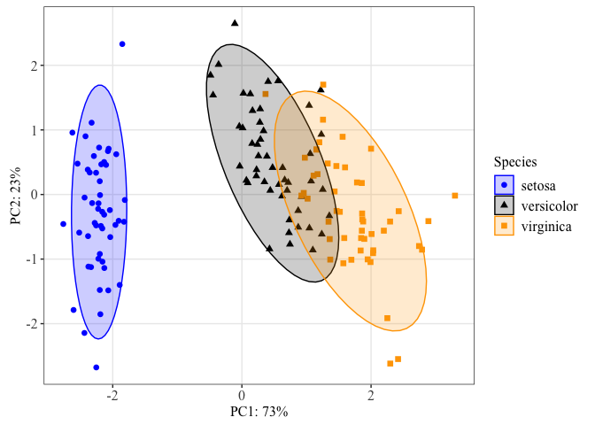 We can use this color palette for all plots of these three species to keep our figures consistent throughout a presentation or publication.
Using ggfortify to make a PCA
ggfortify is an excellent package to consider for easily generating PCA plots. ggfortify provides "unified plotting tools for statistics commonly used, such as GLM, time series, PCA families, clustering and survival analysis. The package offers a single plotting interface for these analysis results and plots in a unified style using 'ggplot2'."
library(ggfortify)
autoplot(pca, data = iris, colour = 'Species',size=2)

Since this is a ggplot2 object, this can easily be customized by adding ggplot2 customization layers.
Putting it all together
Let's update our ggplot2 grammar of graphics template:
ggplot(data = <DATA>) +
  <GEOM_FUNCTION>(
     mapping = aes(<MAPPINGS>),
     stat = <STAT>
  ) +
  <FACET_FUNCTION> +
  <COORDINATE SYSTEM> +
  <THEME>
Creating a publication ready volcano plot
We now know enough to put our new skills to use to make a volcano plot from RNASeq data.
A volcano plot is a type of scatterplot that shows statistical significance (P value) versus magnitude of change (fold change). It enables quick visual identification of genes with large fold changes that are also statistically significant. These may be the most biologically significant genes. --- Maria Doyle, 2021
Introducing EnhancedVolcano
There is a dedicated package for creating volcano plots available on Bioconductor, EnhancedVolcano. Plots created using this package can be customized using ggplot2 functions and syntax.
Using EnhancedVolcano:
#The default cut-off for log2FC is >|2|
#the default cut-off for P value is 10e-6
library(EnhancedVolcano)
EnhancedVolcano(dexp_sigtrnsc,
                title = "Enhanced Volcano with Airways",
                lab = dexp_sigtrnsc$transcript,
                x = 'logFC',
                y = 'FDR')
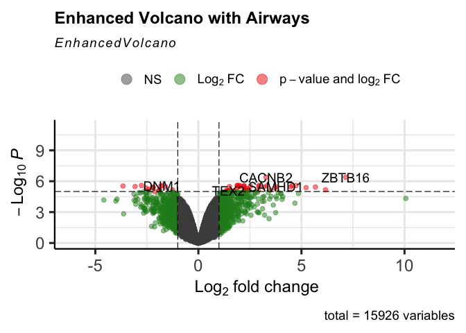
Let's take a quick look at the data we loaded at the beginning of the lesson:
head(dexp_sigtrnsc)
##           feature albut transcript ref_genome .abundant     logFC   logCPM
## 1 ENSG00000109906 untrt     ZBTB16       hg38      TRUE  7.146970 4.149689
## 2 ENSG00000165995 untrt     CACNB2       hg38      TRUE  3.280645 4.508931
## 3 ENSG00000106976 untrt       DNM1       hg38      TRUE -1.764478 5.381597
## 4 ENSG00000120129 untrt      DUSP1       hg38      TRUE  2.938116 7.313059
## 5 ENSG00000146250 untrt     PRSS35       hg38      TRUE -2.761556 3.908222
## 6 ENSG00000152583 untrt    SPARCL1       hg38      TRUE  4.555765 5.534393
##           F       PValue          FDR Significant
## 1 1429.3427 5.107615e-11 4.067194e-07        TRUE
## 2 1575.2829 3.342498e-11 4.067194e-07        TRUE
## 3  645.7452 1.616082e-09 2.573772e-06       FALSE
## 4  694.4165 1.179551e-09 2.573772e-06        TRUE
## 5  806.5147 6.162483e-10 2.573772e-06        TRUE
## 6  721.3794 9.999692e-10 2.573772e-06        TRUE
topgenes
## [1] "ZBTB16" "CACNB2" "DNM1" "DUSP1" "PRSS35" "SPARCL1"
Significant differential expression was assigned based on an absolute log fold change greater than or equal to 2 and an FDR corrected p-value less than 0.05.
Let's start our plot with the <DATA>, <GEOM_FUNCTION>, and <MAPPING>. We do not need to fix the coordinate system because we are working with two different values on the x and y and we don't need any special coordinate system modifications. Let's plot logFC on the x axis and the mutated column with our false discovery rate corrected p-values on the y-axis and set the significant p-values off from the non-significant by size and color. We can also go ahead and customize the size and color scales, since we have learned how to do that.
ggplot(data=dexp_sigtrnsc) +
  geom_point(aes(x = logFC, y = log10(FDR), color = Significant,
                 size = Significant,
                  alpha = Significant)) +
  scale_color_manual(values = c("black", "#e11f28")) +
  scale_size_discrete(range = c(1, 2))
## Warning: Using size for a discrete variable is not advised.
## Warning: Using alpha for a discrete variable is not advised.
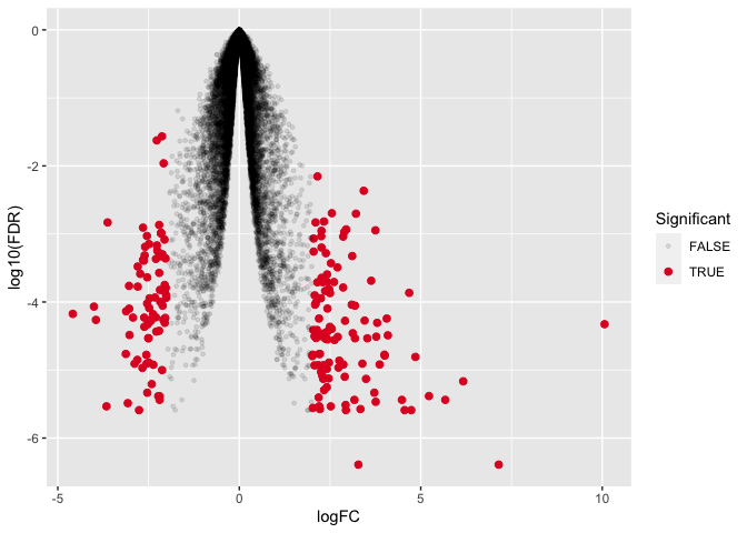
This is not exactly what we want so let's keep working.
Immediately, you should notice that the figure is upside down compared to what we would expect from a volcano plot. there are two possible ways to fix this. We could transform the FDR corrected values by multiplying by -1 OR we could work with our axes scales. Aside from text modifications, we haven't yet changed the scaling of the axes. Let's see how we can modify the scale of the y-axis.
Changing axes scales
To change the y axis scale, we will need a specific function. These functions generally start with scale_y.... In our case we want to reverse our axis so that increasingly negative is going in the positive direction rather than the negative direction. Luckily, there is a function to reverse our axis; see ?scale_y_reverse().
ggplot(data=dexp_sigtrnsc) +
  geom_point(aes(x = logFC, y = log10(FDR), color = Significant,
                 size = Significant,
                  alpha = Significant)) +
  scale_color_manual(values = c("black", "#e11f28")) +
  scale_size_discrete(range = c(1, 2)) +
  scale_y_reverse(limits=c(0,-7)) #we can also set the limits
## Warning: Using size for a discrete variable is not advised.
## Warning: Using alpha for a discrete variable is not advised.
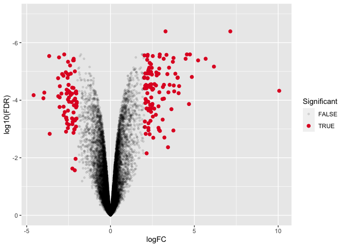
This looks pretty good, but we can tidy it up more by working with our legend guides and our theme.
Modifying legends
We can modify many aspects of the figure legend using the function guide(). Let's see how that works and go ahead and customize some theme arguments. Notice that the legend position is specified in theme().
ggplot(data=dexp_sigtrnsc) +
  geom_point(aes(x = logFC, y = log10(FDR), color = Significant,
                 size = Significant,
                  alpha = Significant)) +
  scale_color_manual(values = c("black", "#e11f28")) +
  scale_size_discrete(range = c(1, 2)) +
  scale_y_reverse(limits=c(0,-7)) + #we can also set the limits
  guides(size = "none", alpha= "none",
         color= guide_legend(title="Significant DE")) +
       theme_bw() +
      theme(
        panel.border = element_blank(),
        axis.line = element_line(),
        panel.grid.major = element_line(size = 0.2),
        panel.grid.minor = element_line(size = 0.1),
        text = element_text(size = 12),
        legend.position = "bottom",
        axis.text.x = element_text(angle = 30, hjust = 1, vjust = 1)
      )
## Warning: Using size for a discrete variable is not advised.
## Warning: The `size` argument of `element_line()` is deprecated as of ggplot2 3.4.0.
## ℹ Please use the `linewidth` argument instead.
## This warning is displayed once every 8 hours.
## Call `lifecycle::last_lifecycle_warnings()` to see where this warning was
## generated.
## Warning: Using alpha for a discrete variable is not advised.
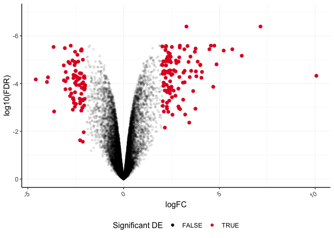
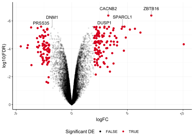
Lastly, let's layer another geom function to label our top six differentially abundant genes based on significance. We can use geom_text_repel() from library(ggrepel), which is a variation on geom_text().
plot_de<-ggplot(data=dexp_sigtrnsc) +
  geom_point(aes(x = logFC, y = log10(FDR), color = Significant,
                 size = Significant,
                  alpha = Significant)) +
  geom_text_repel(data=dexp_sigtrnsc %>%
                    filter(transcript %in% topgenes),
                  aes(x = logFC, y = log10(FDR),label=transcript),
                  nudge_y=0.5,hjust=0.5,direction="y",
                  segment.color="gray")+
  scale_color_manual(values = c("black", "#e11f28")) +
  scale_size_discrete(range = c(1, 2)) +
  scale_y_reverse(limits=c(0,-7)) + #we can also set the limits
  guides(size = "none", alpha= "none",
         color= guide_legend(title="Significant DE")) +
       theme_bw() +
      theme(
        panel.border = element_blank(),
        axis.line = element_line(),
        panel.grid.major = element_line(size = 0.2),
        panel.grid.minor = element_line(size = 0.1),
        text = element_text(size = 12),
        legend.position = "bottom",
        axis.text.x = element_text(angle = 30, hjust = 1, vjust = 1)
      )
## Warning: Using size for a discrete variable is not advised.
plot_de
## Warning: Using alpha for a discrete variable is not advised.
Save to an .rds file
We want to use this in a multi-panel figure in a later lesson, so let's go ahead and save it to a file that will hold a single R object (.rds).
saveRDS(plot_de, "volcanoplot.rds")
References
Code for PCA was adapted from Learning R through examples by Xijin Ge, Jianli Qi, and Rong Fan, 2021. Other sources for content included R4DS and Holmes and Huber, 2021.