Stat Transformations: Bar plots, box plots, and histograms
Objectives
- Review the grammar of graphics template
- Learn about the statistical transformations inherent to geoms
- Review data types
- Create bar plots, box & whisker plots, and histograms.
Our grammar of graphics template
This is where we left off at the end of lesson 3.
Our grammar of graphics template
one or more datasets,
one or more geometric objects that serve as the visual representations of the data, – for instance, points, lines, rectangles, contours,
descriptions of how the variables in the data are mapped to visual properties (aesthetics) of the geometric objects, and an associated scale (e. g., linear, logarithmic, rank),
a facet specification, i.e. the use of multiple similar subplots to look at subsets of the same data,
one or more coordinate systems,
optional parameters that affect the layout and rendering, such text size, font and alignment, legend positions.
statistical summarization rules
ggplot(data = <DATA>) +
  <GEOM_FUNCTION>(
     mapping = aes(<MAPPINGS>),
     stat = <STAT>
  ) +
  <FACET_FUNCTION> +
  <COORDINATE SYSTEM> +
  <THEME>
While we added stat_ellipse() to our PCAs, scatter plots do not have a built in statistical transformation. Today, we will talk more about statistical transformations and how these impact our plot representations. For a list of available statistical transformations in ggplot2 see https://ggplot2-book.org/layers.html?q=stat#stat.
Libraries
In this lesson, we will continue to use the ggplot2 package for plotting. To use ggplot2, we first need to load it into our R work environment using the library command.
library(ggplot2)
The Data
In this lesson we will use data obtained from a study that examined the effect that dietary supplements at various doses have on guinea pig tooth length. This data set is built into R, so if you want to take a look for yourself you can type data("ToothGrowth") either in the console or in a script. But in this exercise, we will import the data to our R work environment because it is more likely that we will import our own data for analysis.
Here, we are going to import two data sets using read.delim. The file data1.txt contains raw data from the tooth growth study. The file data2.txt is summary level data with mean tooth length and standard deviation pre-computed. We will assign data1.txt to object a1 and data2.txt to object a2. Within read.delim we use sep='\t' to indicate that the columns in the data are tab separated. After importing, we use the head command to look at the first 6 rows of each data set.
a1 <- read.delim("./data/data1.txt", sep='\t')
a2 <- read.delim("./data/data2.txt", sep='\t')
head(a1)
##    len supp dose
## 1  4.2   VC  0.5
## 2 11.5   VC  0.5
## 3  7.3   VC  0.5
## 4  5.8   VC  0.5
## 5  6.4   VC  0.5
## 6 10.0   VC  0.5
head(a2)
##   supp dose treat mean_len       sd
## 1   OJ  0.5 OJ0.5    13.23 4.459709
## 2   OJ  1.0   OJ1    22.70 3.910953
## 3   OJ  2.0   OJ2    26.06 2.655058
## 4   VC  0.5 VC0.5     7.98 2.746634
## 5   VC  1.0   VC1    16.77 2.515309
## 6   VC  2.0   VC2    26.14 4.797731
The tooth growth data set measured tooth length for two supplement types (OJ - orange juice, VC - vitamin c) at three different doses (0.5, 1, and 2). Each supplement and dose combination has 10 measurements so we have a total of 60 measurements in this data set. In a1, we have the raw data. On the other hand, in a2, we pre-computed the mean tooth length and standard deviation for the 10 measurements taken at each supplement and dose combination.
The column headings (colnames(a1),colnames(a2)) in the raw data (a1) and summary level data (a2) are as follows:
- len (tooth length - in raw data)
- supp (supplement type)
- dose
- treat (treatment, which is a concatenation of supp and dose - in summary level data only)
- mean_len (mean tooth length - in summary level data only)
- sd (standard deviation - in summary level data only)
Variable Types
Before diving into the construction of bar plot, box & whisker plot, and histogram, we should do a quick review of the types of variables that we commonly work with in data analysis.
- Categorical variables are qualitative, for instance
- patient gender (male or female)
- disease status (case or control)
- Discrete variables are quantifiable and can take on a finite number of of values, for instance
- number of male or female patients
- number of controls or disease cases
- medication dose
- Continuous variables can take on an infinite number of values
- age
- height
- weight
- Independent variable is a variable whose variation does not depend on another
- Dependent variable is a variable whose variation depends on another
- Factors are independent variables in which an experimental outcome is dependent on. Levels are variations in the factors.
The stat argument
Until this point we have been plotting raw data with geom_point(), but now we will be introducing geoms that transform and plot new values from your data.
Many graphs, like scatterplots, plot the raw values of your dataset. Other graphs, like bar charts, calculate new values to plot:
bar charts, histograms, and frequency polygons bin your data and then plot bin counts, the number of points that fall in each bin.
smoothers fit a model to your data and then plot predictions from the model.
boxplots compute a robust summary of the distribution and then display a specially formatted box.---R4DS
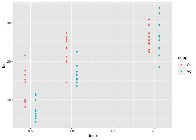
Let's explore the tooth growth data using plots. The tooth growth data has two independent variables, supplement and dose (variables supp and dose, respectively) for which the dependent variable tooth length (len) is measured. We would like to use the scatter plot to learn about tooth growth as a function of both dose and supplement (supp). Remember from Lesson 3 that a scatter plot can be generated using geom_point.
Within the aesthetic mapping in geom_point, we assign dose to the x axis, len (tooth length) to y, and the second independent variable supp (supplement) by assigning it to color. This will give us a scatter plot where dose is plotted along the x axis and len plotted along the y axis. The color code indicating which supplement (supp) each of the points or measurements came from is provided in the legend. In short, the color argument allows us to visualize how the dependent variable changes as a function of two independent variables.
Within geom_point, position=position_dodge is included to separate the points by supplement (supp), otherwise the points for the two supplements will overlap each other. The parameter width in position_dodge allows us to specify how far apart we want the points for the different supplement groups to be.
ggplot(data=a1)+
  geom_point(mapping=aes(x=dose,y=len,color=supp),
             position=position_dodge(width=0.25))
Bar Plot
A barplot is used to display the relationship between a numeric and a categorical variable. --- R Graph Gallery
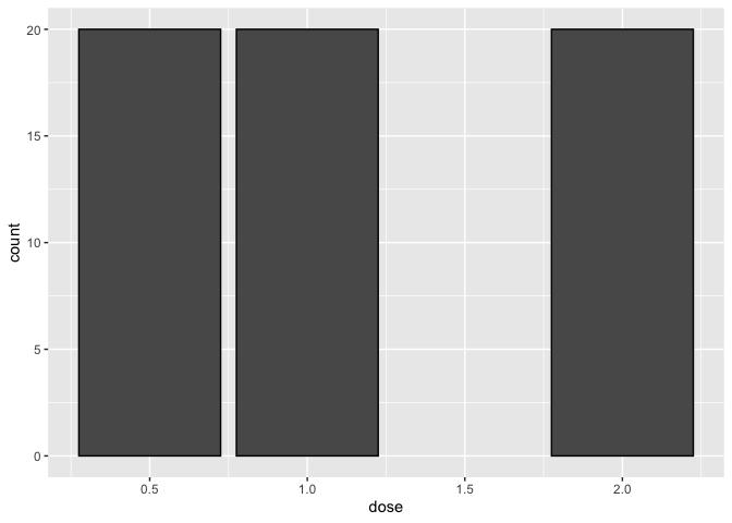
The tooth growth data can also be visualized via bar plot using geom_bar. However, if we try to plot tooth length (len) across each dose using the code below, we will get an error. We get this error because geom_bar uses stat_count by default where it counts the number of cases at each x position. Thus, by default, geom_point does not require y axis.
ggplot(data=a1)+
  geom_bar(mapping=aes(x=dose,y=len))
## Error in `f()`:
## ! stat_count() can only have an x or y aesthetic.
We received an error referencing stat_count().
stat = count
Let's take a look at a bar plot constructed using the default stat="count" transformation. Below, we plot the number of tooth length measurements taken at each dose. Setting color="black" allows us to include a black outline to the bars for better readability. In accordance with the description of this data, we see from the plot that 20 measurements were taken at each dose.
ggplot(data=a1)+
  geom_bar(mapping=aes(x=dose), color="black")
Given the above plot, how many of the 20 measurements taken at each dose came from the OJ or VC group. To find out, we can set fill=supp. Like color in the scatter plot, fill, allows us to include a second independent variable in our graph. The plot below tells us that 10 measurements were taken from the OJ group and 10 were taken from the VC group at each dose.
ggplot(data=a1)+
  geom_bar(mapping=aes(x=dose, fill=supp), color="black")
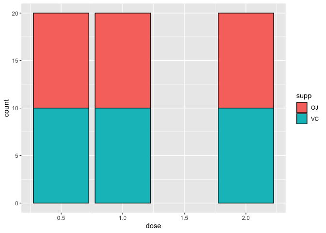
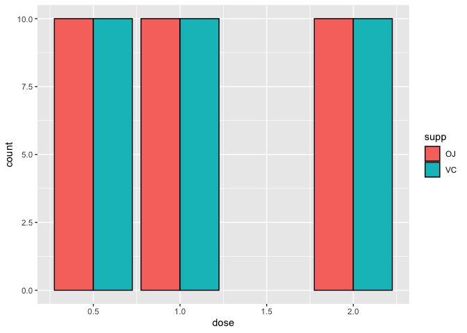
By default, geom_bar stacks bars from different groups. If we do not like the arrangement, we can use position_dodge to arrange the bars from the OJ and VC groups side-by-side.
ggplot(data=a1)+
  geom_bar(mapping=aes(x=dose,fill=supp), color="black",
           position=position_dodge())
stat_count() is a great way to compare differences in sample sizes between treatment categories or other variables and can be a great way to explore and represent metadata associated with -omics data.
stat = identity
Above, we learned about the number of tooth length measurements taken at each dose and supplement combination using the default stat="count" transformation of geom_bar. But what if we want to specify a y axis and plot exactly the values of our dependent variable in the y axis? This can be done in geom_bar by setting stat="identity".
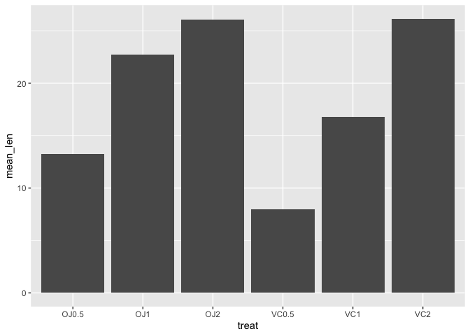
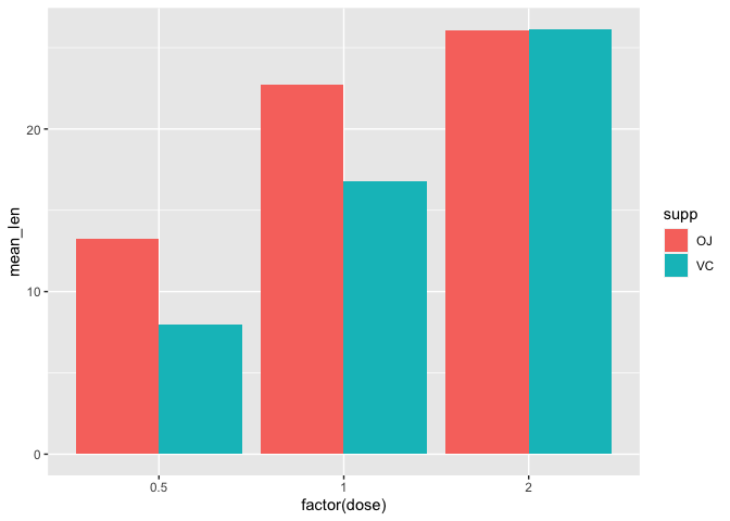
Below, we are plotting the mean tooth length (mean_len) across each of the treatment groups (treat) using the summary level data, a2. Using stat="identity", the exact y value or mean_len is plotted.
ggplot(data=a2)+
  geom_bar(mapping=aes(x=treat,y=mean_len),stat="identity")
What if we wanted to look at the raw values across the treatment groups using a bar plot? We still use geom_bar but the aesthetic mapping will be similar to the scatter plot except we are filling the bars to provide color coding for the supplements using fill. Again, because we want ggplot2 to plot exact value in the y axis, we specify stat="identity" inside geom_bar. To avoid stacking the values, we can use position_dodge2 in geom_bar to visualize each of the 10 measurements taken at each supplement and dose combination arranged side-by-side.
ggplot(data=a1)+
  geom_bar(mapping=aes(x=dose,y=len,fill=supp),stat="identity",
           position=position_dodge2(),color="black")
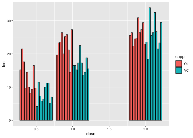
Note that because R interprets dose as numeric continuous variable (class(a2$dose)) ggplot2 gives us an extra dose of 1.5. But, the study did not measure tooth length at a dose of 1.5 for either of the supplements. Thus, we would like to remove this dose.
Using factors
class(a1$dose)
## [1] "numeric"
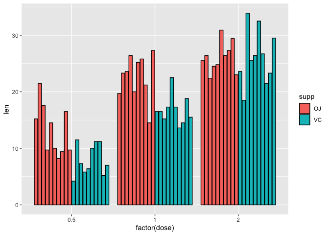
As it turns out, dose is really an experimental factor, so if we specify factor(dose) it will be interpreted as categorical or discrete. Before fixing the x axis in the above plot, let's diverge briefly and speak about factors in R.
Using the factor function we see that there are three levels for dose (0.5, 1, and 2)
factor(a1$dose)
##  [1] 0.5 0.5 0.5 0.5 0.5 0.5 0.5 0.5 0.5 0.5 1   1   1   1   1   1   1   1   1
## [20] 1   2   2   2   2   2   2   2   2   2   2   0.5 0.5 0.5 0.5 0.5 0.5 0.5 0.5
## [39] 0.5 0.5 1   1   1   1   1   1   1   1   1   1   2   2   2   2   2   2   2
## [58] 2   2   2
## Levels: 0.5 1 2
To remove the dose of 1.5, we can set the x axis to factor(dose).
ggplot(data=a1)+
  geom_bar(mapping=aes(x=factor(dose),y=len,fill=supp),stat="identity"
           ,position=position_dodge2(),color="black")
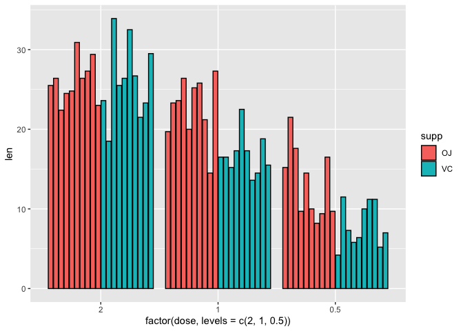
We can reorder factors using the function factor. For instance if we want to plot the doses backwards from highest to lowest on the x axis (i.e., 2, 1, 0.5) we can set the x axis in aesthetic mapping of geom_bar to factor(dose,levels=c(2,1,0.5)), where in the levels parameter, we are reassigning the order of the levels.
ggplot(data=a1)+
  geom_bar(mapping=aes(x=factor(dose,
           levels=c(2,1,0.5)),y=len,fill=supp),stat="identity",
           position=position_dodge2(),color="black")
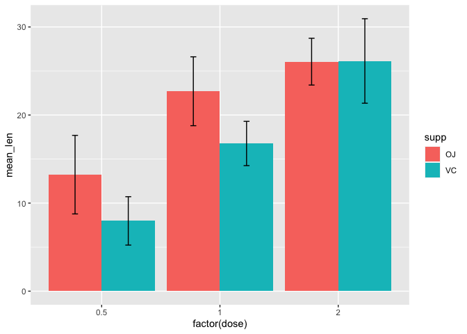
Adding error bars
Often, we will use bar plots to illustrate mean plus minus standard deviation in our data so we should learn how to incorporate error bars in our plots. We will learn to do this using the summary level data (a2) where the mean and standard deviation have been pre-computed and then with the raw data (a1) to take advantage of more statistical transformations.
First, we use the summary level data (a2) to plot the mean tooth length (mean_len) across the treatment groups, remembering to set stat="identity" because we are providing a y axis and position=position_dodge to arrange the bars side-by-side.
ggplot(data=a2, mapping=aes(x=factor(dose),y=mean_len,fill=supp))+
geom_bar(stat="identity", position=position_dodge())
Next, we add geom_errorbar to incorporate error bars that illustrate plus/minus 1 standard deviation from the mean. To set the upper and lower bounds of the error bar, we simply set ymax=mean_len+sd and ymin=mean_len-sd within the aesthetic mapping of geom_errorbar. Setting position=position_dodge in geom_errorbar again allows us to separate the error bars from each of the supplement groups. Within the position_dodge argument we set width=0.9 to help center the error bars with their respective bars. The width parameter within geom_errorbar allows us to adjust the error bar width (set to 0.1 here).
ggplot(data=a2, mapping=aes(x=factor(dose),y=mean_len,fill=supp))+
geom_bar(stat="identity", position=position_dodge())+
geom_errorbar(aes(ymax=mean_len+sd,ymin=mean_len-sd),
              position=position_dodge(width=0.9), width=0.1)
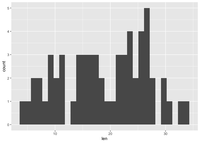
Histogram
Understanding data distribution can help us decide appropriate downstream steps in analysis such as which statistical test to use. A histogram is a good way to visualize distribution. It divides the data into bins or increments and informs the number of occurrences in each of the bins. Thus, the default statistical transformation for geom_histogram is stat_bin, which bins the data into a user specified integer (default is 30) and then counts the occurrences in each bin. In geom_histogram we have the ability to control both the number of bins through the bins argument or binwidth through the binwidth argument. Important to note is that stat_bin only works with continuous variables.
Below we constructed a basic histogram using the len column in a1 (the raw data for the Tooth Growth study). Note that within geom_histogram we do not need to explicitly state stat="bin" because it is default. The histogram below is not very aesthetically pleasing - there are gaps and difficult to see the separation of the bins.
ggplot(data=a1, mapping=aes(x=len))+
geom_histogram()
## `stat_bin()` using `bins = 30`. Pick better value with `binwidth`.
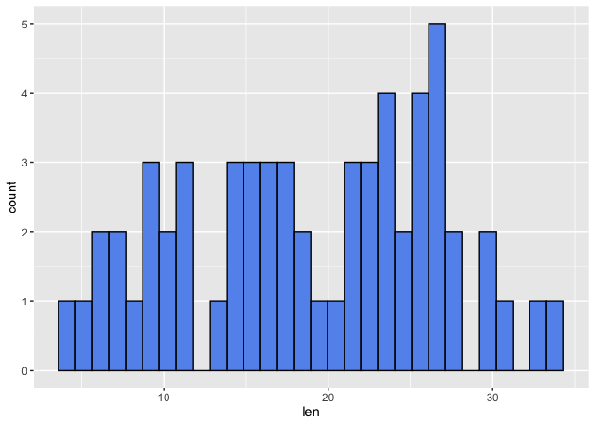
First, we will use the color argument in geom_histogram to assign a border color to help distinguish the bins. Then we use the fill argument in geom_histogram to change the bars associated with the bins to a color other than gray. Below we have a histogram of tooth length with a default bin of 30.
ggplot(data=a1, mapping=aes(x=len))+
geom_histogram(color="black", fill="cornflowerblue")
## `stat_bin()` using `bins = 30`. Pick better value with `binwidth`.
Let's alter the number of bins
ggplot(data=a1, mapping=aes(x=len))+
geom_histogram(color="black", fill="cornflowerblue", bins=7)
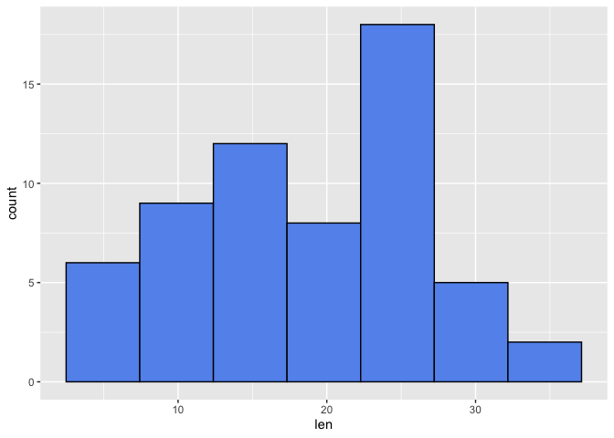
From the above, we see that altering the number of bins alters the binwidth (ie. the range in which occurrence are counted). Thus, altering the bins can influence the distribution that we see. The histograms above seem to be left skewed and a lot of the tooth length values fall between 22.5 and 27.5 when 7 bins were used.
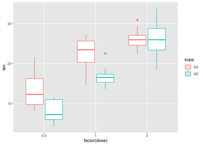
Box plot
Box and whisker plots also show data distribution. Unlike a histogram, we can readily see summary statistics such as median, 25th and 75th percentile, and maximum and minimum.
The default statistical tranformation of a box plot in ggplot2 is stat_boxplot which calculates components of the boxplot. To construct a box plot in ggplot2, we use the geom_boxplot argument. Note that within geom_boxplot we do not need to explicitly state stat="boxplot" because it is default. Below, we have a default boxplot depicting tooth length across the treatment groups. Potential outliers are presented as points.
ggplot(data=a1, mapping=aes(x=factor(dose), y=len, color=supp))+
geom_boxplot()
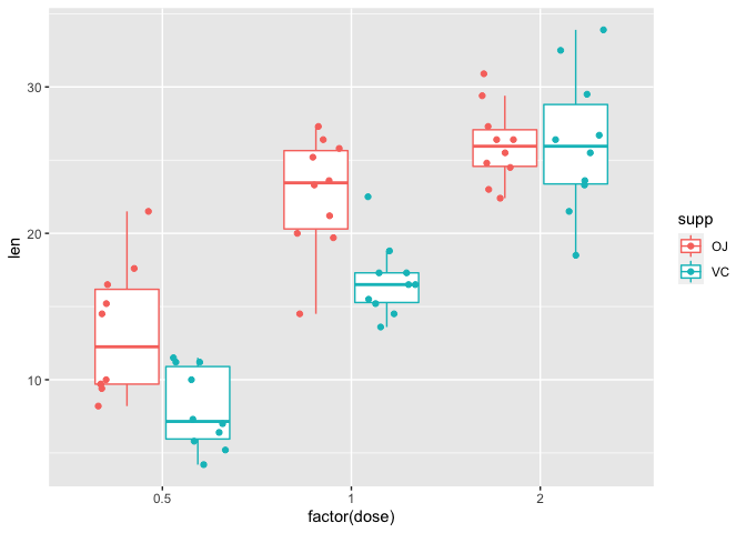
Rather than showing the outliers, we could instead add on geom_point to overlay the data points. Here, in geom_boxplot we set outlier.shape=NA to remove the outliers for the purpose of avoiding duplicating a data point. Within geom_point we set the position of the points to position_jitterdodge to avoid overlapping of points whose values are close together (set by jitter.width) and overlapping of points from measurements derived from different supplements (dodge.width).
ggplot(data=a1, mapping=aes(x=factor(dose), y=len, color=supp))+
geom_boxplot(outlier.shape=NA)+
geom_point(position=position_jitterdodge(jitter.width=0.3,
                                         dodge.width=0.8))
The box plot above shows several things
- Tooth length appears to be longer for the OJ treated group at doses of 0.5 and 1
- Tooth length appears to be equal for both the OJ and VC groups at a dose of 2
- At a dose of 0.5 and 1, the median (line inside the box) for the OJ group is larger than the VC group
- At a dose of 0.5 and 1, the interquartile range (IQR) which is defined by the lower (25th percentile) and upper (75th percentile) bounds of the box along the vertical axis is larger for the OJ group as compared to VC - so there is more variability in the OJ group measurements.
- At a dose of 2, the median for both the OJ and VC group are roughly equal
- At a dose of 2, the IQR for the VC group is larger than that for the OJ group